
Pro blocks
Woo Product CarouselPro
How to choose which WooCommerce products appear (featured, on sale, best-selling, top-rated, or by category), configure the slider, show or hide product details, and style the product card.
This feature needs the Pro version of WPMozo Blocks and Addons.
On this page
See the Woo Product Carousel block live on the demo site (opens in a new tab)
Requires: WooCommerce.
Adding the block#
- Click the “+” (Block Inserter) button.
- Search for “Woo Product Carousel” and select it.
- Choose which products to show under General → Content.
General tab#
Content#
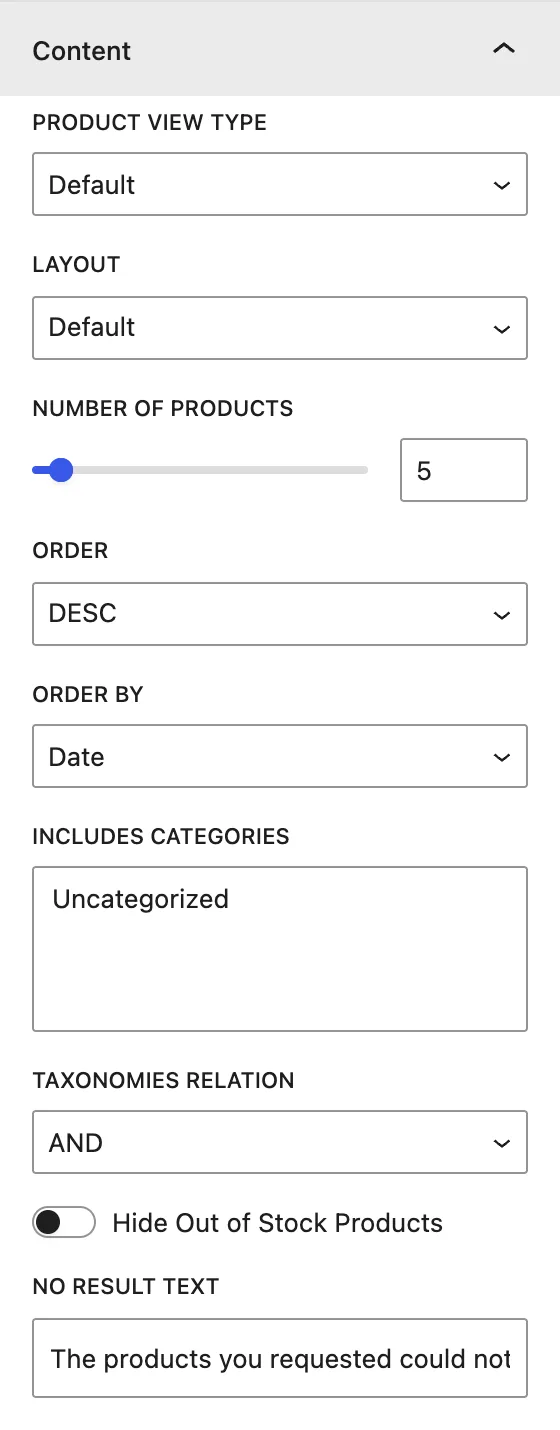
| Setting | Description |
|---|---|
| Product View Type | Default (all products), Featured Products, Sale Products, Best Selling Products, or Top Rated Products. |
| Layout | Default (WooCommerce style), Layout 1, or Layout 2. |
| Number of Products | Total products in the carousel. |
| Order / Order by | DESC/ASC by Date, Modified Date, Title, Slug, ID, Random, None. |
| Includes Categories | Shows only products from the chosen product categories. |
| Taxonomies Relation | When several categories are chosen: OR (in any of them) or AND (in all of them). |
| Hide Out of Stock Products | Leaves out products that are out of stock. |
| No Result Text | Message shown when no products match. |
Display#
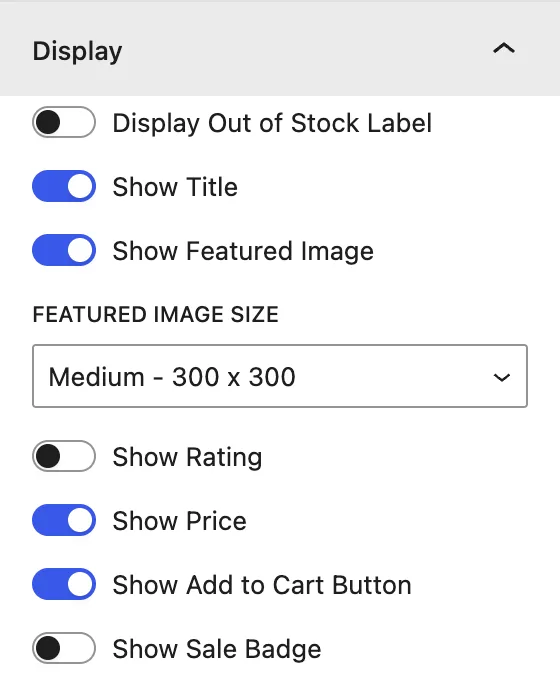
| Setting | Description |
|---|---|
| Display Out of Stock Label | Shows an “Out of stock” label on those products. |
| Show Title / Show Featured Image | Product name and image. Choose a Featured Image Size. |
| Show Rating | Star rating. |
| Show Price | Regular and sale price. |
| Show Add to Cart Button | The WooCommerce add-to-cart button. |
| Show Sale Badge | “Sale!” badge on discounted products. |
Slider#
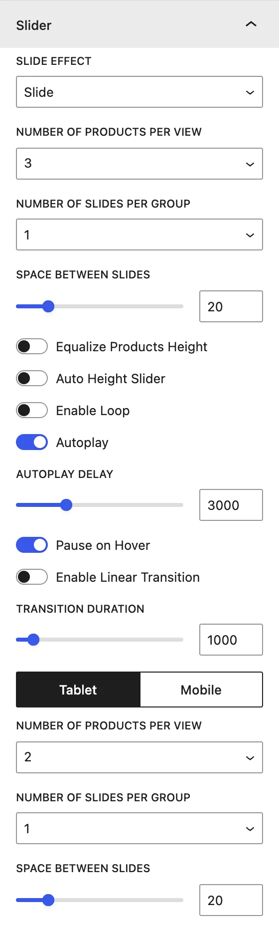
| Setting | Description |
|---|---|
| Slide Effect | Slide, Cube, Coverflow, Flip, or Fade. |
| Number of Products Per View | Products visible at once. Use the Desktop / Tablet / Mobile switch to set it per device. |
| Number of Slides Per Group | Products moved per swipe. |
| Space Between Slides | Gap, in px. |
| Equalize Products Height / Auto Height Slider | Height behavior. |
| Enable Loop / Autoplay / Autoplay Delay / Pause on Hover | Looping and automatic sliding. |
| Enable Linear Transition / Transition Duration | Continuous movement and speed. |
Slider Navigation#
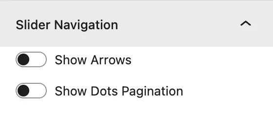
Show Arrows and Show Dots Pagination, with icons, positions, and styles. See Blog Slider → Slider Navigation.
Design tab#
| Panel | What it controls |
|---|---|
| Slider Container | Padding around the carousel. |
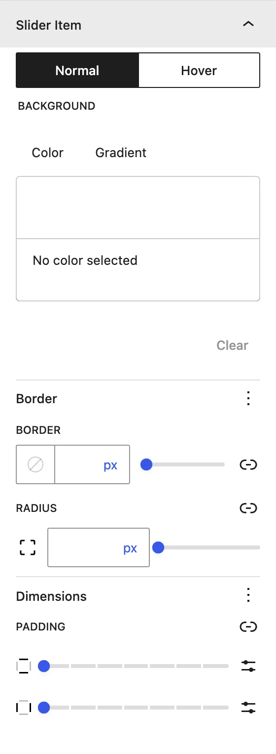
| Slider Item | Normal / Hover background, border, radius, and padding of each product card. |
| Slider Navigation | Arrow padding, Arrows Font Size, color, and background border. |
| Slider Pagination | Control Dot Color. |
| Title | Alignment, color, typography, and spacing. |
| Image | Image Width and Height. |
| Price | Alignment, color, and typography. |
| Add to Cart | Colors, typography, border, and spacing of the button. |
| Sale Label | Colors, typography, border, and spacing of the badge. |
Advanced tab#
Tips#
- Use Sale Products with Show Sale Badge for a “Deals of the week” section.
- Best Selling Products needs some order history before it shows results.
Was this article helpful?
Thanks for the feedback. Need more help? Contact support.