Pro blocks
Blog SliderPro
How to select which posts appear, pick one of the 4 layouts and 5 slide effects, set autoplay, arrows, and dots, and style each part of the post card.
This feature needs the Pro version of WPMozo Blocks and Addons.
On this page
See the Blog Slider block live on the demo site (opens in a new tab)

Adding the block#
- Click the “+” (Block Inserter) button.
- Search for “Blog Slider” and select it.
- Your latest posts load automatically. Change the source, layout, and slider behavior in the sidebar.
Settings overview#
| Tab | What you control there |
|---|
| General | Which posts to show, the layout, slider options, and navigation |
| Design | Image, card, title, category, text, meta, button, and container styles |
| Advanced | See Common Advanced Settings |
General tab#
Content#
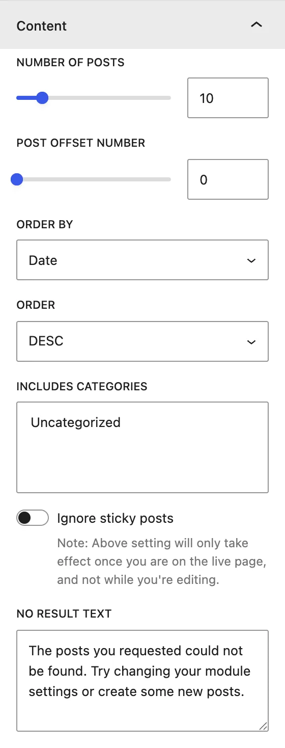
| Setting | Description |
|---|
| Number of Posts | Total posts in the slider. |
| Post Offset Number | Skips this many of the newest posts. |
| Order by / Order | Sort by Date, Modified Date, Title, Slug, ID, Random, Relevance, None, in DESC or ASC order. |
| Includes Categories | Shows only posts from the chosen categories. |
| Ignore sticky posts | Lists sticky posts in normal order. This only applies on the live page, not in the editor. |
| No Result Text | Message shown when no posts match. |
Display#
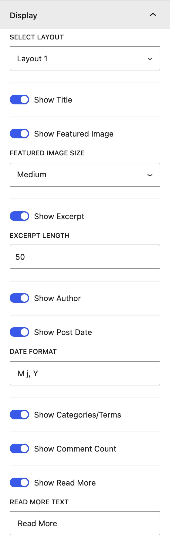
| Setting | Description |
|---|
| Select Layout | Layout 1–4: different card designs, for example image on top, text over the image, or side by side. |
| Show Title / Show Featured Image | Turns the post title and image on or off. Choose a Featured Image Size (Medium, Large, Full). |
| Show Excerpt / Excerpt Length | Shows a summary limited to a number of words. |
| Show Author / Show Post Date / Date Format | Post meta. The date uses PHP date formats (for example M j, Y). |
| Show Categories/Terms | Shows category labels. |
| Show Comment Count | Shows the number of comments. |
| Show Read More / Read More Text | Adds a button that links to the post. |
Slider#
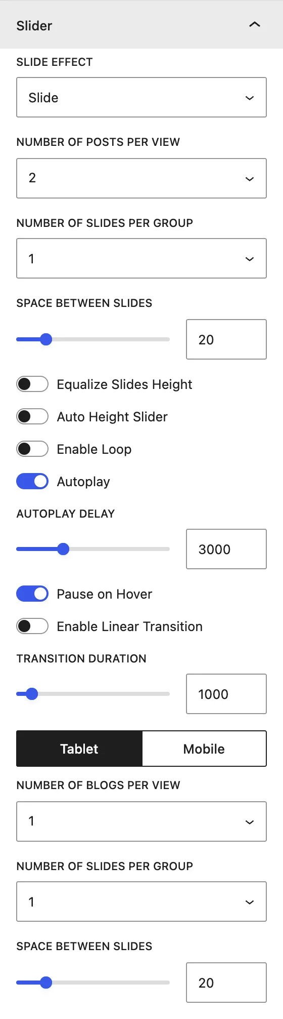
| Setting | Description |
|---|
| Slide Effect | Slide, Cube, Coverflow, Flip, or Fade. Coverflow also has Coverflow Rotate, Coverflow Depth, and Enable Slide Shadow. |
| Number of Posts Per View | How many posts are visible at once (1–10). Use the Desktop / Tablet / Mobile switch to set it per device. |
| Number of Slides Per Group | How many posts move with each swipe or arrow click. |
| Space Between Slides | Gap between cards, in px. |
| Equalize Slides Height | Makes all cards the same height. |
| Auto Height Slider | Resizes the slider to fit the current slide. |
| Enable Loop | Goes back to the first slide after the last one. |
| Autoplay / Autoplay Delay | Moves slides automatically. The delay is the pause between slides, in ms. |
| Pause on Hover | Stops autoplay while the cursor is over the slider. |
| Enable Linear Transition | Constant-speed movement, for a continuous ticker-style slider. |
| Transition Duration | Length of the slide animation, in ms. |
Slider Navigation#
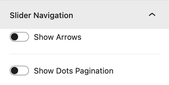
| Setting | Description |
|---|
| Show Arrows | Previous and next arrows. Pick the Previous Arrow and Next Arrow icons. |
| Show Arrows On Hover | Hides the arrows until the cursor is over the slider. |
| Arrows Position | Inside, Outside, Top Left, Top Right, Top Center, Bottom Left, Bottom Right, Bottom Center. |
| Show Dots Pagination | Clickable dots under the slider. |
| Dots Pagination Style | Solid Dot, Transparent Dot, Stretched Dot, Line, Rounded Line, Squared Dot. |
| Enable Dynamic Dots | Shows only a few dots at a time and scales them. Useful when there are many slides. |
Design tab#
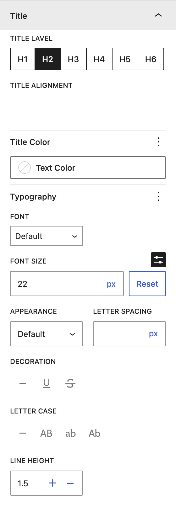
| Panel | What it controls |
|---|
| Image | Featured image border and radius. |
| Post Content | Background, padding, and margin of the text area in each card. |
| Title | Title Level (H1–H6), alignment, color, and typography. |
| Category | Alignment, color, typography, and padding of category labels. |
| Body Text | Excerpt alignment, color, and typography. |
| Meta Text | Author and date alignment, color, and typography. |
| Read More Button | Normal / Hover colors, icon, typography, dimensions, and border. |
| Single Post | Border and radius of each card. |
| Slider Container | Padding around the whole slider. |
| Arrows / Dots(when enabled) | Size, color, background, and position of the navigation. |
Advanced tab#
See Common Advanced Settings.
Tips#
- Set Posts Per View to 3 on desktop, 2 on tablet, and 1 on mobile for a well-balanced carousel.
- Turn on Equalize Slides Height when excerpts have different lengths.
- Cube and Flip effects work only with 1 post per view.
Was this article helpful?
Thanks for the feedback. Need more help? Contact support.Updated Nov 2, 2026
