
Blocks
Image CardFree
The Image Card Block is a free and versatile block that lets you display images or icons with titles, descriptions, and buttons in a stylish card layout.
It helps highlight key content or features in an attractive and organized way.
Adding the block#
To add the block:
- Click the “+” button to add a new block.
- Search for “Image Card” and select it.
- For detailed instructions on how to add blocks in Gutenberg, refer to the official WordPress Block Editor documentation (opens in a new tab).
Content configuration#
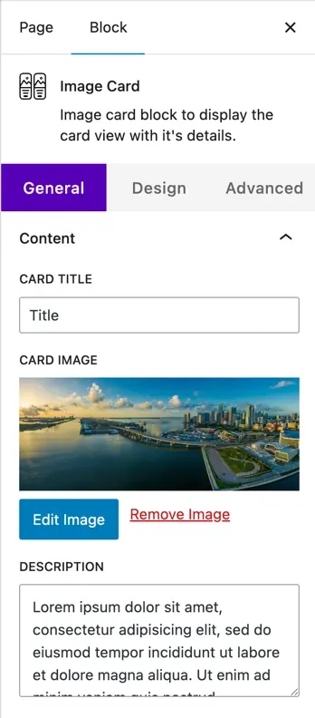
- Card Title
Add a title for your card. This will appear at the top of the image card. - Card Image
Upload or select an image from the media library to display on the card. - Description
Enter the text content you want to show on the card under the title.
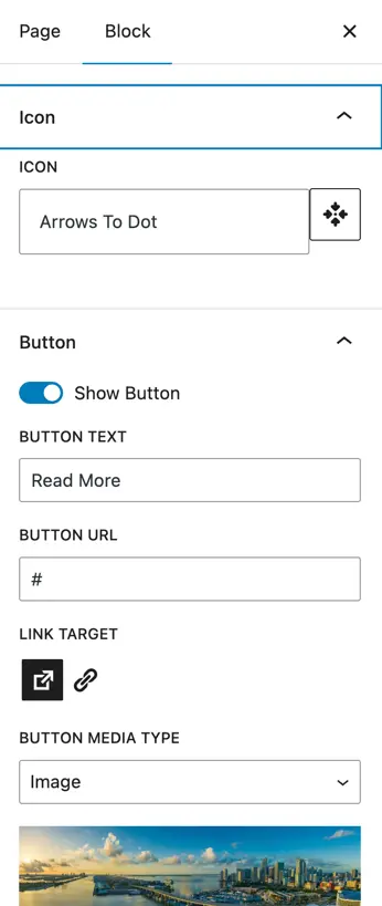
- Icon
Choose an icon to display on the card. - Button
- Show Button: Enable this toggle to display a button on the card.
- Button Text: Set the text that will appear on the button.
- Button URL: Enter the link where the button should redirect.
- Link Target: Choose whether the link opens in the same tab or a new tab.
- Button Media Type
Choose how you want to display media on the button. Available options are:- None – No media will appear.
- Icon – Lets you choose an icon to show on the button.
- Image – Lets you upload an image to show on the button.
- Position of Media Type
Set the position of the chosen media (icon or image) on the button. - Show Media on Hover
Enable this toggle if you want the selected icon or image to appear only when the user hovers over the button.
Design customization#
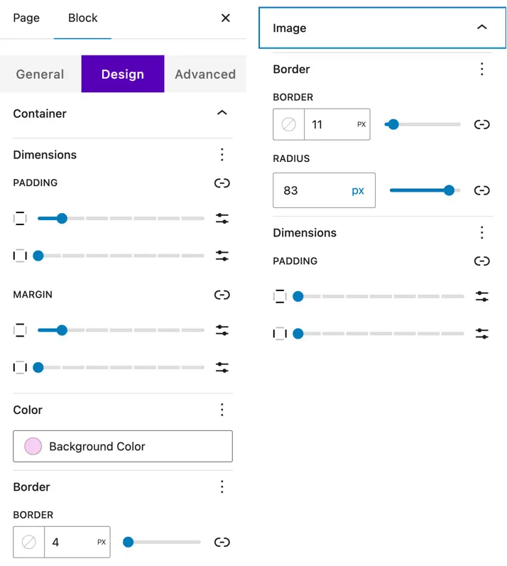
Container
Customize the overall card container with:
- Dimensions – Adjust width and height.
- Padding & Margin – Add inner and outer spacing around the card.
- Color – Set the background color of the container.
- Border – Customize border style, width, color, and border radius.
Image
Style the image used in the card (if added).
Title
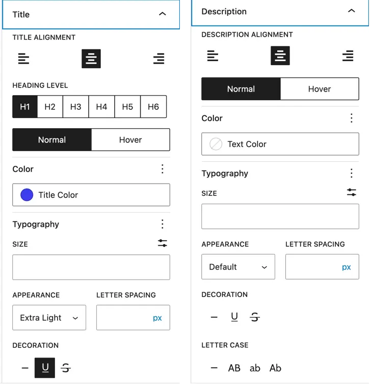
- Title Alignment – Set the alignment (left, center, right).
- Heading Level – Choose the heading tag (H1–H6).
- Color – Set the title text color.
- Typography – Customize font family, size, weight, and spacing.
Description
- Alignment – Set text alignment.
- Color – Choose description text color.
- Typography – Control font family, size, weight, and spacing.
Content (Icon and Button Styling)
- Content – Customize color, dimensions, and padding.
- Icon
- Color – Set icon color.
- Font Size – Adjust icon size.
- Alignment – Set icon alignment.
- Icon Shape – Choose from circle, square, or hexagon.
- Button
- Color – Set text and background colors.
- Alignment – Position the button.
- Typography – Adjust font settings.
- Border & Border Radius – Customize the border style and rounded corners.
- Hover Options – Set hover colors, borders, and border radius.
Was this article helpful?
Thanks for the feedback. Need more help? Contact support.