
Pro blocks
Image Card CarouselPro
How to add cards with an image, title, text, icon, and button, set the slide effect, autoplay, arrows, dots, and lightbox, and style the cards.
This feature needs the Pro version of WPMozo Blocks and Addons.
On this page
See the Image Card Carousel block live on the demo site (opens in a new tab)
Adding the block#
- Click the “+” (Block Inserter) button.
- Search for “Image Card Carousel” and select it. It is added with three cards.
- Select a card to set its image and text, or the carousel to control the slider.
- To add cards, select the parent and use the “+” appender, or duplicate a card.
Parent block: Image Card Carousel#
General tab#
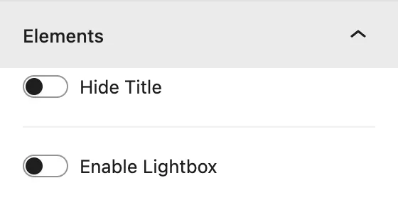
Elements
| Setting | Description |
|---|---|
| Hide Title | Hides the titles on all cards. |
| Enable Lightbox | Opens the card image in a popup when it is clicked. |
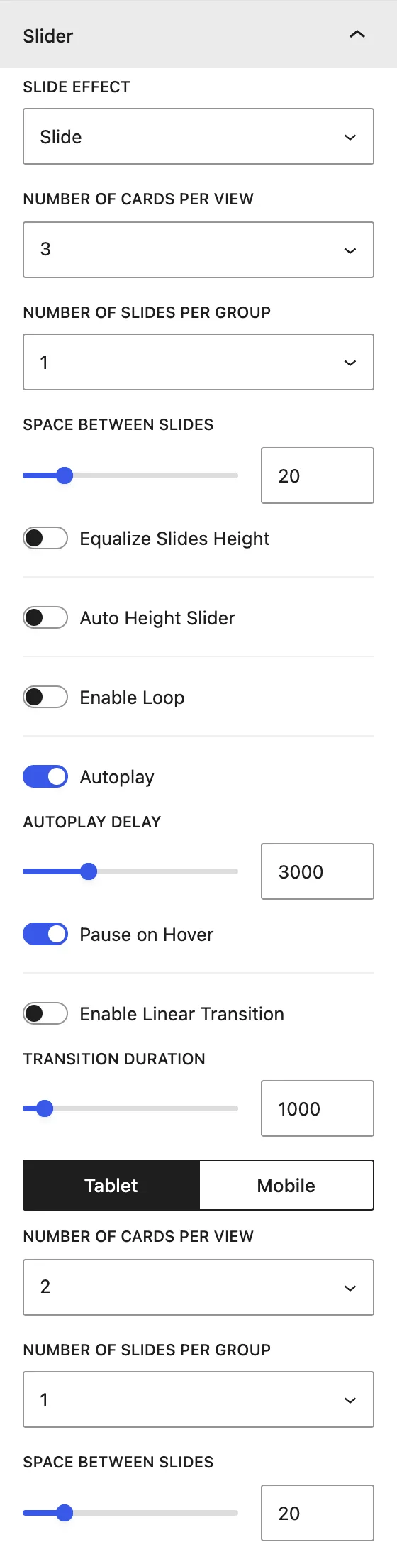
Slider
| Setting | Description |
|---|---|
| Slide Effect | Slide, Cube, Coverflow, Flip, or Fade. |
| Number of Cards Per View | Cards visible at once (1–15). Use the Desktop / Tablet / Mobile switch to set it per device. |
| Number of Slides Per Group | Cards moved per swipe or arrow click. |
| Space Between Slides | Gap, in px. |
| Equalize Slides Height / Auto Height Slider | Keeps all cards the same height, or resizes the slider to each card. |
| Enable Loop | Goes back to the first card after the last one. |
| Autoplay / Autoplay Delay / Pause on Hover | Automatic sliding, the pause between moves (ms), and stopping on hover. |
| Enable Linear Transition / Transition Duration | Constant-speed movement and animation length. |
Slider Navigation
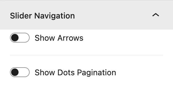
Show Arrows (icons, show on hover, 8 positions) and Show Dots Pagination (6 styles, dynamic dots). See Blog Slider → Slider Navigation for the full list.
Design tab#
| Panel | What it controls |
|---|---|
| Image | Image border and radius for all cards. |
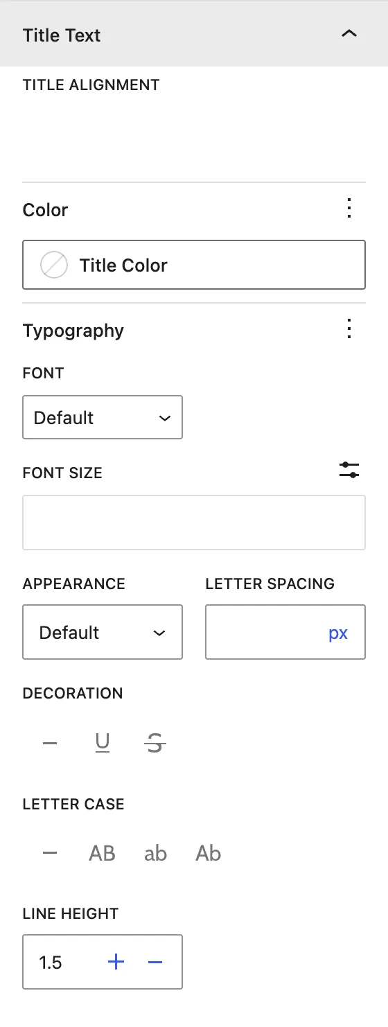
| Title Text | Alignment, color, and typography of all titles. |
| Content Text | Alignment, color, and typography of all texts. |
| Icon | Alignment, size, and color of all icons. |
| Slider Container | Padding around the carousel. |
| Arrows / Dots(when enabled) | Navigation styling. |
Child block: Image Card Carousel Item#
General tab#
Content
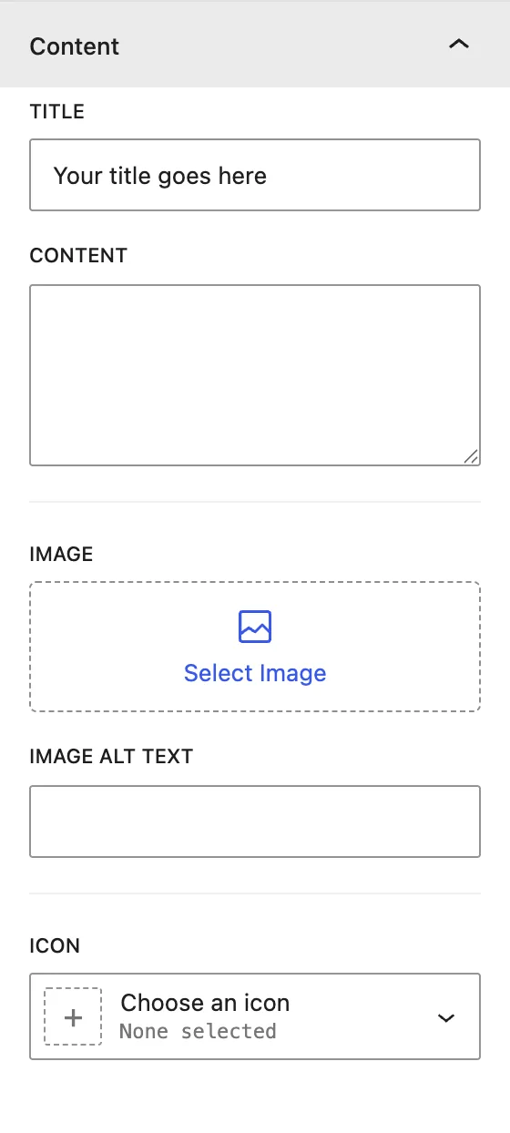
| Setting | Description |
|---|---|
| Title | Card title. |
| Content | Card text. |
| Image / Image Alt Text | Card image and its alternative text. |
| Icon | Optional icon on the card. |
Button
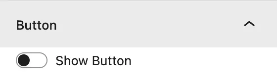
Show Button adds a button to this card, with its own text and link.
Design tab#
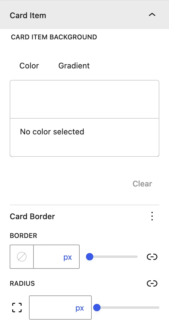
| Panel | What it controls |
|---|---|
| Title Text | Title Level (H1–H6), alignment, color, and typography for this card. |
| Content Text | Alignment, color, and typography. |
| Icon | Alignment, size, color, and Style Icon (icon inside a shape). |
| Card Content | Background and padding of the text area. |
| Card Item | Card background, border, and radius. |
Styles set on a card override the parent styles for that card only.
Advanced tab#
Tips#
- Use images of the same size for an even row of cards.
- Style everything on the parent first, then use the child settings to highlight one card.
Was this article helpful?
Thanks for the feedback. Need more help? Contact support.