
Pro blocks
Dynamic GalleryPro
How to create Media Categories and assign them to images, how the filter buttons work, and how to set up the lightbox, overlay, titles and captions, and pagination.
This feature needs the Pro version of WPMozo Blocks and Addons.
On this page
See the Dynamic Gallery block live on the demo site (opens in a new tab)
Before you start: Media Categories#
The Pro plugin adds a Media Categories taxonomy to your media.
- Go to Media → Media Categories and create categories, for example Weddings, Portraits, Events.
- Open any image in Media → Library and assign one or more categories to it.
- These categories become the gallery filters.
Adding the block#
- Click the “+” (Block Inserter) button.
- Search for “Dynamic Gallery” and select it.
- Under Configuration → Includes Categories, choose the media categories to show.
General tab#
Configuration#
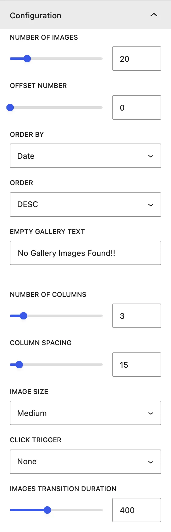
| Setting | Description |
|---|---|
| Number of Images | How many images to load (per page when pagination is on). |
| Offset Number | Skips this many images. |
| Order by / Order | Sort by Date, Modified Date, Title, Slug, or ID, in DESC or ASC order. |
| Includes Categories | Media categories to show in the gallery and as filters. |
| Empty gallery text | Message shown when no images are found. |
| Number Of Columns | Images per row. |
| Column Spacing | Gap between images. |
| Image Size | Thumbnail, Medium, Large, or Full. |
| Click Trigger | What happens on click: None, Lightbox (open the image in a popup), or Link (go to a URL, in the Same Window or a New Window). |
| Images Transition Duration | Speed of the filter animation, in ms. |
Elements#
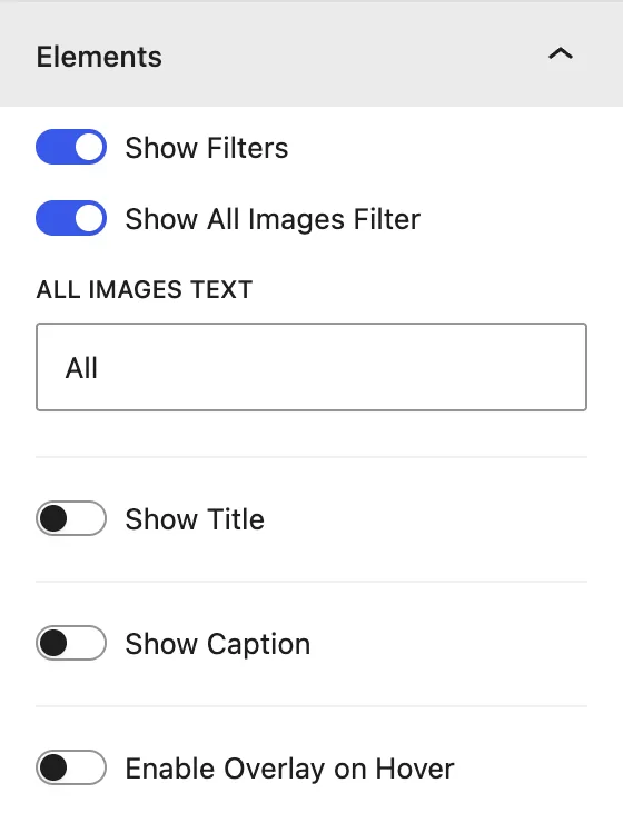
| Setting | Description |
|---|---|
| Show Filters | Shows the category filter buttons above the gallery. |
| Show All Images Filter / All Images Text | Adds an “All” button and lets you rename it. |
| Show Title / Show Title in | Shows the image title in the Lightbox Only, Gallery Only, Overlay, or Both Gallery and Lightbox. |
| Show Caption / Show Caption in | Same choices, for the image caption. |
| Enable Overlay on Hover | Adds a color overlay when the visitor hovers over an image. |
| Show Overlay Icon | Shows an icon (for example a zoom icon) on the overlay. |
Lightbox#
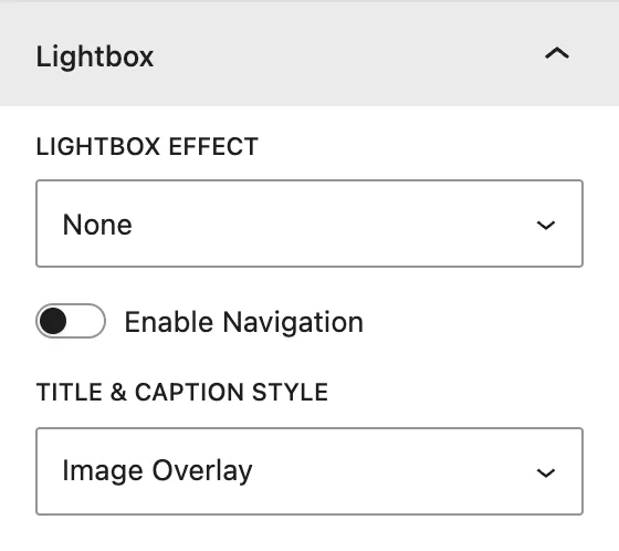
| Setting | Description |
|---|---|
| Lightbox Effect | Open animation: None, Zoom, or Fade. |
| Enable Navigation | Previous and next arrows inside the lightbox. |
| Title & Caption Style | Shows text as an Image Overlay or Below Image in the lightbox. |
Pagination#
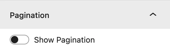
| Setting | Description |
|---|---|
| Show Pagination | Splits the gallery into pages, using Number of Images per page. |
| Show Previous Next Links | Adds previous and next links, with custom Prev Link Text and Next Link Text. |
Design tab#
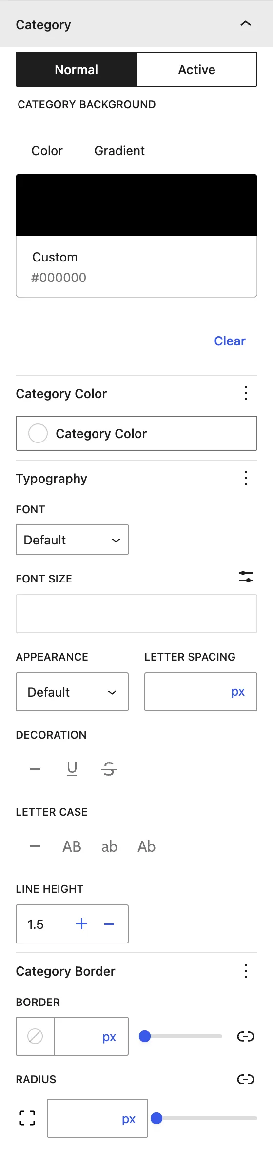
| Panel | What it controls |
|---|---|
| Images | Image border and radius. |
| Title | Title Level, alignment, color, and typography of image titles. |
| Caption | Caption alignment, color, and typography. |
| Category | Filter buttons, with Normal / Active background, text color, typography, border, and radius. |
| Overlay | Overlay Background Color, Overlay Icon Size, and Overlay Icon Color. |
| Lightbox | Lightbox Color (the backdrop behind the image). |
| Pagination | Normal and active page-number background and text colors. |
Advanced tab#
Tips#
- Give an image several categories to show it under more than one filter.
- Use Image Size → Medium or Large for fast loading, because the lightbox still opens the full image.
Was this article helpful?
Thanks for the feedback. Need more help? Contact support.