
Blocks
Hover ListFree
How to set the dividers and layout of the parent list, add list items with a title, subtitle, description, hover image, icon, and button, and style each item.
On this page
See the Hover List block live on the demo site (opens in a new tab)
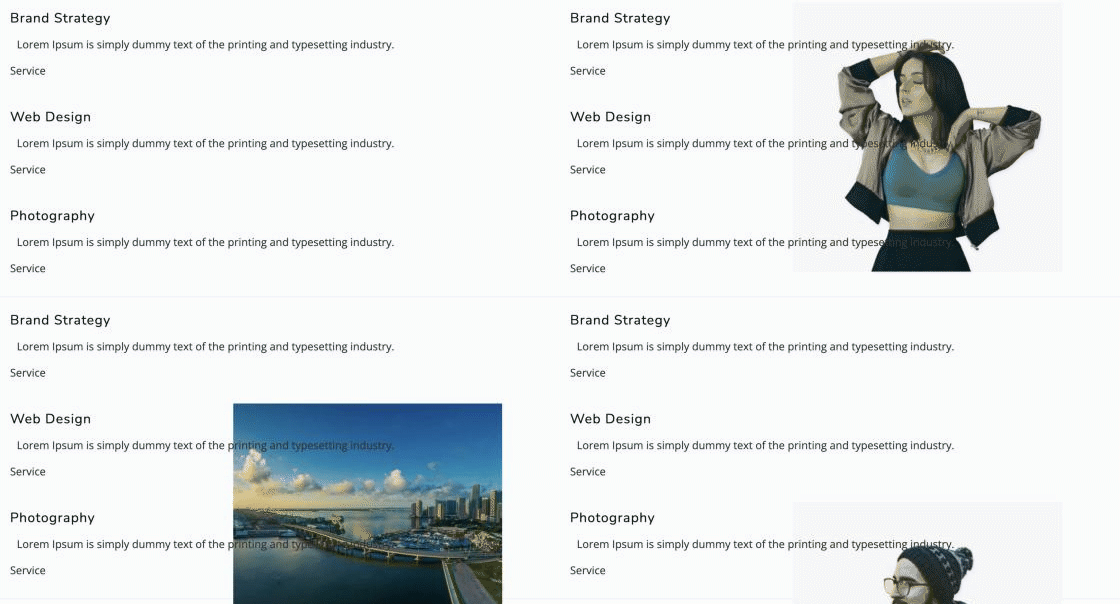
Adding the block#
- Click the “+” (Block Inserter) button.
- Search for “Hover List” and select it. It is added with three sample items.
- Select the parent block to style the whole list, or select an item to edit its content.
- To add a row, select the parent and click the “+” appender, or duplicate an existing item.
Parent block: Hover List#
Settings here apply to every row in the list.
General tab#
Divider
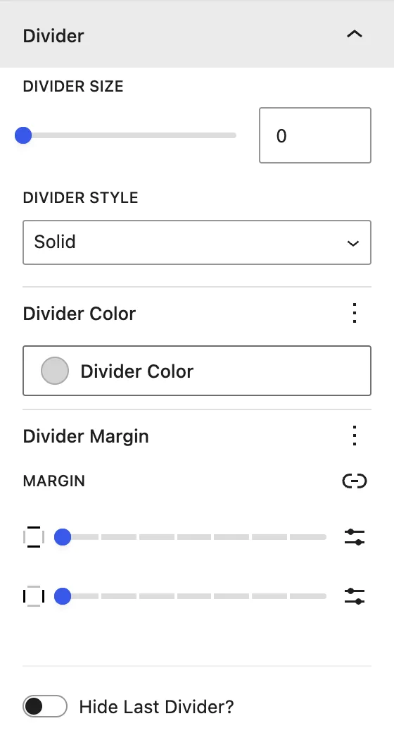
| Setting | Description |
|---|---|
| Divider Size | Thickness of the line between rows. |
| Divider Style | Solid, Dashed, Dotted, Double, Groove, Ridge, Inset, Outset. |
| Divider Color | Color of the line. |
| Divider Margin | Space above and below the divider. |
| Hide Last Divider? | Removes the line under the last row. |
Design tab#
Title
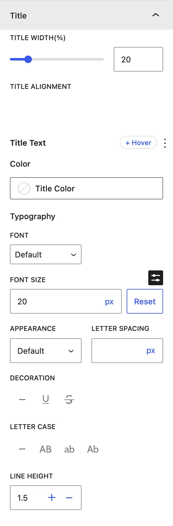
| Setting | Description |
|---|---|
| Title Width (%) | Width of the title column in the row. |
| Title Alignment | Left, center, or right. |
| Color / Typography | Title color (normal and hover) and font settings. |
Sub Title Text
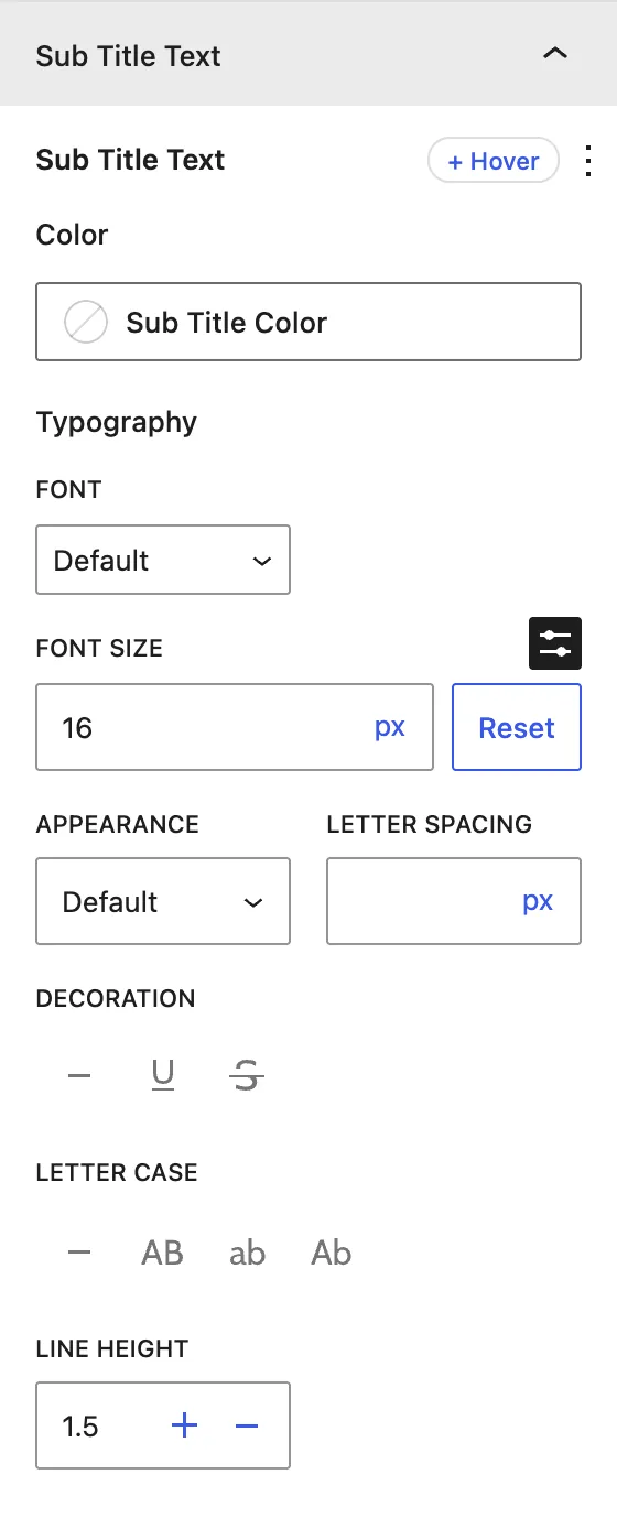
Color and Typography for the subtitle.
Description
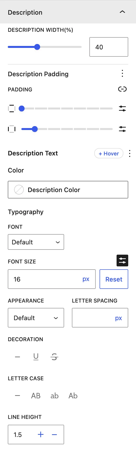
| Setting | Description |
|---|---|
| Description Width (%) | Width of the description column. |
| Description Padding | Space around the description. |
| Color / Typography | Text color and font settings. |
Hover Image
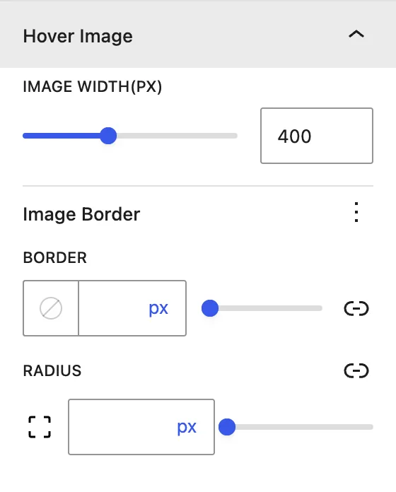
| Setting | Description |
|---|---|
| Image Width (px) | Size of the image that appears on hover. |
| Image Border / Radius | Border and rounded corners of the image. |
Icon
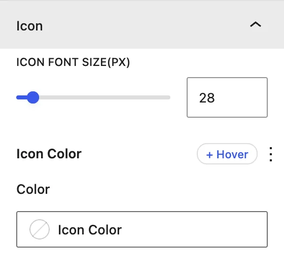
Icon Font Size (px) and Color for the row icons.
Child block: Hover List Item#
Each row is a separate Hover List Item. Its settings override the parent’s styles for that row only.
General tab#
Content
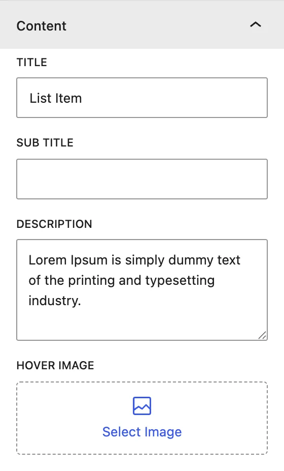
| Setting | Description |
|---|---|
| Title | Main text of the row. |
| Sub Title | Small label, for example a category or date. |
| Description | Short text about the item. |
| Hover Image | Image shown when the visitor hovers over this row. |
Display
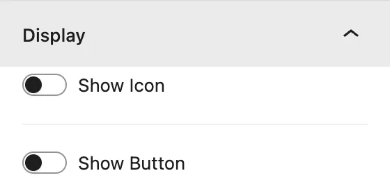
| Setting | Description |
|---|---|
| Show Icon | Adds an icon to the row. Pick it from the icon library. |
| Show Button | Adds a button, with Button Text, Button URL, and Button Link Target (New Window or Same Window). |
Design tab#
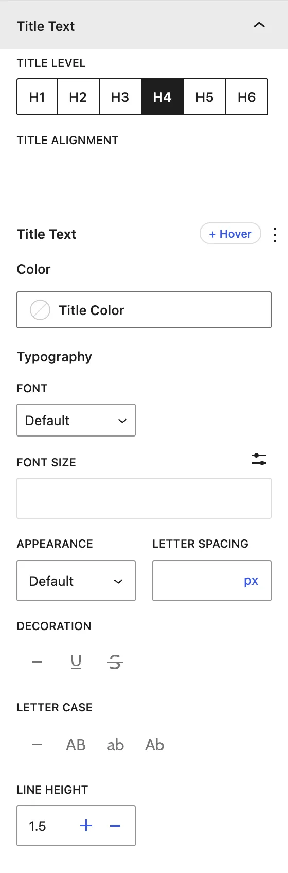
| Panel | What it controls |
|---|---|
| Title Text | Title Level (H1–H6), alignment, color, and typography for this row. |
| Sub Title Text | Subtitle color and typography. |
| Description Text | Description color and typography. |
| Icon | Icon color. |
| Button | Button colors, typography, icon (Before or After, show on hover), and dimensions. |
| Block | Background, padding, and margin of the row. |
Advanced tab#
Tips#
- Use landscape images of the same size for the Hover Image so every row feels consistent.
- Style shared things (fonts, divider) on the parent, and change the child only for exceptions.
Was this article helpful?
Thanks for the feedback. Need more help? Contact support.