
Pro blocks
Common Advanced Settings
The Advanced tab every block shares: background, spacing, border, transform, your own CSS classes, CSS for one block, and different values per device.
On this page
Every Free block has an Advanced tab in the block sidebar, next to General and Design. The options are the same for all Free blocks, so they are documented once here.
Advanced tab#
Background#
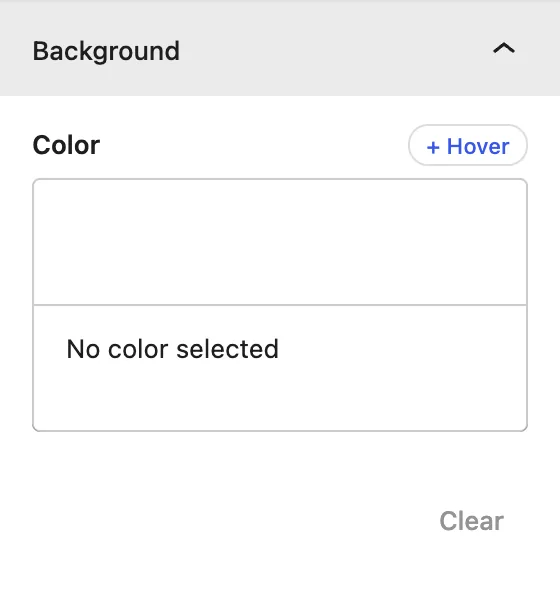
| Setting | Description |
|---|---|
| Color | Background color or gradient for the whole block. |
| + Hover | Adds a different background when the visitor hovers over the block. |
Spacing#
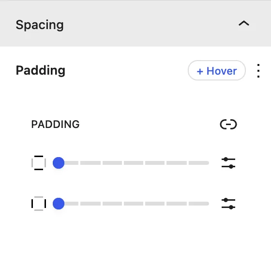
| Setting | Description |
|---|---|
| Padding | Space inside the block. Click the link icon to set each side separately. |
| + Hover | Different spacing on hover, for example to “lift” a card. |
Border#
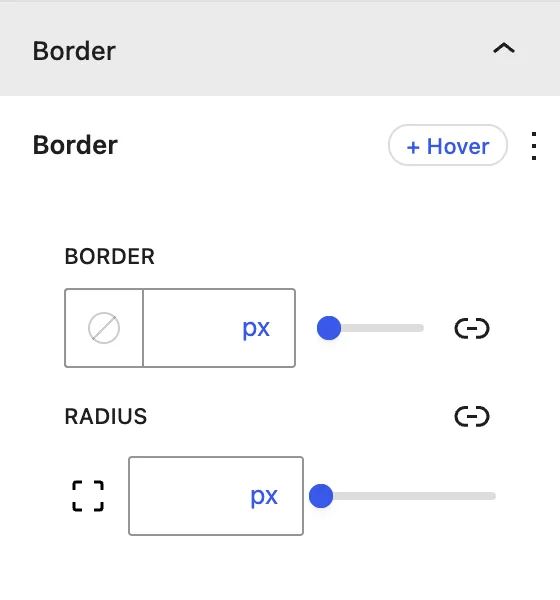
| Setting | Description |
|---|---|
| Border | Width, style, and color, for all sides or each side separately. |
| Radius | Rounded corners. |
Transform#
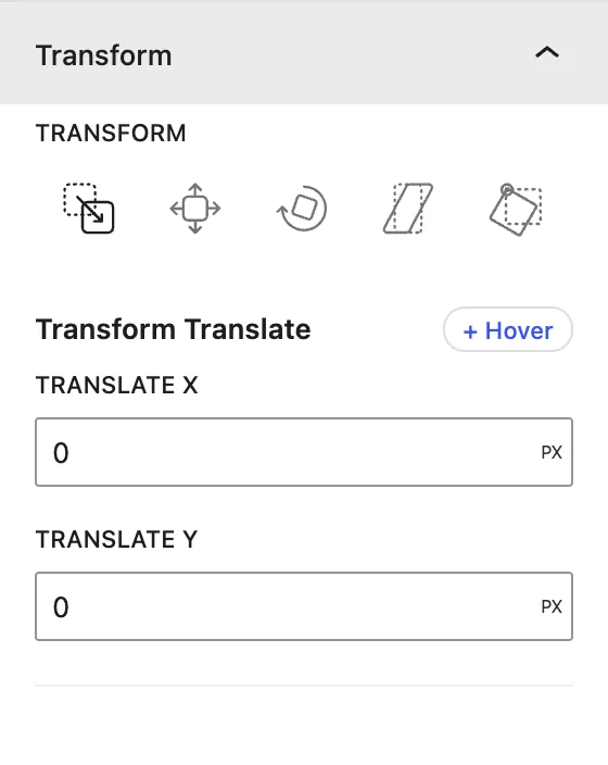
| Setting | Description |
|---|---|
| Translate | Moves the block on the X (horizontal) and Y (vertical) axis. |
| Scale | Makes the block bigger or smaller. |
| Rotate | Rotates the block. |
| Skew | Slants the block. |
| Transform Origin | The point that rotation and scaling start from (center, top left, …). |
Additional Class(es)#
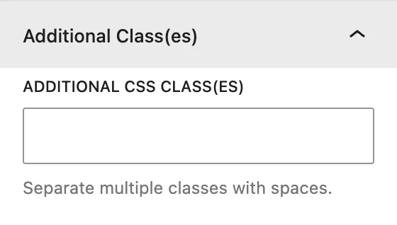
Additional CSS Class(es): adds your own CSS class names to the block, separated by spaces. Use them to target the block from your theme or a custom CSS file.
Additional CSS#
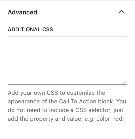
Additional CSS: writes CSS that applies only to this block. You don’t need a selector. Just type properties and values, for example:
Pro blocks#
The Pro blocks have a shorter Advanced tab: Additional CSS Class(es) and Additional CSS, which work exactly as described above. Background, spacing, border and transform live in each Pro block’s Design tab.
box-shadow: 0 10px 30px rgba(0,0,0,.08);
transition: all .3s ease;
Responsive values#
Some controls, such as items per view in sliders and carousels, have a Desktop / Tablet / Mobile switch. Choose a device and set a different value for it. To check other screen sizes, use Preview → Tablet / Mobile in the editor toolbar.
Was this article helpful?
Thanks for the feedback. Need more help? Contact support.