
Pro blocks
Woo Products AccordionPro
How to select products, choose whether panels expand on hover or click, set the horizontal or vertical layout, and style the panel content (category, title, description, price, button).
This feature needs the Pro version of WPMozo Blocks and Addons.
See the Woo Products Accordion block live on the demo site (opens in a new tab)
Requires: WooCommerce.
Adding the block#
- Click the “+” (Block Inserter) button.
- Search for “Woo Products Accordion” and select it.
- Choose the products and accordion behavior in the sidebar.
General tab#
Content#
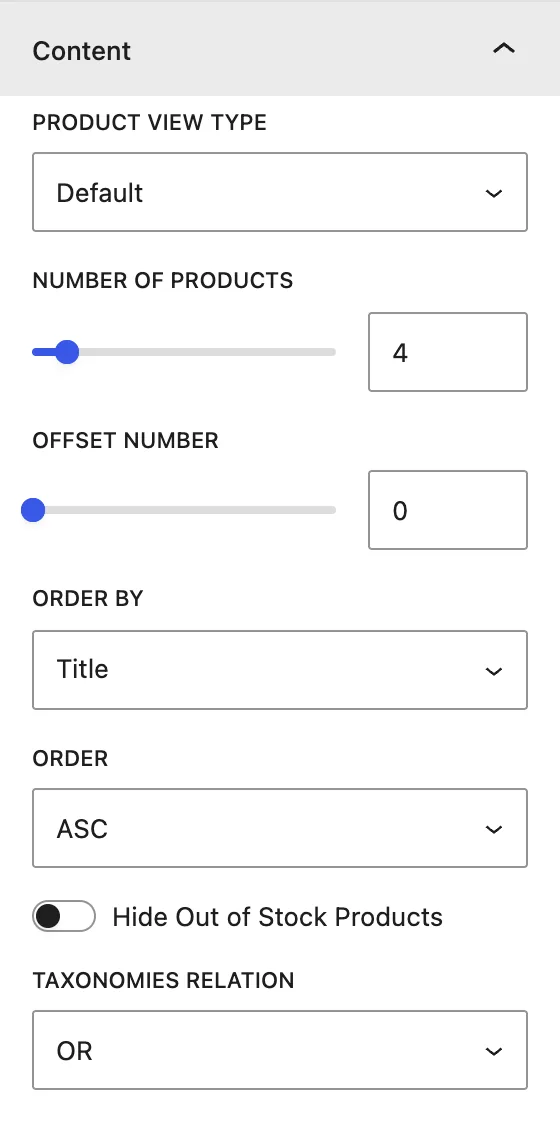
| Setting | Description |
|---|---|
| Product View Type | Default, Featured Products, Sale Products, Best Selling Products, Top Rated Products. |
| Number of Products | Number of panels. 3 to 6 works best. |
| Offset Number | Skips this many products. |
| Order by / Order | Sort by Date, Modified Date, Menu Order, Title, Slug, ID, Random, Stock Status, Price, None, in DESC or ASC order. |
| Hide Out of Stock Products | Leaves out products that are out of stock. |
| Taxonomies Relation | OR or AND logic when filtering by several categories. |
Display#
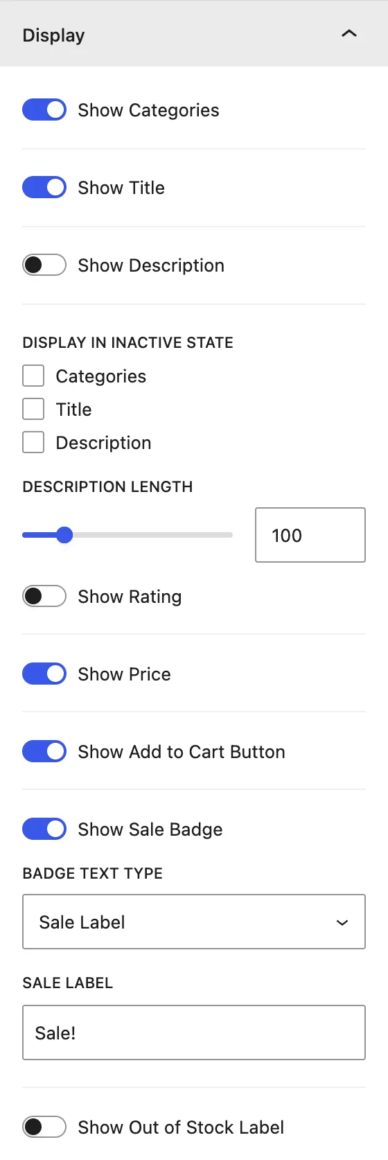
| Setting | Description |
|---|---|
| Show Categories / Show Title / Show Description | What appears on the open panel. |
| Display in Inactive State | Which details stay visible on closed panels: Categories, Title, and/or Description. |
| Description Length | Maximum number of words in the description. |
| Show Rating / Show Price / Show Add to Cart Button | Product details. |
| Show Sale Badge / Badge Text Type | Shows a badge with a Sale Label text (for example “Sale!”) or the Sale Percentage (for example “-20%”). |
| Show Out of Stock Label | Label on products that are out of stock. |
Accordion#
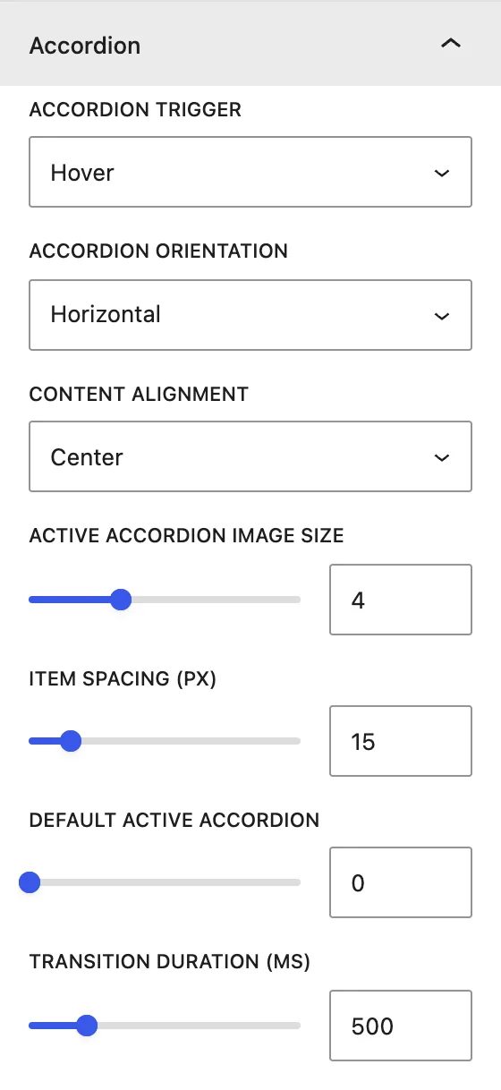
| Setting | Description |
|---|---|
| Accordion Trigger | Expands panels on Hover or Click. |
| Accordion Orientation | Horizontal (panels side by side) or Vertical (stacked). |
| Content Alignment | Position of the text on the open panel: Top/Center/Bottom + Left/Center/Right. |
| Active Accordion Image Size | How much wider the open panel is than the closed ones. |
| Item Spacing (px) | Gap between panels. |
| Default Active Accordion | Which panel is open when the page loads (1 = first). |
| Transition Duration (ms) | Speed of the expand animation. |
Design tab#
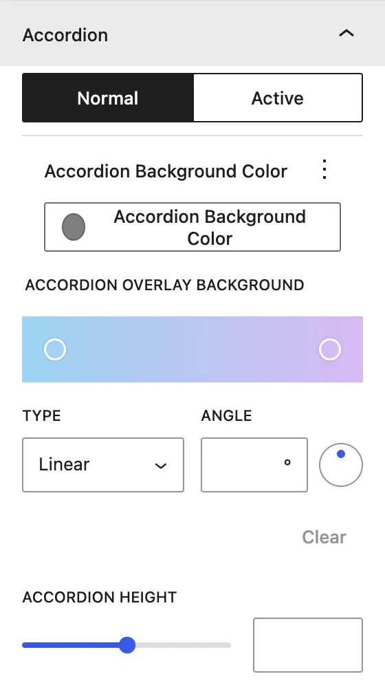
| Panel | What it controls |
|---|---|
| Accordion | Normal / Active background color, Accordion Overlay Background (solid or Linear/Radial gradient with angle), and Accordion Height. |
| Product | Product Container Height, content padding, border, and radius. |
| Text | Accordion Content Animation (Top To Bottom, Left To Right, Right To Left, Bottom To Top, No Animation), alignment, and a Light or Dark text color scheme. |
| Categories | Alignment, color, and typography. |
| Title | Title Level (H1–H6), alignment, color, and typography. |
| Price | Regular Price / Sale Price: alignment, color, and typography. |
| Sale Badge | Color, typography, border, and radius. |
| Add to Cart Button | Normal / Hover background, alignment, icon, text color, typography, dimensions, and border. |
Advanced tab#
Tips#
- Use tall product images, because only a narrow strip of each closed panel is visible.
- A dark gradient overlay with Light text gives the best readability on busy photos.
Was this article helpful?
Thanks for the feedback. Need more help? Contact support.