
Pro blocks
Team GridPro
How to add team members (photo, designation, bio, social links, skills), select which members appear, set up department filters and the member popup, and style the grid.
This feature needs the Pro version of WPMozo Blocks and Addons.
On this page
See the Team Grid block live on the demo site (opens in a new tab)
Before you start: add team members#
The plugin adds a WPMozo Team Members menu in the dashboard.
- Go to WPMozo Team Members → Add New.
- Enter the name (post title) and set the Team Member Image (featured image).
- Fill in the member details box: Short Description, Designation, Email Address, Phone Number, Website URL, Facebook, Twitter, LinkedIn, Instagram, YouTube URLs, and Skills (skill name + value 0–100).
- Optionally assign Team Member Categories (for example Design, Development). These are used as filters.
Adding the block#
- Click the “+” (Block Inserter) button.
- Search for “Team Grid” and select it.
- Your team members load automatically.
General tab#
Content#
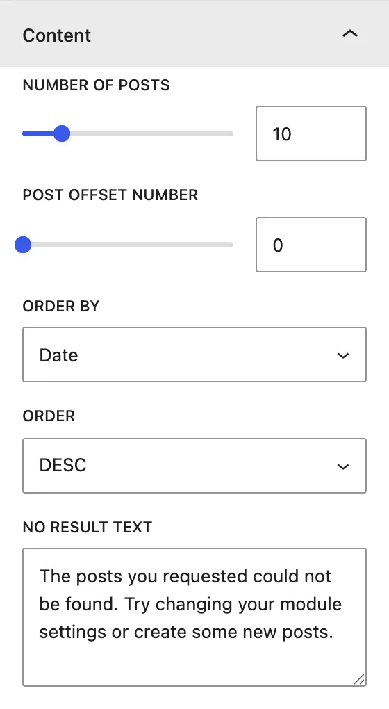
| Setting | Description |
|---|---|
| Number of Posts | How many members to show (per page when pagination is on). |
| Post Offset Number | Skips this many members. |
| Order by / Order | Sort by Date, Modified Date, Title, Slug, ID, Random, Relevance, None, in DESC or ASC order. Tip: use Title + ASC for alphabetical order. |
| No Result Text | Message shown when no members are found. |
Display#
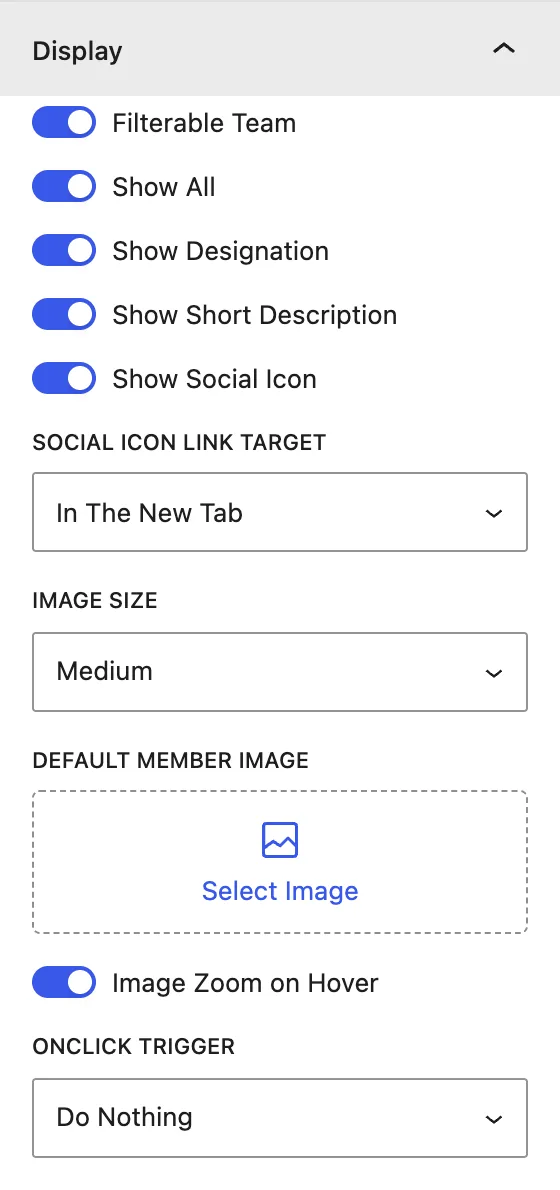
| Setting | Description |
|---|---|
| Filterable Team | Shows category filter buttons above the grid. Show All adds an “All” button. |
| Show Designation / Short Description / Social Icon | Choose which details appear on the card. |
| Social Icon Link Target | Opens social links In The Same Window or In The New Tab. |
| Image Size | Medium, Large, or Full. |
| Default Member Image | Placeholder used for members without a photo. |
| Image Zoom on Hover | Zooms the photo slightly on hover. |
| OnClick Trigger | Do Nothing, Open Popup (a detailed card with bio, skills, and socials), or Open Link (the member’s page, with a Member Link Target). Use Button adds a “View Profile” button with custom Button Text. |
Pagination#
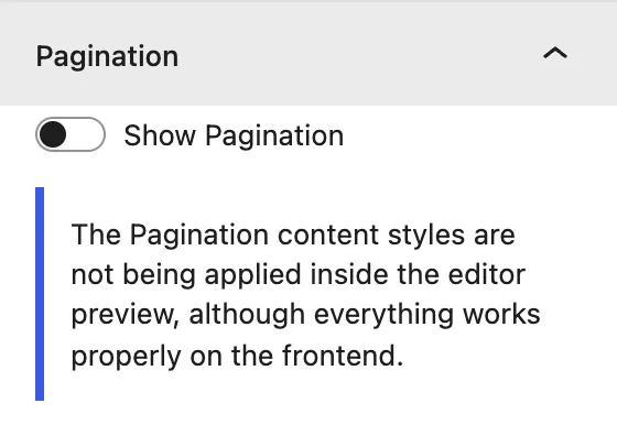
Show Pagination, plus Show Previous Next Links with custom Next/Prev Link Text.
Design tab#
Layout#
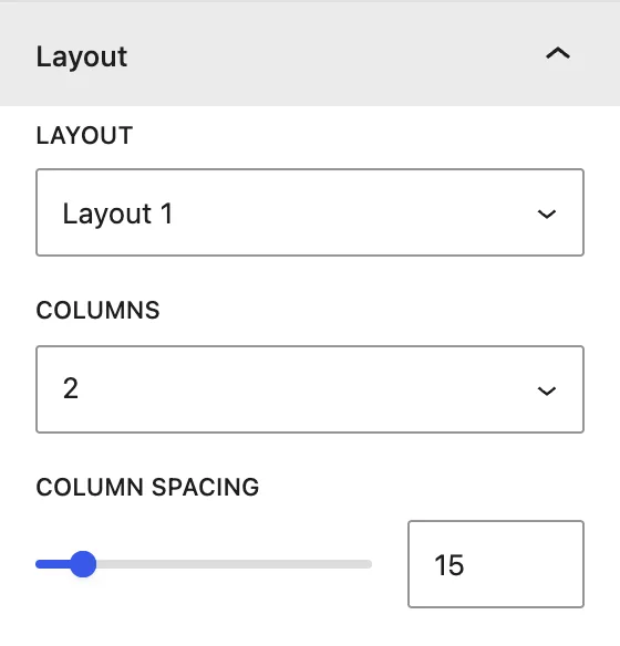
| Setting | Description |
|---|---|
| Layout | Layout 1–4: four different card designs. Switch between them to preview each one in the editor. |
| Columns | Members per row (1–6). |
| Column Spacing | Gap between cards. |
Other panels#
| Panel | What it controls |
|---|---|
| Name | Heading Level, alignment, color, and typography. |
| Designation | Alignment, color, and typography. |
| Short Description | Alignment, color, and typography. |
| Social Icons | Icon Size, color, alignment, border, and padding. |
| Filter Category | Normal / Active colors, typography, and border of filter buttons. |
| Button | Alignment, plus Custom Style colors, typography, and border. |
| Popup Text | Typography for Name / Designation / Description / Skill Text in the popup. |
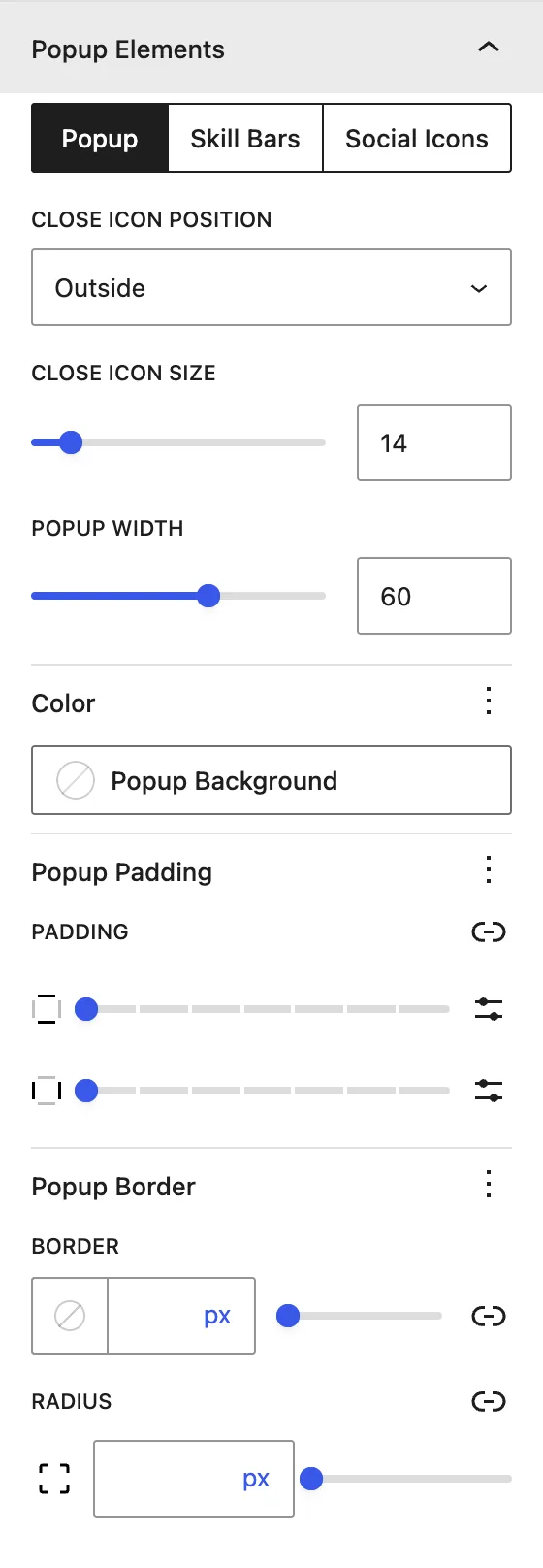
| Popup Elements | Popup width, background, padding, and border. Also Skill Bars colors and Social Icons placement (Outside or Inside). |
| Content Wrapper | Padding and margin around the card text. |
| Pagination(when enabled) | Normal and active page-link colors. |
Advanced tab#
Tips#
- Use square photos of the same size so all cards line up.
- Open Popup is a great way to show full bios and skill bars without making separate profile pages.
Was this article helpful?
Thanks for the feedback. Need more help? Contact support.