
Pro blocks
Modal PopupPro
How to choose what opens the popup (button, image, icon, text, page load, or exit intent), add content inside the popup, set how often it appears, and style the trigger, popup, overlay, and close button.
This feature needs the Pro version of WPMozo Blocks and Addons.
On this page
See the Modal Popup block live on the demo site (opens in a new tab)
Adding the block#
- Click the “+” (Block Inserter) button.
- Search for “Modal Popup” and select it.
- Choose a Trigger Type in General → Configuration.
- Turn on Modal Body → Show Modal Body to edit the popup content in the editor, then add blocks inside it.
General tab#
Configuration#
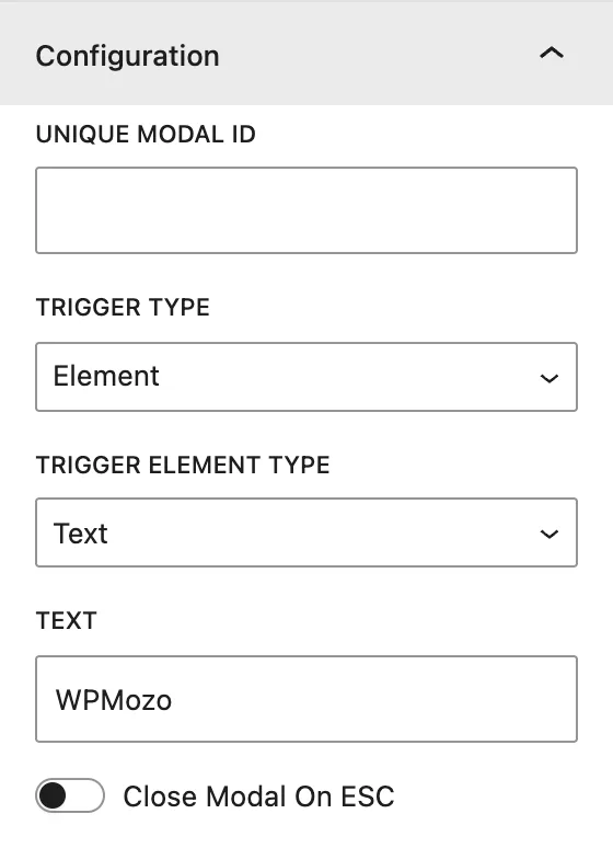
| Setting | Description |
|---|---|
| Unique Modal ID | An ID for this popup. It must be unique if a page has several popups. |
| Trigger Type | Element opens the popup when the visitor clicks a trigger. On Page Load opens it automatically. Exit Intent opens it when the cursor moves toward the browser bar to leave. |
| Trigger Element Type | (Element) The trigger: Button (Button Text), Image (Image and Alt Text), Icon, or Text. |
| Element CSS ID / Element CSS Class | (Element) Lets any other element on the page open this popup. Add the same ID or class to a menu item, a core button, or a link. |
| Trigger Delay (ms) | (On Page Load / Exit Intent) Wait time before the popup opens. |
| Re-render modal on reloading/revisiting the page | When on, the popup shows on every visit. When off, a visitor who closed it won’t see it again. |
| Close Modal On ESC | Visitors can close the popup with the Esc key. |
Modal Header#
| Setting | Description |
|---|---|
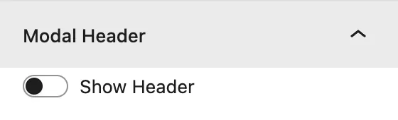
| Show Header | Shows the top bar of the popup. |
| Show Modal Title / Modal Title | Title text in the header. |
| Show Close Icon | Shows the × close icon. |
Modal Body#
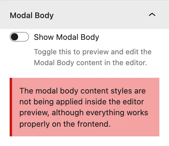
Show Modal Body: shows the popup content area in the editor so you can add and edit its blocks.
Modal Footer#
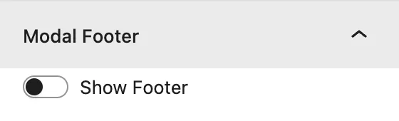
Show Footer: adds a bottom bar with a close button. Set its label in Close Button Text.
Scroll Settings#
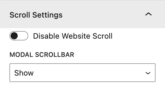
| Setting | Description |
|---|---|
| Disable Website Scroll | Locks the page behind the popup while it is open. |
| Modal Scrollbar | Show or Hide the scrollbar inside long popups. |
Design tab#
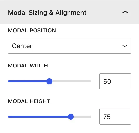
| Panel | What it controls |
|---|---|
| Alignment | Position of the trigger element (left, center, right). |
| Trigger Button | Colors, typography, padding and margin, and Use Icon on Button. |
| Trigger Icon | Icon color and Icon Font Size (px). |
| Trigger Text | Text color and typography. |
| Modal Title Text | Heading Level, alignment, color, and typography of the title. |
| Modal Body Text | Alignment, color, and typography of body text. |
| Modal Close Icon | Color of the × icon. |
| Modal Close Button | Footer button alignment, colors, typography, and spacing. |
| Modal Sizing & Alignment | Modal Position (Center, Top Left/Right/Center, Bottom Left/Right/Center), Modal Width, and Modal Height. |
Advanced tab#
Tips#
- Open a popup from your header menu: add a CSS class (for example
open-offer) to the menu item and enter the same class in Element CSS Class. - Use Exit Intent with a discount code to win back visitors who are leaving. Exit intent only works on desktop, where the mouse can leave the window.
- Keep Re-render modal… off for page-load popups so returning visitors aren’t annoyed.
Was this article helpful?
Thanks for the feedback. Need more help? Contact support.