
Pro blocks
Gravity Forms StylerPro
How to select a Gravity Form and restyle its labels, fields, radios, checkboxes, upload field, and buttons without writing CSS.
This feature needs the Pro version of WPMozo Blocks and Addons.
On this page
See the Gravity Forms Styler block live on the demo site (opens in a new tab)
Requires: the Gravity Forms (opens in a new tab) plugin, installed and active.
Adding the block#
- Create a form in Forms → New Form (Gravity Forms).
- In the editor, click “+”, search for “Gravity Forms Styler”, and select it.
- Under General → Forms, choose your form from Select Gravity Form.
General tab#
Forms#
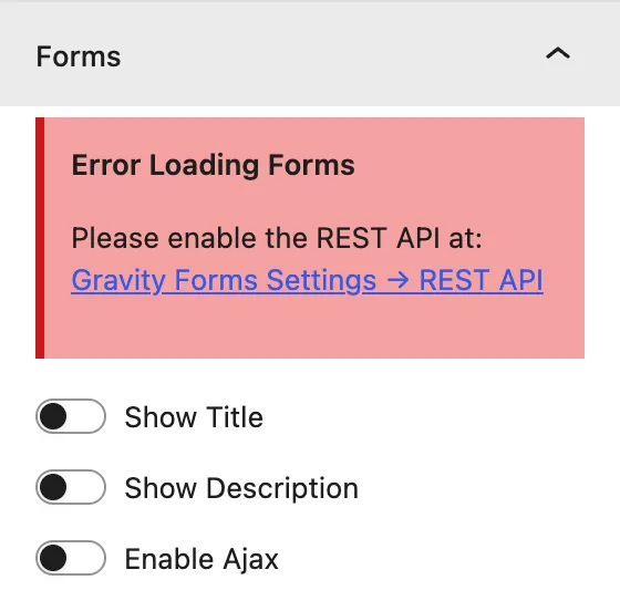
| Setting | Description |
|---|---|
| Select Gravity Form | The form to display. |
| Show Title | Shows the form title set in Gravity Forms. |
| Show Description | Shows the form description. |
| Enable Ajax | Submits the form without reloading the page. |
Design tab#
Form text#
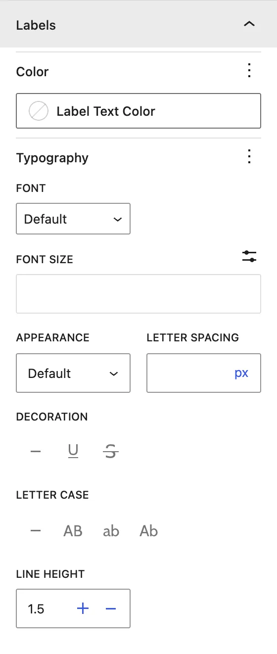
| Panel | What it controls |
|---|---|
| Alignment | Alignment of the whole form (left, center, right). |
| Form Title | Title color and typography. |
| Form Description | Description color, typography, and padding. |
| Labels | Field label color and typography. |
| Required Text | Color and typography of the “(Required)” marker. |
| Field Instructions Text | Color and typography of the help text under fields. |
Input Fields#

Use the Input / Placeholder / Description switch to style each part.
| Setting | Description |
|---|---|
| Alignment | Text alignment inside fields. |
| Color | Text and background colors. |
| Typography | Font settings. |
| Input Field Width / Input Field Height | Size of the text inputs. |
| Input Border | Border and radius. |
| Input Dimensions | Padding inside fields. |
Input Fields on Hover: colors for input, placeholder, and description while the visitor hovers over a field.
Choice and special fields#
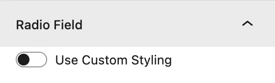
| Panel | What it controls |
|---|---|
| Radio Field | Use Custom Styling replaces the browser radios with styled ones. Set the Radio Button Size, colors, and Radio Label Text Color. |
| Checkbox Field | Use Custom Styling, Checkbox Size, colors, and Checkbox Label Text Color. |
| Textarea Field | Textarea Fields Height. |
| Upload Field | Typography, padding, and Normal / Hover colors of the file-upload button. |
Buttons#
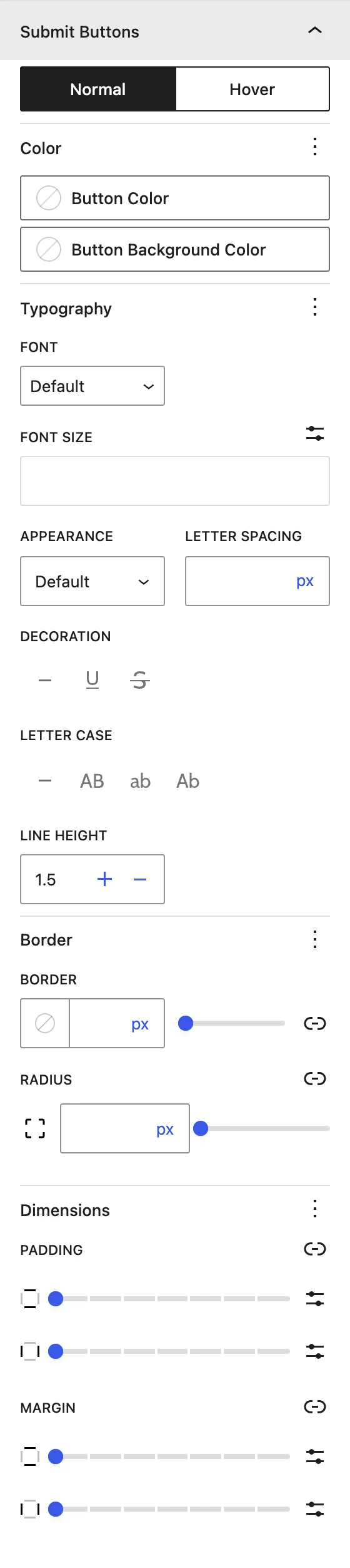
There are three button panels: Submit Buttons, Next and Previous Buttons (multi-page forms), and Save and Continue Buttons. Each one has:
| Setting | Description |
|---|---|
| Normal / Hover | Switch between the normal and hover state. |
| Color | Text and background colors. |
| Typography | Font settings. |
| Border / Radius | Border and rounded corners. |
| Dimensions | Padding and margin. |
Advanced tab#
Tips#
- Turn on Enable Ajax so validation errors and the confirmation message show without a page reload.
- If the form list is empty, check that Gravity Forms is active and that you have at least one form.
Was this article helpful?
Thanks for the feedback. Need more help? Contact support.