
Pro blocks
Image HotspotPro
How to upload the main image, add markers and place them on it, set the tooltip content (title, text, image) and trigger (click or hover), and style the markers and tooltips.
This feature needs the Pro version of WPMozo Blocks and Addons.
On this page
See the Image Hotspot block live on the demo site (opens in a new tab)
Adding the block#
- Click the “+” (Block Inserter) button.
- Search for “Image Hotspot” and select it.
- In General → Hotspot Content, click Replace to choose your main image.
- Each Image Hotspot Item inside the block is one marker. Add more with the “+” appender and place each one with Marker Position Top / Left (%).
Parent block: Image Hotspot#
General tab#
Hotspot Content
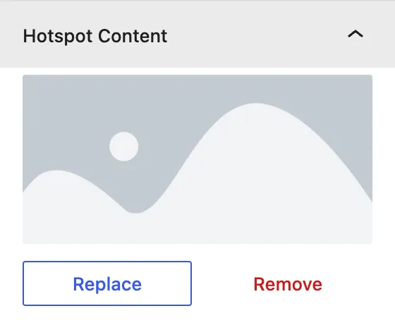
Replace / Remove: the background image the markers sit on.
Design tab#
Settings here are global. They apply to every marker unless a marker overrides them.
Hotspot Setting
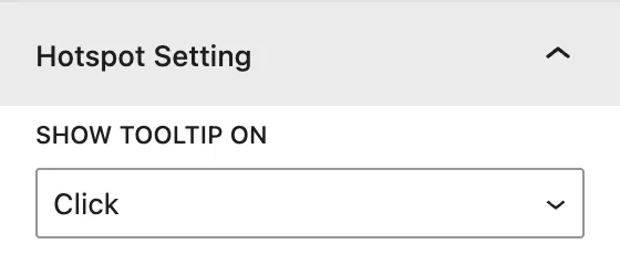
Show Tooltip On: open tooltips on Hover or Click.
Global Marker Styling
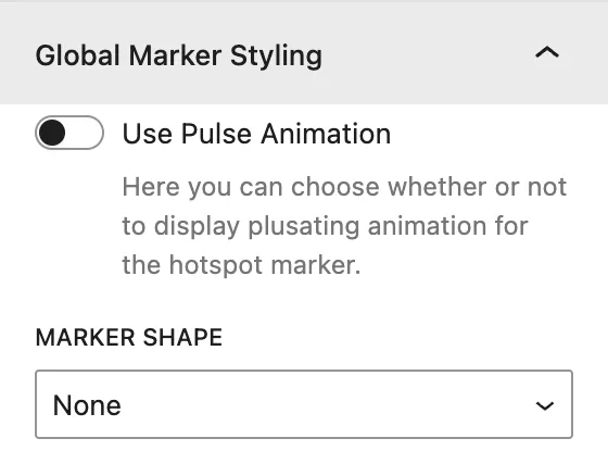
| Setting | Description |
|---|---|
| Use Pulse Animation | Adds a pulsing ring around the markers to draw attention. |
| Marker Shape | None, Square, or Circle behind the marker. |
| Marker Shape Background | Fill color of the shape. |
| Display Marker Shape Border | Adds a border, with Border Color and Border Size. |
Global Marker Icon / Image / Text Styling
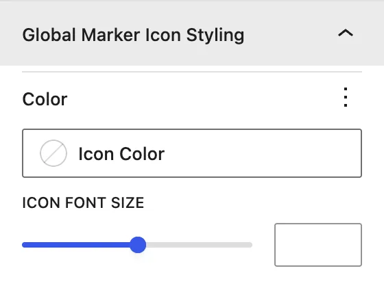
| Panel | What it controls |
|---|---|
| Global Marker Icon Styling | Icon Color and Icon Font Size. |
| Global Marker Image Styling | Image Size, border, and radius of image markers. |
| Global Marker Text Styling | Text color, background color, and typography of text markers. |
Global Tooltip Styling
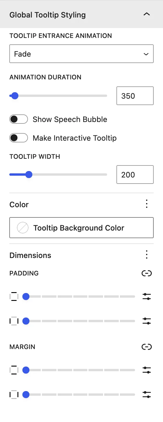
| Setting | Description |
|---|---|
| Tooltip Entrance Animation | Fade, Scale, Shift Away, Scale Toward, Perspective (each with Subtle and Extreme versions). |
| Animation Duration | Speed of the animation, in ms. |
| Show Speech Bubble | Adds the small arrow pointing to the marker. |
| Make Interactive Tooltip | Keeps the tooltip open while the cursor is inside it, so links can be clicked. |
| Tooltip Width | Maximum width, in px. |
| Tooltip Background Color / Dimensions | Background, padding, and margin. |
Tooltip Heading · Tooltip Content
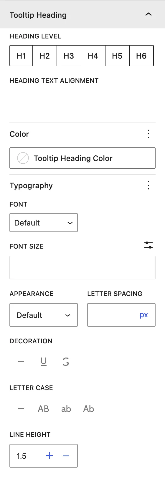
Heading Level (H1–H6), alignment, color, and typography for the tooltip title and text.
Child block: Image Hotspot Item (marker)#
General tab#
Marker Content
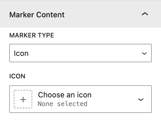
| Setting | Description |
|---|---|
| Marker Type | Icon, Text (for example 1, 2, +), or Image. |
| Icon / Text / Image | The marker content, depending on the type. |
Tooltip Content
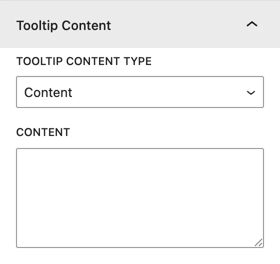
| Setting | Description |
|---|---|
| Tooltip Content Type | What the tooltip shows: Content, Title and Content, Title and Image, Image and Content, or Title Image and Content. |
| Title / Content / Image | The tooltip fields, depending on the type. |
Design tab#
Marker Styling
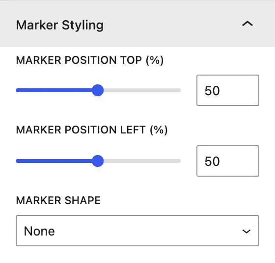
| Setting | Description |
|---|---|
| Marker Position Top (%) | Vertical position of the marker on the image. 0 is the top edge, 100 is the bottom. |
| Marker Position Left (%) | Horizontal position. 0 is the left edge, 100 is the right. |
| Marker Shape | Overrides the global shape for this marker. |
Marker Element Styling
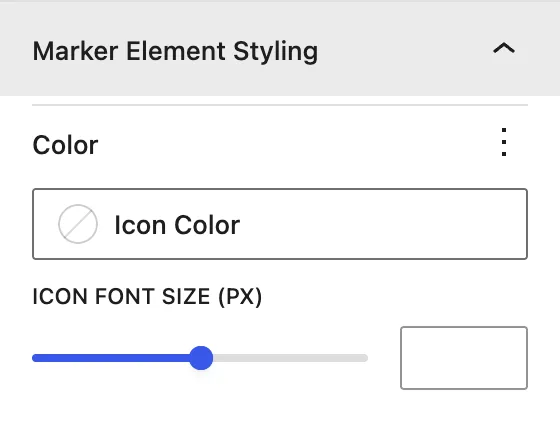
Icon Color and Icon Font Size (px) for this marker only.
Advanced tab#
Tips#
- Positions are in %, so markers stay in the right place on every screen size.
- Use Text markers with numbers and a matching numbered list under the image for accessibility.
Was this article helpful?
Thanks for the feedback. Need more help? Contact support.