
Blocks
Scroll Stack CardsFree
On this page
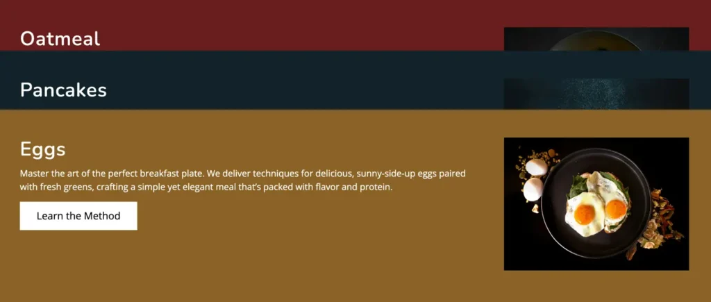
The Scroll Stack Cards Block is a free Gutenberg block that helps you display content in stacked, scroll-based cards. With global display and animation controls, you can manage layout orientation and animation timing easily. This block is ideal for creating interactive sections.
Adding the block#
To add the block:
- Click the “+” button to add a new block.
- Search for “Scroll Stack Cards” and select it.
General#
Display#
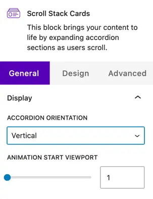
Choose how the accordion items are displayed:
Accordion orientation
- Vertical – Items are stacked one below another, which is ideal for long content and standard page layouts.
- Horizontal – Items are aligned side by side, creating a more interactive and modern layout.
Animation#
Animation start viewport
This setting controls when the animation starts as the user scrolls the page.
- The default value is 1.
- A lower value starts the animation earlier.
- A higher value delays the animation until the element is more visible in the viewport.
General settings#
Content#
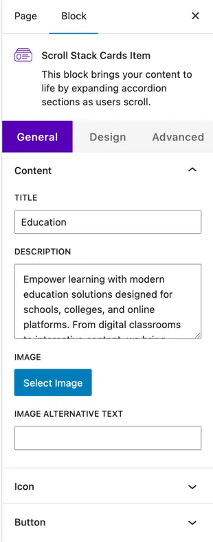
Title
Enter the main heading for the card. This is usually used to highlight the feature, step, or section name.
Description
Add a short description or supporting text below the title. This helps explain the content of the card in more detail.
Image
- Select Image – Upload a new image or choose one from the media library to display on the card.
- Image Alt Text – Add alternative text for accessibility and SEO purposes.
Icon
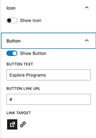
- Show Icon – Enable this toggle to display an icon on the card.
- Icon Selector – Choose an icon that represents the card content visually.
Button
- Show Button – Enable this option to display a button on the card.
- Button Text – Enter the label text for the button (e.g., Learn More).
- Button Link URL – Add the URL the button should link to.
- Link Target – Choose whether the link opens in the same tab or a new tab.
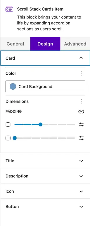
Design settings#
Card styling#
- Color – Set the background color of the card.
- Dimensions – Control the spacing and layout of the card.
- Padding – Adjust the inner spacing of the card content for better readability.
Title Design#
Customize the appearance of the card title:
- Text Color
- Typography (font size, weight, letter spacing, etc.)
Description design#
Style the description text to match your site design:
- Text Color
- Typography options for improved readability
Icon design#
Control how the icon appears on the card:
- Icon Color
- Icon Size
Was this article helpful?
Thanks for the feedback. Need more help? Contact support.