
Blocks
Advanced TooltipFree
How to choose the trigger element (button, image, icon, or text), set whether the tooltip opens on hover or click, add content inside the tooltip, and style the trigger and tooltip (entrance animation, speech bubble, width, background).
On this page
See the Advanced Tooltip block live on the demo site (opens in a new tab)
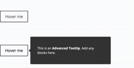
Adding the block#
- Click the “+” (Block Inserter) button.
- Search for “Advanced Tooltip” and select it.
- Choose the Trigger Element in the sidebar.
- Turn on Show tooltip content in editor, then add blocks to the tooltip area (click “+” inside it).
Settings overview#
| Tab | What you control there |
|---|---|
| General | Trigger type, how the tooltip opens, and the trigger content |
| Design | Trigger style and tooltip animation, size, and colors |
| Advanced | See Common Advanced Settings |
General tab#
Configuration#
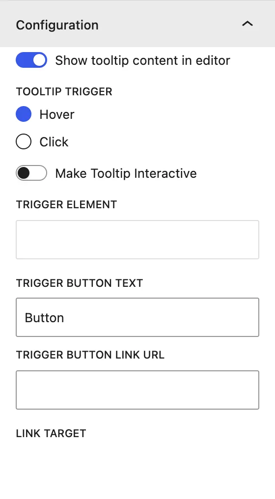
| Setting | Description |
|---|---|
| Show tooltip content in editor | Shows the tooltip area in the editor so you can add and edit its blocks. Turn it off to see the trigger as visitors do. |
| Tooltip Trigger | Hover opens the tooltip on mouse over. Click opens it on click or tap. |
| Make Tooltip Interactive | Keeps the tooltip open while the cursor is inside it, so visitors can click links in it. |
| Trigger Element | What visitors interact with: Button, Image, Icon, or Text. |
| Trigger Button Text / Link Url / Link Target | (Button) Button label, optional link, and New Window or Same Window. |
| Trigger Image | (Image) Image used as the trigger. |
| Trigger Icon | (Icon) Icon used as the trigger. |
| Trigger Text | (Text) Text used as the trigger, for example a word with a dotted underline. |
Design tab#
Trigger Button#
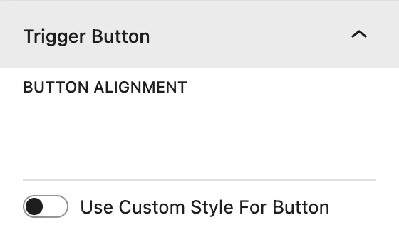
| Setting | Description |
|---|---|
| Button Alignment | Left, center, or right. |
| Use Custom Style For Button | Replaces the theme’s button style with your own Button Text Color, background, Typography, border, and Dimensions. |
| Show Button Icon | Adds an icon. Set Button Icon Placement (Before or After) and Show Icon On Hover. |
For other trigger types this panel shows matching options: Trigger Image Width (%) and Alignment for images, Icon Color and Icon Size (px) for icons, and Trigger Text Alignment, Color, and Typography for text.
Tooltip Styling#
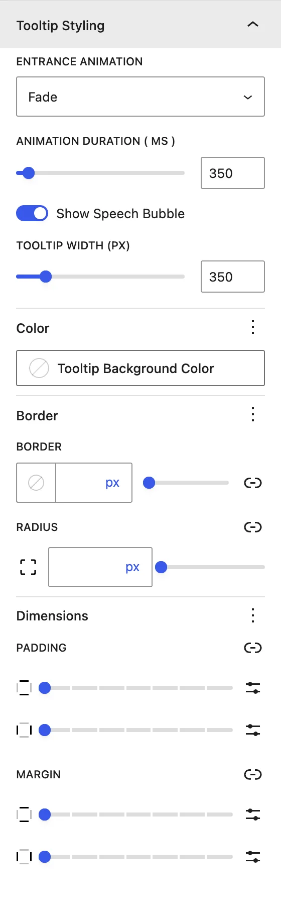
| Setting | Description |
|---|---|
| Entrance Animation | How the tooltip appears: Fade, Scale, Scale Subtle, Scale Extreme, Shift Away (Subtle/Extreme), Scale Toward (Subtle/Extreme), Perspective (Subtle/Extreme). |
| Animation Duration (ms) | Length of the entrance animation. |
| Show Speech Bubble | Adds the small arrow that points from the tooltip to the trigger. |
| Tooltip Width (px) | Maximum width of the tooltip. |
| Tooltip Background Color | Background of the bubble. |
| Border / Radius | Border and rounded corners of the tooltip. |
| Dimensions | Padding and margin inside and around the tooltip. |
Advanced tab#
Tips#
- Use Click on mobile-first sites, because hover is not available on touch screens.
- Turn on Make Tooltip Interactive whenever the tooltip contains a link or button.
Was this article helpful?
Thanks for the feedback. Need more help? Contact support.