
Blocks
Pricing TableFree
On this page
The Pricing Table Block is a free block that helps you showcase your plans or packages in a visually appealing way. It allows you to display plan titles, prices, features, and call-to-action buttons in a single well-structured table. With flexible design controls, you can fully customize the layout, colors, and typography to match your site’s branding.
Adding the block#
To add the block:
- Click the “+” button to add a new block.
- Search for “Pricing Table” and select it.
- For detailed instructions on how to add blocks in Gutenberg, please refer to the official WordPress Block Editor documentation (opens in a new tab).
Content configuration#
Header#
- Title – Add the main title for the pricing table (e.g., WPMozo Pricing).
- Subtitle – Add a short subtitle or plan name (e.g., Ultimate Plan).
- Header Graphics – Choose to display an icon or image as a graphic for the header.
- Icon – If you select Icon, pick an icon (e.g., Star) to display above the title.
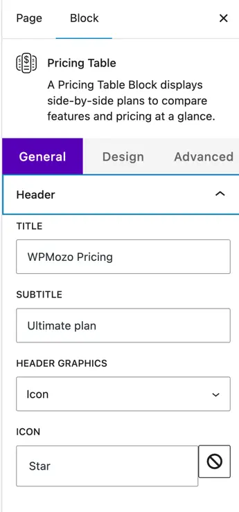
Table Pricing#
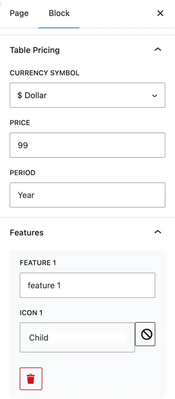
- Currency Symbol – Choose the currency symbol to display (e.g., $, €, ₹).
- Price – Enter the amount (e.g., 99).
- Period – Add the billing cycle text (e.g., Year, Month).
Features#
- Add features included in the plan with optional icons.
- Feature 1, Feature 2, etc. – Enter the feature name.
- Icon 1, Icon 2, etc. – Choose an icon for each feature (e.g., Child, Check).
- Use Add Item to add more features.
- Show Icon – Toggle to show or hide icons for all features.
Button#
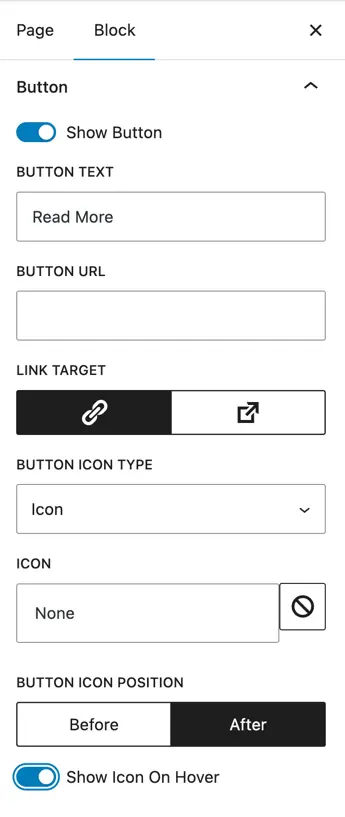
- Show Button – Toggle to enable or disable the button.
- Button Text – Set the text for the button (e.g., Read More).
- Button URL – Add a link to the page for this plan.
- Link Target – Choose to open the link in the same or a new tab.
- Button Icon Type – Choose to add an icon to the button.
- Icon – Pick an icon for the button.
- Button Icon Position – Choose to show the icon Before or After the text.
- Show Icon on Hover – Toggle to only display the icon on hover.
Design customization#
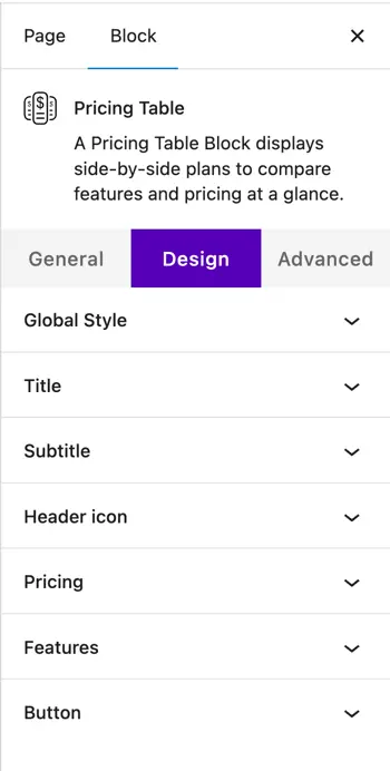
The Design tab lets you style every part of the pricing table such as header, pricing, features, and button. Here are the available design options:
Global Style#
- Color
- Background Color – Choose the overall background color of the pricing table.
- Dimensions
- Padding – Add inner spacing inside the pricing table container.
- Margin – Add outer spacing around the pricing table container.
- Border
- Border Type – Choose border style (Solid, Dashed, etc.).
- Border Width – Set border thickness.
- Border Radius – Round the corners of the pricing table.
Title#
- Color – Choose the title text color.
- Heading Level – Select heading tag (H1–H6).
- Title Alignment – Align the title (left, center, right).
- Typography
- Size, Letter Spacing, Line Height – Adjust text size and spacing.
- Appearance, Decoration, Letter Case – Choose font weight, underline/strike, and uppercase/lowercase.
Subtitle#
- Color – Choose subtitle text color.
- Subtitle Alignment – Align the subtitle.
- Typography – Adjust size, letter spacing, appearance, decoration, letter case, and line height.
Header Icon#
- Color – Choose icon color.
- Icon Alignment – Align the header icon.
- Use Icon Font Size – Enable to set custom size.
- Icon Font Size – Set the icon size in pixels.
- Dimensions – Adjust icon padding and margin.
Pricing#
- Currency Color – Set color for the currency symbol.
- Currency Alignment – Align currency and price text.
- Currency Typography – Adjust font size, spacing, appearance, and letter case.
Features#
- Color – Set feature text and background color.
- Alignment – Align the feature text.
- Features Spacing (px) – Control spacing between feature items.
- Features Margin (px) – Add margin around feature items.
- Icon Font Size (px) – Set icon size.
- Icons Color – Choose feature icons color.
- Icon Spacing – Set space between icon and text.
Button#
- Button Alignment – Align the button.
- Button Font Size (px) – Set the font size for button text.
- Button Colors
- Normal – Choose text color, background color, icon color, and border color.
- Hover – Choose hover text color, background color, icon color, and border color.
- Border Type – Select border style.
- Border Width – Set border thickness.
- Border Radius – Round the corners of the button.
Was this article helpful?
Thanks for the feedback. Need more help? Contact support.