
Blocks
Star RatingFree
How to set the title, rating, and rating scale, add an image and description, choose the rating icon and its position, and style the container, title, rating number, and icons.
On this page
See the Star Rating block live on the demo site (opens in a new tab)
Adding the block#
- Click the “+” (Block Inserter) button.
- Search for “Star Rating” and select it.
- Enter your rating in the sidebar under General → Configuration.
Settings overview#
| Tab | What you control there |
|---|---|
| General | Title, rating value, image, description, icon type, and layout |
| Design | Container, title, description, rating number, and icon styles |
| Advanced | See Common Advanced Settings |
General tab#
Configuration#
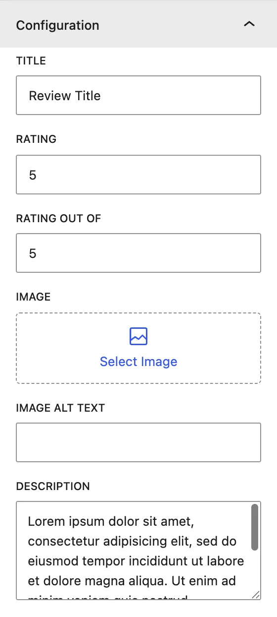
| Setting | Description |
|---|---|
| Title | Name of the item being rated, for example “Customer Support”. |
| Rating | The score, for example 4.5. Decimals show as partly filled icons. |
| Rating Out Of | The maximum score, usually 5. This is also the number of icons shown. |
| Image | Optional image for the item being reviewed. It is also used in the schema. |
| Image Alt Text | Alternative text for the image, for accessibility and SEO. |
| Description | Short review text shown under the rating. |
Display#
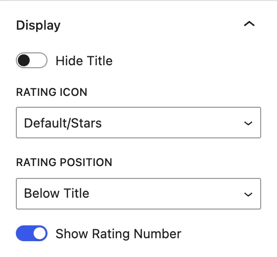
| Setting | Description |
|---|---|
| Hide Title | Hides the title on the page. It is still used in the schema. |
| Rating Icon | Icon set: Default/Stars, Like, Heart, Smiley, Smiley Mood Scale, Trophy, Sun, Drop. |
| Rating Position | Shows the icons After Title (same line) or Below Title. |
| Show Rating Number | Shows the score as text (for example “4.5/5”) next to the icons. |
Design tab#
Container#
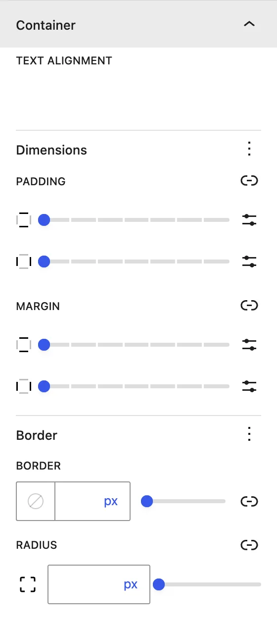
| Setting | Description |
|---|---|
| Text Alignment | Aligns all content left, center, or right. |
| Dimensions | Padding and margin of the block. |
| Border / Radius | Border and rounded corners around the block. |
Title#
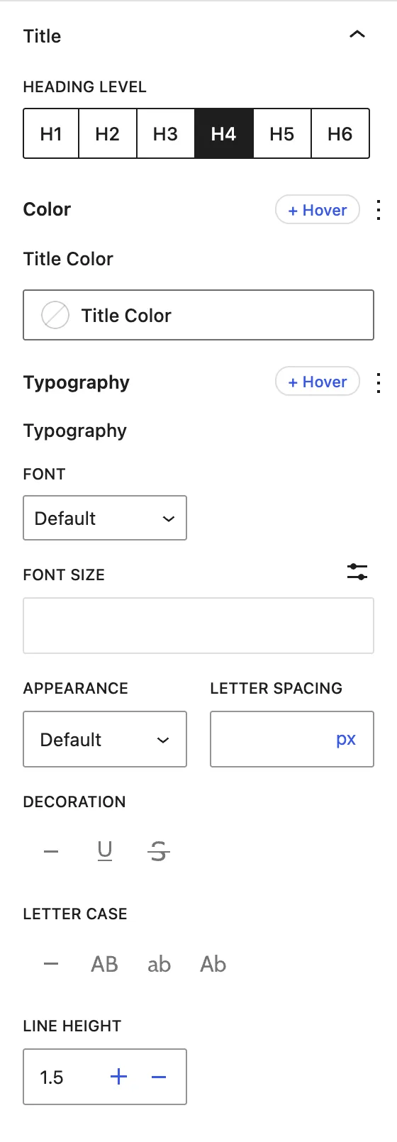
| Setting | Description |
|---|---|
| Heading Level | HTML tag of the title (H1–H6). |
| Title Color | Title text color. |
| Typography | Font family, size, weight, spacing, case, and line height. |
Description#
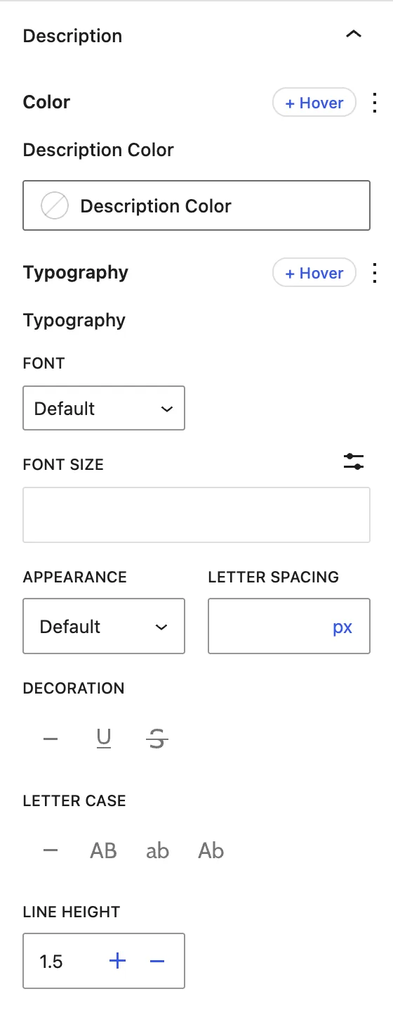
Description Color and Typography for the review text.
Rating Number#
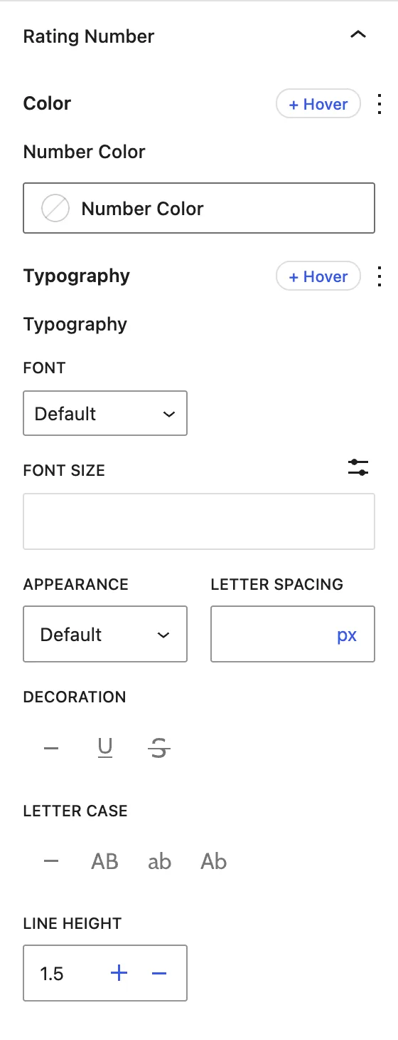
Number Color and Typography for the “4.5/5” label. This panel applies when Show Rating Number is on.
Rate Icons/Stars#
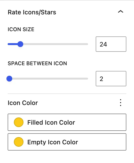
| Setting | Description |
|---|---|
| Icon Size | Size of each icon. |
| Space Between Icon | Gap between icons. |
| Filled Icon Color | Color of the filled (scored) icons. |
| Empty Icon Color | Color of the empty (unscored) icons. |
Advanced tab#
Tips#
- Use real ratings only. Search engines may ignore or penalize fake review markup.
- Try Smiley Mood Scale for satisfaction surveys and Trophy for awards or rankings.
Was this article helpful?
Thanks for the feedback. Need more help? Contact support.