
Blocks
Tilt ImageFree
How to add the image and the content on top of it (title, text, icon, button), set the tilt behavior (rotation, perspective, scale, glare, 3D effect), and style the overlay and content.
On this page
See the Tilt Image block live on the demo site (opens in a new tab)
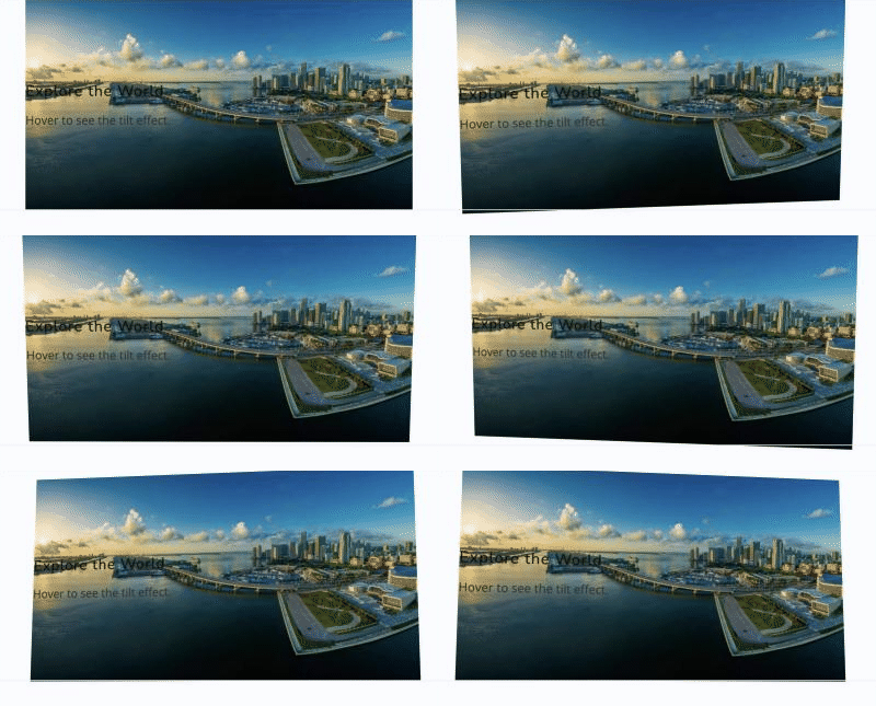
Adding the block#
- Click the “+” (Block Inserter) button.
- Search for “Tilt Image” and select it.
- Click the placeholder to upload or select an image, then adjust the settings in the sidebar.
Settings overview#
| Tab | What you control there |
|---|---|
| General | Image, title, content, icon, and button |
| Design | Tilt behavior, overlay, content position, and text and button styles |
| Advanced | See Common Advanced Settings |
General tab#
Tilt Image#
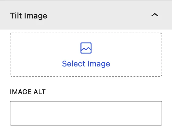
| Setting | Description |
|---|---|
| Image | The image that tilts. Replace it from the Media Library. |
| Image Alt | Alternative text for screen readers and SEO. |
Content#
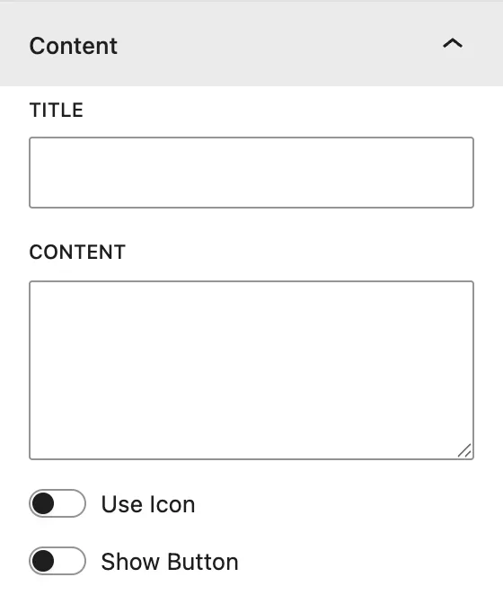
| Setting | Description |
|---|---|
| Title | Heading shown on top of the image. |
| Content | Short description text. |
| Use Icon | Shows an icon above the title. Pick one from the icon library. |
| Show Button | Adds a button. When on, you can set Button Text, Button Url, and Link Target (Same Window or External/new tab). |
Design tab#
Tilt Setting#
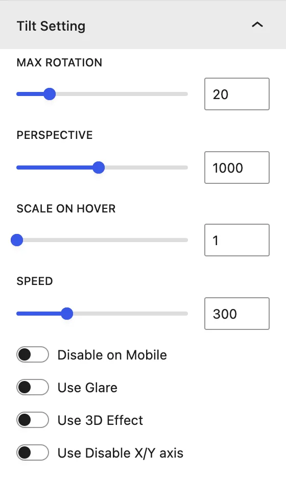
| Setting | Description |
|---|---|
| Max Rotation | Maximum tilt angle, in degrees. A higher value gives a stronger tilt. |
| Perspective | 3D perspective distance. A lower value makes the effect more dramatic. |
| Scale on Hover | Zooms the image while the visitor hovers over it (for example 1.05 = 5% bigger). |
| Speed | How fast the image returns to its normal position. |
| Disable on Mobile | Turns the tilt off on touch devices. |
| Use Glare | Adds a light glare that moves with the cursor. Max Glare sets its strength. |
| Use 3D Effect | Makes the text content float in front of the image. 3D Effect sets the depth. |
| Use Disable X/Y axis | Limits the tilt to one direction. Choose X axis or Y axis to disable. |
Overlay#
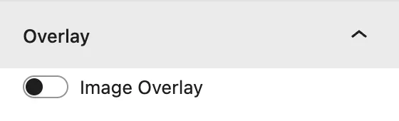
| Setting | Description |
|---|---|
| Image Overlay | Adds a color layer over the image so the text is easier to read. |
| Overlay Color | Color and opacity of the overlay. |
Content Styling#
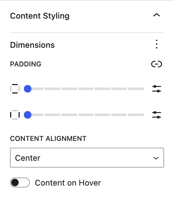
| Setting | Description |
|---|---|
| Padding | Space around the content inside the image. |
| Content Alignment | Position of the content on the image: a 3×3 grid from Top Left to Bottom Right. |
| Content on Hover | Hides the content until the visitor hovers over the image. |
| Content Alignment(second dropdown, animation) | (When Content on Hover is on) How the content appears: Top To Bottom, Left To Right, Right To Left, Bottom To Top, or No Animation. |
Title#
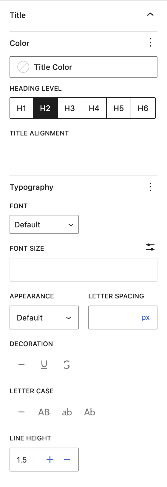
Color, Heading Level (H1–H6), Title Alignment, and Typography for the title.
Description#
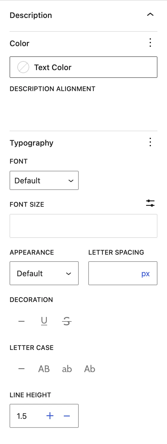
Color, Description Alignment, and Typography for the content text.
Icon (when “Use Icon” is on)#
Icon Color, Icon Size, and Icon Alignment.
Button Style (when “Show Button” is on)#
Text Color, Background Color, typography, border, and padding for the button.
Advanced tab#
Tips#
- A Max Rotation between 10° and 20° looks natural. Higher values can feel jumpy.
- Combine Use 3D Effect with Content on Hover for a strong reveal.
- Turn on Disable on Mobile if the image sits near scrollable content on phones.
Was this article helpful?
Thanks for the feedback. Need more help? Contact support.