Star Rating
The Star Rating Block is a free block that lets you visually display ratings using customizable icons. You can add titles, descriptions, and choose from different rating icons to match your content style. It’s perfect for showcasing product reviews, service feedback, or testimonial ratings on your website.
Adding the block
To add the block:
- Click the “+” button to add a new block.
- Search for “Star Rating” and select it.
- For detailed instructions on how to add blocks in Gutenberg, please refer to the official WordPress Block Editor documentation.
Content configuration
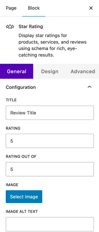
Title
Enter the title you want to display for the rating block.
Rating
Set the rating value to be shown.
Rating Out Of
Define the maximum rating scale (e.g., out of 5 or 10).
Image
Select an image to display with the rating and add its alt text for accessibility.
Description
Add a brief description or supporting text under the title.
Display
Show Rating Number: Toggle to show or hide the numeric rating beside the icons.
Hide Title: Toggle this to hide or show the title.
Rating Icon: Choose from icons like Heart, Smiley, Smiley Mood Scale, Trophy, Sun, or Drop.
Rating Position: Decide where to display the rating — below title or after title.
Design customization
- Container
Adjust the dimensions, padding, margin, and border radius to control the overall block layout and shape.
- Title
Customize the typography of the title including font size, weight, letter spacing, appearance (normal/bold), text decoration (underline/none), letter case (uppercase/lowercase/capitalize), and line height.
- Description & Rating Number
- Set different styles for Normal and Hover states.
- Control color (text color) and number color for the rating value.
- Adjust typography properties: size (px), letter spacing, appearance, text decoration, letter case, and line height.
- Rate Icons/Stars
- Icon Size: Define the size of rating icons (e.g., 24px).
- Space Between Icons: Adjust the gap between icons (e.g., 2px).
- Icon Colors: Choose filled icon color (for rated icons) and empty icon color (for unrated icons).