Pricing Table
The Pricing Table Block is a free block that helps you showcase your plans or packages in a visually appealing way. It allows you to display plan titles, prices, features, and call-to-action buttons in a single well-structured table. With flexible design controls, you can fully customize the layout, colors, and typography to match your site’s branding.
Adding the block
To add the block:
- Click the “+” button to add a new block.
- Search for “Pricing Table” and select it.
- For detailed instructions on how to add blocks in Gutenberg, please refer to the official WordPress Block Editor documentation.
Content configuration
Header
- Title – Add the main title for the pricing table (e.g., WPMozo Pricing).
- Subtitle – Add a short subtitle or plan name (e.g., Ultimate Plan).
- Header Graphics – Choose to display an icon or image as a graphic for the header.
- Icon – If you select Icon, pick an icon (e.g., Star) to display above the title.
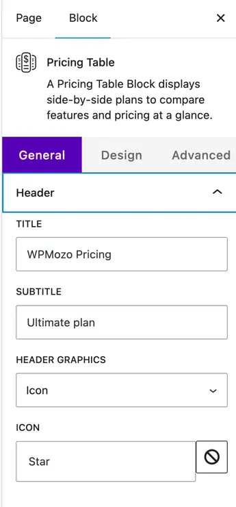
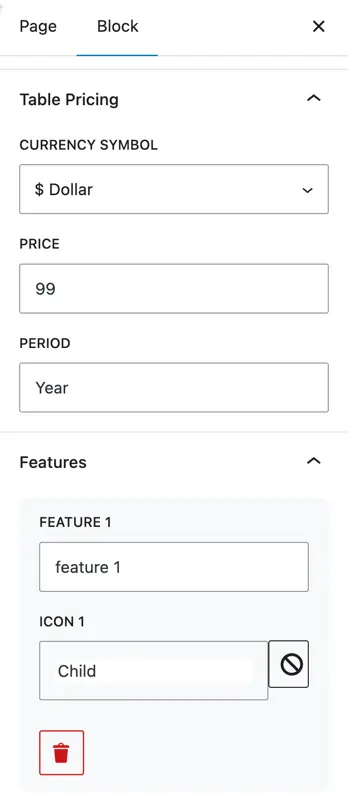
Table Pricing
- Currency Symbol – Choose the currency symbol to display (e.g., $, €, ₹).
- Price – Enter the amount (e.g., 99).
- Period – Add the billing cycle text (e.g., Year, Month).
Features
- Add features included in the plan with optional icons.
- Feature 1, Feature 2, etc. – Enter the feature name.
- Icon 1, Icon 2, etc. – Choose an icon for each feature (e.g., Child, Check).
- Use Add Item to add more features.
- Show Icon – Toggle to show or hide icons for all features.
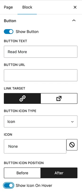
Button
- Show Button – Toggle to enable or disable the button.
- Button Text – Set the text for the button (e.g., Read More).
- Button URL – Add a link to the page for this plan.
- Link Target – Choose to open the link in the same or a new tab.
- Button Icon Type – Choose to add an icon to the button.
- Icon – Pick an icon for the button.
- Button Icon Position – Choose to show the icon Before or After the text.
- Show Icon on Hover – Toggle to only display the icon on hover.
Design customization
The Design tab lets you style every part of the pricing table such as header, pricing, features, and button. Here are the available design options:
Global Style
- Color
- Background Color – Choose the overall background color of the pricing table.
- Dimensions
- Padding – Add inner spacing inside the pricing table container.
- Margin – Add outer spacing around the pricing table container.
- Border
- Border Type – Choose border style (Solid, Dashed, etc.).
- Border Width – Set border thickness.
- Border Radius – Round the corners of the pricing table.
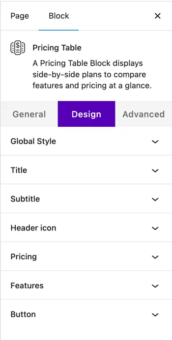
Title
- Color – Choose the title text color.
- Heading Level – Select heading tag (H1–H6).
- Title Alignment – Align the title (left, center, right).
- Typography
- Size, Letter Spacing, Line Height – Adjust text size and spacing.
- Appearance, Decoration, Letter Case – Choose font weight, underline/strike, and uppercase/lowercase.
Subtitle
- Color – Choose subtitle text color.
- Subtitle Alignment – Align the subtitle.
- Typography – Adjust size, letter spacing, appearance, decoration, letter case, and line height.
Header Icon
- Color – Choose icon color.
- Icon Alignment – Align the header icon.
- Use Icon Font Size – Enable to set custom size.
- Icon Font Size – Set the icon size in pixels.
- Dimensions – Adjust icon padding and margin.
Pricing
- Currency Color – Set color for the currency symbol.
- Currency Alignment – Align currency and price text.
- Currency Typography – Adjust font size, spacing, appearance, and letter case.
Features
- Color – Set feature text and background color.
- Alignment – Align the feature text.
- Features Spacing (px) – Control spacing between feature items.
- Features Margin (px) – Add margin around feature items.
- Icon Font Size (px) – Set icon size.
- Icons Color – Choose feature icons color.
- Icon Spacing – Set space between icon and text.
Button
- Button Alignment – Align the button.
- Button Font Size (px) – Set the font size for button text.
- Button Colors
- Normal – Choose text color, background color, icon color, and border color.
- Hover – Choose hover text color, background color, icon color, and border color.
- Border Type – Select border style.
- Border Width – Set border thickness.
- Border Radius – Round the corners of the button.