Logo Slider
The Logo Slider block for Gutenberg is a free tool that lets users create sleek, animated carousels to showcase logos perfect for displaying partners, clients, or brand affiliations with smooth transitions and customizable layouts.
Adding the block
To add the block:
- Click the “+” button to add a new block.
- Search for “Logo Slider” and select it.
- For detailed instructions on how to add blocks in Gutenberg, please refer to the official WordPress Block Editor documentation.
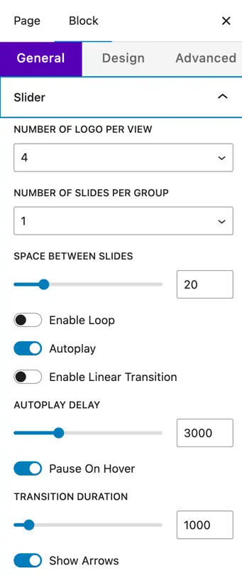
Content configuration
General settings
- Number of Logo per View – Set how many logos are visible at once in the slider.
- Number of Slides per Group – Choose how many logos move together in one slide transition.
- Space Between Slides – Define the gap between each logo item.
- Enable Loop – Make the slider loop continuously.
- Autoplay – Automatically play the slider.
- Enable Linear Transition – Enable smooth, linear sliding animation.
- Autoplay Delay – Time (in ms) between automatic slide transitions.
- Pause on Hover – Pause the slider when the mouse hovers over it.
- Transition Duration – Set the speed of the slide transition (in ms).
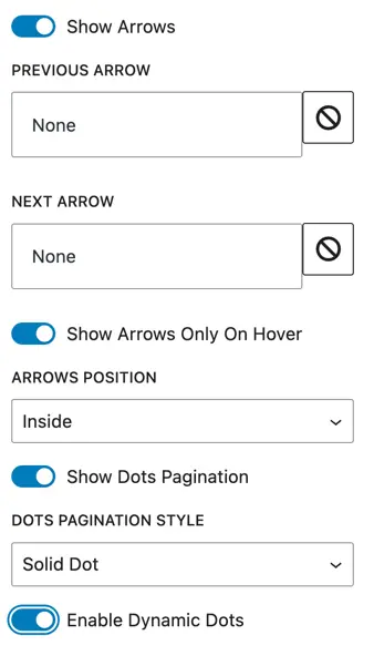
Navigation controls
- Show Arrows – Display next and previous arrows.
- Show Arrows Only on Hover – Show arrows only when hovering over the slider.
- Arrows Position – Choose arrow placement (Inside or Outside).
- Show Dots Pagination – Display navigation dots below the slider.
- Dots Pagination Style – Choose style (Solid Dot) and enable dynamic dots.
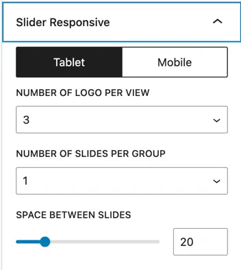
Responsive settings
- Tablet / Mobile – Set the number of logos per view, slides per group, and space between slides separately for smaller devices.
Design Settings
Logo Styling
- Logo Width & Height – Adjust the size of the logos in the slider.
Color Options
- Background Color – Set a background color for the slider container.
- Arrow Color & Background – Style the slider arrows.
- Active/Inactive Dot Pagination Color – Customize the color of navigation dots.
Spacing
- Padding – Add spacing around the slider content.