Image Stack
The Image Stack block allows you to display multiple images or icons stacked together in a neat and organized way. It’s useful for showcasing related visuals in a compact layout. You can customize the appearance, spacing, and tooltips for each item in the stack.
Adding the block
To add the block:
- Click the “+” button to add a new block.
- Search for “Image Stack” and select it.
- For detailed instructions on how to add blocks in Gutenberg, please refer to the official WordPress Block Editor documentation.
How to Add Images or Icons
- First, add the Image Stack block to your page.
- To insert individual images or icons, click on an Image Stack Item block.
- Upload an image or select an icon for each item you want to include in the stack.
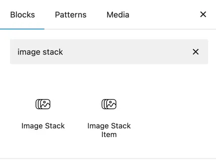
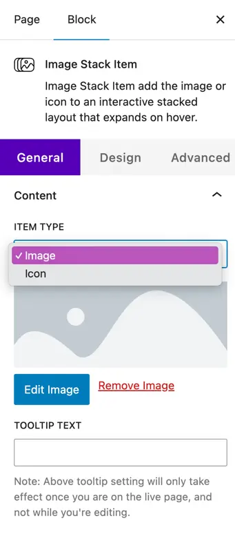
Image Stack Item – Content Settings
Each Image Stack Item has its own content settings, where you can choose the type of item and add additional information like tooltips.
- Item Type
Choose whether this stack item will display an Image or an Icon. - Image Options
- Edit Image – Upload or change the image used for this item.
- Remove Image – Delete the current image from this item.
- Tooltip Text
Add custom text that will appear as a tooltip when the user hovers over this item. - Note: The tooltip will only appear on the live page, not while you are editing in the builder.
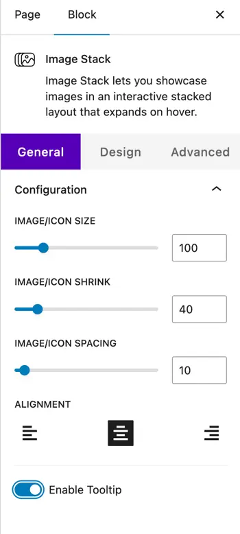
Configuration settings
General Settings
- Image/Icon Size – Set the size of the images or icons.
- Image/Icon Shrink – Adjust how much the image or icon should shrink.
- Image/Icon Spacing – Set the space between each item in the stack.
- Alignment – Align the entire stack (left, center, or right).
- Enable Tooltip – Turn tooltips on or off for each item.
Design settings
- Icon Settings
- Icon Size – Define the size of the icon.
- Icon Color – Choose the color of the icon.
- Item Settings
- Item Dimensions (Padding) – Add padding around each item.
- Item Border Type – Choose a border style (None, Solid, Dashed, etc.).
- Item Border Radius – Set corner roundness of the item.
- Tooltip Settings
- Tooltip Text Color – Choose the text color shown in tooltips.
- Tooltip Background Color – Choose the background color of the tooltip.