Flip Box
The free Flip Box block for Gutenberg helps you create interactive, animated cards that flip to reveal content ideal for highlighting key features, information, or calls-to-action with engaging visual effect.
Adding the block
To add the block:
- Click the “+” button to add a new block.
- Search for “Flip Box” and select it.
- For detailed instructions on how to add blocks in Gutenberg, please refer to the official WordPress Block Editor documentation.
Flip box layout settings
This section allows you to configure the animation behavior of the Flip Box block.
- Animation Type: Choose how the flip animation should behave. Flip or 3D Cube.
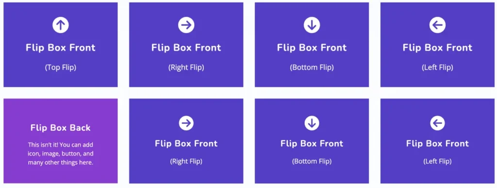
- Flip Direction: Define the direction the box will flip. Options include Right, Left, Top, or Bottom.
- 3D Depth Effect: Toggle this setting to enable or disable a 3D perspective effect while flipping. It adds a more realistic flipping motion.
- Shake On Flip: When enabled, the Flip Box will have a subtle shake effect during the flip animation to make the interaction more engaging.
Flip box content settings
This section allows you to configure the content shown on each side of the Flip Box:
- Front / Back Tabs: Toggle between editing the front and back sides of the Flip Box.
- Title: Enter the heading text that will appear on the selected side.
- Content: Add descriptive text for the selected side.
Flip box elements settings
This panel allows you to add and configure visual elements on the front or back side of the Flip Box:
- Front / Back Tabs: Select which side of the Flip Box you’re customizing.
- Element Type: Choose what type of element to display:
- None – No element will be shown.
- Icon – Displays a selected icon.
- Image – Allows you to upload an image instead.
- Icon: If “Icon” is selected as the element type, choose your preferred icon from the dropdown.
Global styling settings
Use the Global Styling panel to customize the overall appearance of the Flip Box:
- Content Width: Adjust the width of the content area using the slider or input box.
- Color Settings:
- Choose colors for the Title and Content separately.
- Use the toggle below to switch between styling Title or Content.
- Typography:
- Size: Set the font size.
- Appearance: Select the font style (e.g., Default, Bold, Italic).
- Letter Spacing: Define spacing between characters (in pixels).
- Decoration: Apply underline, strikethrough, or no decoration.
- Letter Case: Choose between uppercase, lowercase, capitalized, or default.
- Line Height: Adjust vertical spacing between lines of text.
FlipBox style settings
Use the FlipBox Style panel to customize the design of both the front and back sides of the Flip Box:
- Side Selection: Toggle between Front and Back to apply different styles to each side.
- Heading Level: Choose the heading tag (H1–H6) for the title element.
- Color Settings:
- Title Color and Content Color: Customize text colors individually.
- Background Color: Set a background color for the selected side.
- Style Target: Switch between Title and Content to apply typography styles.
- Typography:
- Size: Enter a custom font size (in pixels).
- Appearance: Choose text style such as Bold or Italic.
- Letter Spacing: Adjust spacing between letters.
- Decoration: Apply underline, strikethrough, or none.
- Letter Case: Set text to uppercase, lowercase, capitalized, or default.
- Line Height: Control vertical spacing between lines.
FlipBox image/icon style
This section allows you to customize the image or icon used in the FlipBox module. You can style either the Front or Back side by toggling between the two tabs.
- Front / Back Tabs
Switch between styling the front or back face of the FlipBox. - Color
Select the icon color using the color picker provided. - Icon Size
Adjust the size of the icon using the slider or input field (in pixels).- Use the Reset button to revert to the default size.
- Image/Icon Placement
Choose the position of the image or icon. Options include:Top,Bottom,Left, orRight. - Style Icon (Toggle)
Enable this option if you want to apply additional styles to the icon such as padding, borders, or background.
FlipBox content alignment
This setting allows you to control the horizontal and vertical alignment of the content inside the FlipBox. You can adjust the alignment separately for the Front and Back sides by selecting the appropriate tab.
- Content Alignment: Align the text or content to the left, center, or right within the FlipBox.
- Vertical Alignment: Position the content at the top, center, or bottom vertically within the FlipBox area.
FlipBox border
This section allows you to customize the border appearance for both the Front and Back sides of the FlipBox.
- Border: Adjust the width of the border using the slider or input field. You can also unlink the values to set different border widths for each side.
- Radius: Define the border radius to create rounded corners. This helps soften the box edges and enhance the visual style.
FlipBox padding
This panel lets you adjust internal spacing (padding) within the FlipBox. Use the sliders to set padding values around the content area. The settings can be customized individually for each side top, bottom, left, and right and separately for the front and back of the box.