Before After Slider
The free Before After Slider Gutenberg block lets you visually compare two images side by side, making it perfect for showcasing transformations.

Adding the block
To add the Before After Slider block:
- Click the “+” button to add a new block.
- Search for “Before After Slider” and select it.
- For detailed instructions on how to add blocks in Gutenberg, please refer to the official WordPress Block Editor documentation.
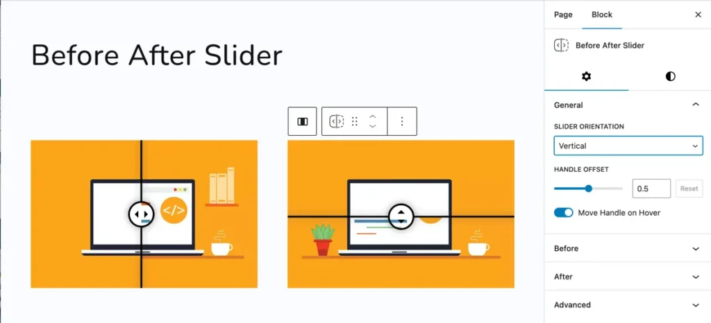
Slider orientation and handle offset
You can customize the slider’s movement direction and position using these options:
- Slider Orientation: Choose between:
HorizontalVertical
- Handle Offset: Adjust the initial position of the slider handle using the slider or by entering a value manually.
- Move Handle on Hover: Enable this toggle to automatically move the handle when hovered.
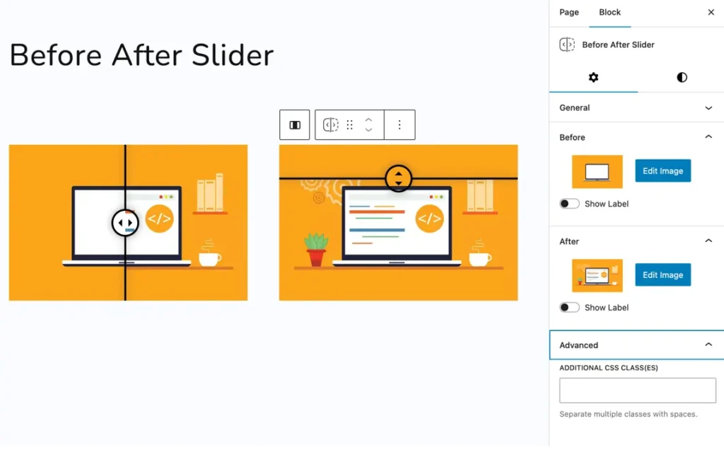
Before section
- Select Image: Upload or choose the image to be displayed as the “Before” image in the slider.
- Show Label (Toggle): When enabled, it displays a label directly on the slider to indicate this is the “Before” image.
- Show Label Only on Hover (Toggle): When enabled, the label appears only when the user hovers over the image.
- Enter Label (Text field): You can type custom text here to display as the label for the Before image. Example:
"Before".
After section
- Select Image: Upload or choose the image to be used as the “After” image in the slider.
- Show Label (Toggle): Enables a visible label over the After image.
- Show Label Only on Hover (Toggle): Shows the label only when the user hovers over the slider.
- Enter Label (Text field): Custom text input for the After image label. Example:
"After".
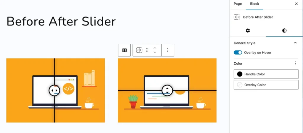
Customize handle and overlay color
Styling options are available under the General Style tab:
- Overlay on Hover: Toggle the overlay effect when hovering over the slider.
- Handle Color: Set the color of the draggable handle.
- Overlay Color: Define the overlay tint color.