Image Accordion
The Image Accordion Block allows you to create engaging image sections that expand on hover or click, revealing additional content such as titles, descriptions, icons, and buttons. It’s perfect for displaying portfolios, product categories, or featured highlights in an interactive and space-saving layout. This block is available for free in WPMozo Blocks and Addons for Gutenberg.
Adding the block
To add the block:
- Click the “+” button to add a new block.
- Search for “Image Accordion” and select it.
- For detailed instructions on how to add blocks in Gutenberg, please refer to the official WordPress Block Editor documentation.
Configuration
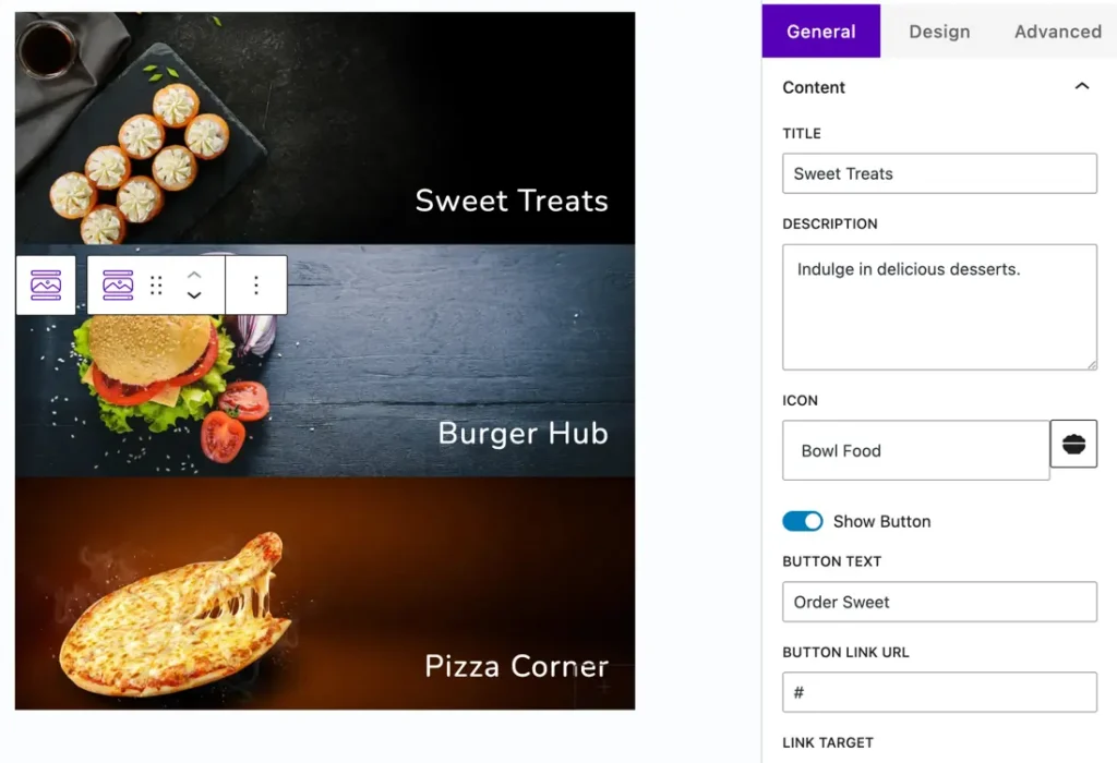
Content
- Title: Add the main title for the accordion item.
- Description: Provide supporting text or details to appear when the accordion expands.
- Icon: Choose an icon that visually represents the content.
- Show Button: Toggle to display or hide a call-to-action button.
- Button Text: Enter the label for the button.
- Button Link URL: Add the link where the button should redirect.
- Link Target: Choose whether to open the link in the same or a new tab.
Design Settings
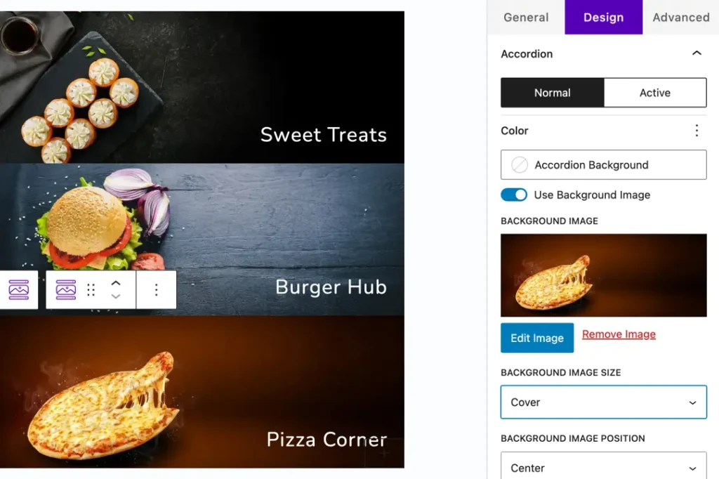
Accordion
- Background: Choose a solid color or enable a Background Image.
- Background Image Size: Options include Cover, Fit, Actual Size, and Stretch to Fill.
- Background Image Position: Set the image position such as Top Left, Center, Bottom Right, etc.
Content Animation: Select how the content appears — Top to Bottom, Left to Right, Right to Left, Bottom to Top, or No Animation.
Text Alignment: Adjust the alignment of the text (Left, Center, or Right).
Text – Customize overall text color, typography, and alignment for better readability.
Title – Adjust title color, font size, typography, and alignment to make it stand out.
Description – Style the description with color, font, and spacing options for a clean layout.
Icon – Modify icon color, size, and alignment to match your design.
Button – Customize button color, typography, border, and hover effects for interactive appeal.