Advanced Button
The Advanced Button Block (Free) lets you create stylish and customizable inline buttons without writing custom CSS. With flexible layouts, icons, hover effects, and typography options, this block makes it easy to design buttons that stand out and improve user interaction.
Adding the block
To add the block:
- Click the “+” button to add a new block.
- Search for “Advanced Button” and select it.
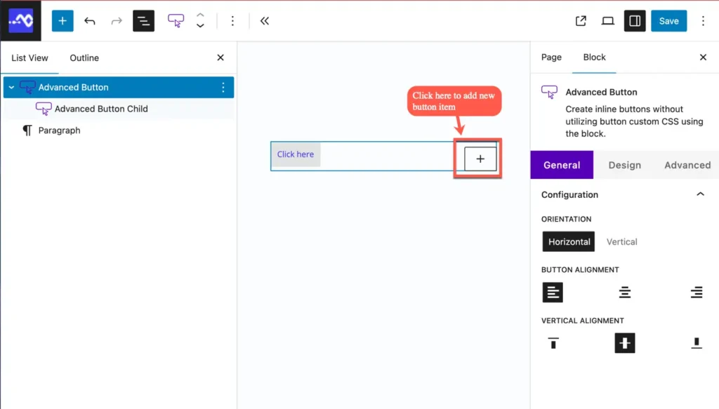
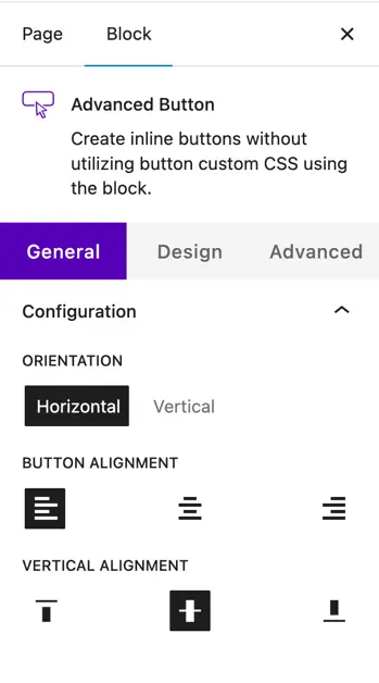
Parent block: Advanced button
The Advanced Button Block acts as a container for individual button items. You can add one or multiple Advanced Button Child Blocks inside it.
Settings
Configuration
Vertical Alignment – Align buttons vertically within the block.
Orientation – Choose to display buttons in Horizontal or Vertical order.
Button Alignment – Align all buttons within the container (left, center, or right).
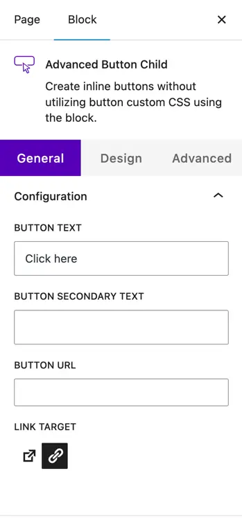
Child block: Advanced button child
The Advanced Button Child Block represents each individual button inside the parent block. Each button can be customized separately with text, links, icons, and styling options.
Settings
General
- Button Text – Enter the main text for the button.
- Button Secondary Text – Add an optional secondary text (useful for sub-labels).
- Button URL – Insert the link for the button.
- Link Target – Choose to open the link in the same tab or a new tab.
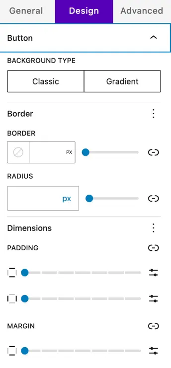
Design settings
Button
- Background Type – Select between Classic (solid color) or Gradient background.
- Border – Define border thickness (in px).
- Radius – Adjust corner roundness (in px).
- Dimensions – Set Padding (inside spacing) and Margin (outside spacing).
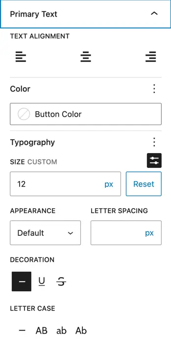
Primary text
- Text Alignment – Align button text (left, center, right).
- Color – Set button text color.
- Typography – Customize size (px), appearance, letter spacing, decoration, and letter case.
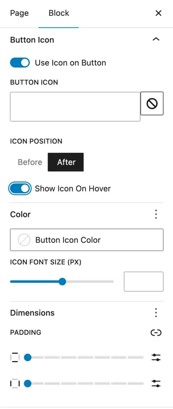
Button icon
- Use Icon on Button – Enable icon for the button.
- Button Icon – Select an icon from the library.
- Icon Position – Place the icon Before or After the text.
- Show Icon on Hover – Display the icon only on hover if desired.
- Color – Set icon color.
- Icon Font Size – Adjust icon size in px.
- Dimensions – Add padding around the icon.
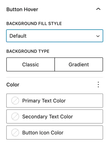
Button hover
- Background Fill Style – Choose Default or apply a custom fill.
- Background Type – Pick Classic or Gradient for hover background.
- Color – Customize hover colors for:
- Primary Text
- Secondary Text
- Button Icon