

WPMozo Blocks and Addons 1.9.0, the free plugin on WordPress.org, is out, and it brings two new blocks: a Progress Bar that shows readers how far down the page they are, and a Portfolio Slider that turns your projects into a carousel. The release also fixes eight problems and makes five changes to how the block settings work in the editor. This post walks through every setting of the two new blocks, shows where they fit on a real site, and explains each fix and improvement in plain terms.
With 1.9.0, the free plugin has 56 blocks that you can add from the inserter, all listed under the WPMozo category.
What is new in 1.9.0 at a glance
- New: Progress Bar block (a reading progress indicator in three shapes).
- New: Portfolio Slider block, with a WPMozo Portfolios post type to hold your projects.
- Fixed: Horizontal Scrolling Posts, Post Ticker, Scrolling Zoom Gallery, Scroll Text, Team Slider, Testimonial Slider, Wavy Gallery, and sticky post ordering in the post blocks.
- Improved: a hover preview in the block settings, the Enter key in the List block, a Duplicate button and collapsible rows in repeater fields, and a new category picker.
New: the Progress Bar block
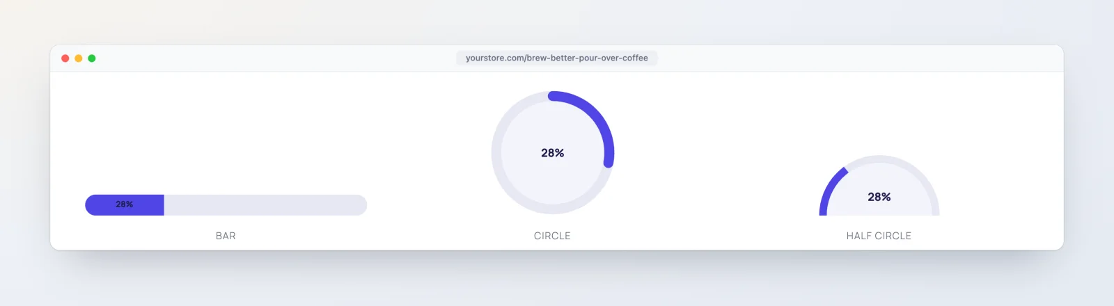
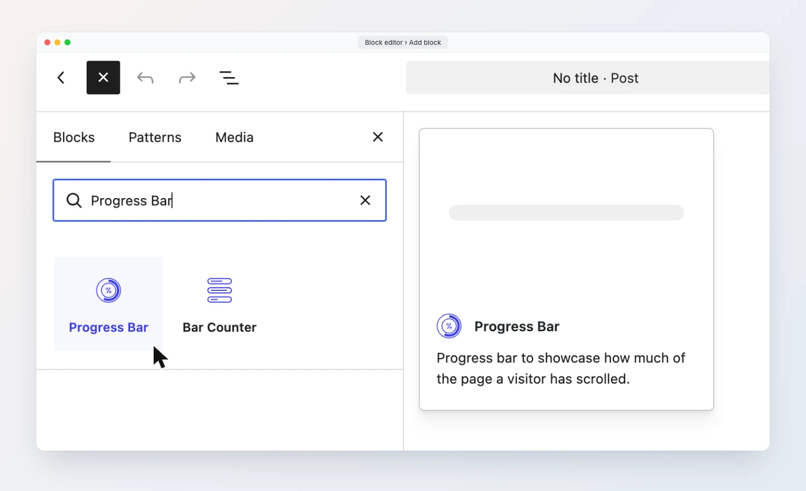
The Progress Bar block measures how much of the page a visitor has scrolled and fills up as they read. At the top of the page it shows 0%, and it reaches 100% when the visitor gets to the bottom. It tracks the whole page, not a single section, so one Progress Bar per page is enough.
It is not a skill or statistics bar. If you want to show a fixed value such as “Design 90%”, use the Bar Counter block, which is also part of the free plugin.
Where a reading progress bar helps
- Long tutorials and guides. A thin bar pinned to the top of the screen tells readers how much is left, which helps them decide to keep going.
- Documentation and knowledge base pages. A small Circle layout in a corner shows the reader’s place in a long reference page without taking space from the text.
- Sales pages and long-form landing pages. A Half Circle or vertical bar with your brand colors adds a progress cue that matches the rest of the design.
Progress Bar settings
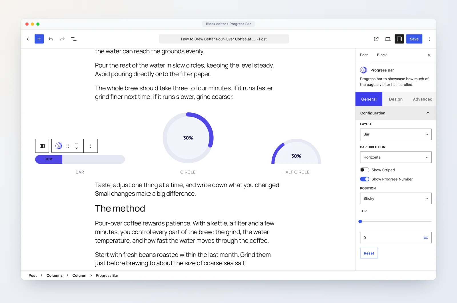
The settings are split into the General, Design, and Advanced tabs, like the other WPMozo blocks. Here is everything in the General tab, under Configuration:
| Setting | Options | Default |
|---|---|---|
| Layout | Bar, Circle, Half Circle | Bar |
| Bar Direction (Bar only) | Horizontal, Vertical | Horizontal |
| Show Striped (Bar only) | Adds moving diagonal stripes to the filled part | Off |
| Show Progress Number | Shows the percentage as text | On |
| Position | Default, Sticky, Fixed | Default |
| Top (Sticky and Fixed) | Distance from the top of the screen | 0px |
| Left (Fixed only) | Distance from the left edge | 0px |
The three positions behave differently:
- Default keeps the block where you placed it in the content. It scrolls away with the page.
- Sticky scrolls with the page until the block reaches the Top distance, then stays there while the visitor keeps reading.
- Fixed pins the block to the screen at the Top and Left distances from the start, across the full width of the window.
In the Design tab, the first panel is named after the layout you picked (Bar Styling, Circle Styling, or Half Circle Styling). It holds:
- Alignment (default left).
- Bar Width (default 100%) and Bar Height (default 30px), for the Bar layout.
- Circle Size, from 50 to 700 pixels (default 150), for the Circle and Half Circle layouts.
- Z-Index, from -999 to 999 (default 3), so a Sticky or Fixed bar can sit above your header or below a menu.
- Bar Empty Color (default light gray, #eeeeee) and Bar Filled Color (default blue, #007bff), each with a Normal and Hover state.
- Circle Background Color (default #a5a5a5) for the circle layouts, also with Normal and Hover.
- Border and corner Radius for the Bar layout.
When Show Progress Number is on, a Percentage Text panel appears with the text color (Normal and Hover), Percentage Alignment for the Bar layout (default center), Typography, and Text Shadow. The Advanced tab has the usual Background, Spacing, Border, Transform, and Additional CSS Class(es) settings.
How to add a reading progress bar to a post
- Open the post or page in the block editor and place the cursor at the very top of the content.
- Click the + inserter, search for “Progress Bar”, and pick the one in the WPMozo category.
- In General, Configuration, keep Layout on Bar and set Position to Sticky.
- If your theme has a sticky header, set Top to the height of the header (for example 80px) so the bar sits under it instead of behind it.
- In Design, Bar Styling, lower Bar Height to around 6px for a thin line, and pick a Bar Filled Color that matches your brand.
- Turn off Show Progress Number if a thin line with no text suits the page better.
- Save, open the post on the front end, and scroll to check the bar fills up.
See it working on the Progress Bar demo page (opens in a new tab).
New: the Portfolio Slider block
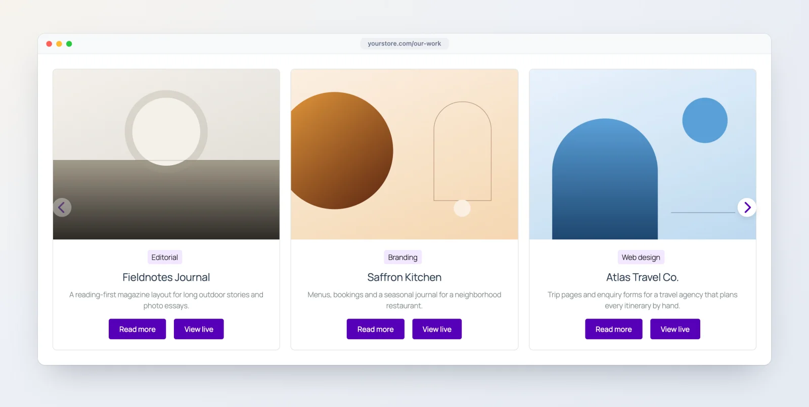
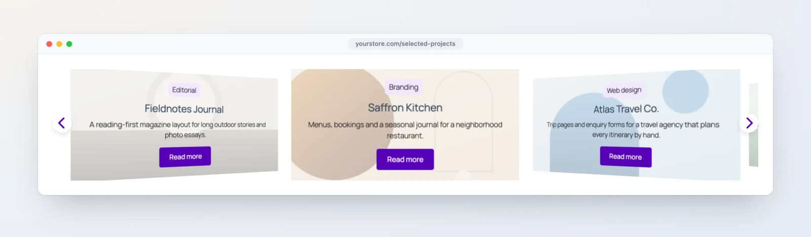
The Portfolio Slider shows your projects as a carousel, with an image, categories, title, excerpt, and buttons on each slide. The projects come from a new post type that 1.9.0 adds to your dashboard, so you write each project once and the slider picks it up wherever you place the block.
Where a portfolio slider fits
- An agency homepage. Show your latest five case studies in a slider below the hero, filtered to one category such as “Web design”.
- A freelancer’s site. Turn on the Project URL button so each slide links to the live site you built, in a new tab, next to a Read more link to the full write-up.
- A photographer, architect, or interior designer. Use Layout 2, where the project image fills the card and the text sits on a panel over it, with the Coverflow effect for a gallery feel.
Step 1: add your projects under WPMozo Portfolios
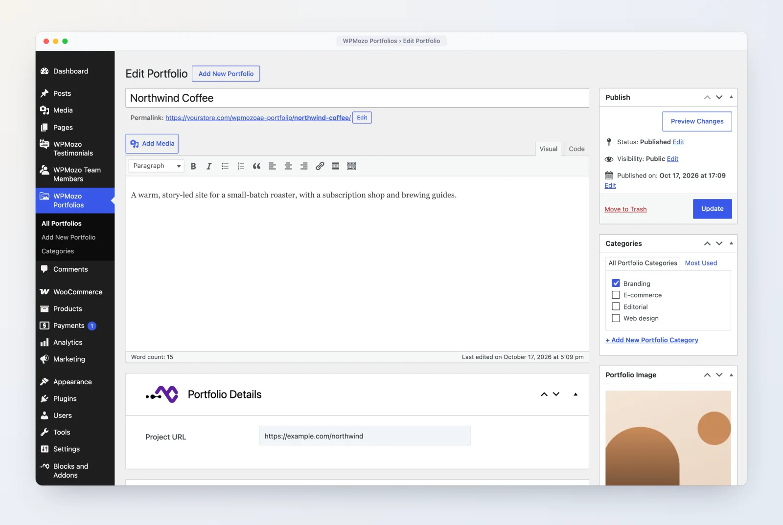
After the update you will see a new WPMozo Portfolios menu in your dashboard. Each portfolio item uses the classic editor and has:
- A title, content, and an excerpt.
- A Portfolio Image (the featured image), which the slider shows on the slide.
- Categories, which you can use to choose which projects a slider shows.
- A Portfolio Details box with one field, Project URL, for the link to the live project.
Go to WPMozo Portfolios, Add New Portfolio, fill these in, and publish. Add at least as many projects as you want to show per slide, so the slider has something to move through.
Step 2: add the block and choose what it shows
Insert the Portfolio Slider from the WPMozo category. In the General tab, the Content panel decides which projects appear:
| Setting | Options | Default |
|---|---|---|
| Portfolio Layout | Layout 1 (image above the text), Layout 2 (text panel over the image) | Layout 1 |
| Number of Portfolios | 1 to 50 | 5 |
| Offset | Skip the first 0 to 50 projects | 0 |
| Order | DESC, ASC | DESC |
| Order by | Date, Modified Date, Title, Slug, ID, Random, None | Date |
| Includes Categories | One or more portfolio categories | All |
| No Result Text | Message shown when no project matches | Preset message |
The Display panel turns the parts of each slide on or off: Show Featured Image (on), Show Title (on), Show Content (off), Show Excerpt (on) with an Excerpt Length from 10 to 300 (default 120, counted in words on English sites), Show Read More Link (on, text “Read more”), and Show Project URL Link (off, text “View live”). The Project URL button opens the link in a new tab and only appears on projects that have a Project URL filled in. Each slide also shows the project’s categories, linked to their archive pages.
Step 3: set how the slider moves
The Slider panel has five Slide Effects: Slide (default), Cube, Coverflow, Flip, and Fade. With Slide and Coverflow you can show several projects at once and set them per device:
- Number of Portfolios Per View, 1 to 10 (defaults: 3 on desktop, 2 on tablet, 1 on mobile).
- Number of Slides Per Group, 1 to 10 (default 1), which sets how many projects move with each step.
- Space Between Slides, 1 to 100 (default 20 on every device).
Coverflow adds Enable Slide Shadow (with a shadow color), Coverflow Rotate (default 40), and Coverflow Depth (default 100). The rest of the panel applies to every effect:
- Equalize Portfolios Height (off) makes every card the same height. When it is off, Auto Height Slider lets the slider follow the height of the current slide.
- Enable Loop (off) starts again from the first project after the last.
- Autoplay (on) with an Autoplay Delay of 3000 milliseconds and Pause on Hover (on).
- Transition Duration (default 1000 milliseconds).
The Slider Navigation panel controls arrows and dots. Arrows are on by default; you can pick your own Previous and Next icons, show the arrows only on hover, and choose one of eight positions: Inside, Outside, Top Left, Top Right, Top Center, Bottom Left, Bottom Right, or Bottom Center. Dots are off by default. When you turn on Show Dots Pagination, choose from six styles (Solid Dot, Transparent Dot, Stretched Dot, Line, Rounded Line, Squared Dot). Enable Dynamic Dots, which shrinks the dots far from the active one, applies to the Solid, Transparent, and Squared styles.
Step 4: style it in the Design tab
The Design tab has a panel for each part of the slide: text alignment (default center), the featured image (width and height in Layout 1, object fit in Layout 2), title, categories, content, excerpt, the Read More and Project URL buttons, the arrows and dots, the portfolio card (background, with an overlay background color in Layout 2, border, and spacing), and the slider container (width in percent and maximum width in pixels). Text parts have color and typography settings with Normal and Hover states.
One thing to know while testing: when you are logged in, private portfolio items also appear in the slider. Check the page in a private browser window to see what visitors see. You can try the block on the Portfolio Slider demo page (opens in a new tab).
Fixes in 1.9.0
- Horizontal Scrolling Posts: the scrolling effect sometimes did not run in the editor preview. It now previews as it does on the live page.
- Post Ticker: the Slide and Fade ticker effects did not work correctly. Both effects now run as set.
- Scrolling Zoom Gallery: the preview did not work correctly in the editor. You can now see the gallery while you edit it.
- Scroll Text: the scroll effects did not work correctly in the editor. They now play in the editor preview.
- Team Slider: when the lightbox popup was on, it opened without the team member’s designation, skill bars, and social icons. The popup was reading the wrong saved fields. It now shows all three when you choose to display them in the popup.
- Testimonial Slider: the dot styles chosen under Dots Pagination Style did not show correctly on the live page. The chosen style now appears on the front end.
- Wavy Gallery: the preview did not work correctly in the editor. It now previews while you edit.
- Sticky posts in post blocks: Horizontal Scrolling Posts, Post Ticker, and Blog Timeline did not order sticky posts reliably. Now, with Ignore Sticky Posts off, sticky posts come first, followed by the other posts in the order you set, up to your post count. With it on, sticky posts take their normal place in that order.
Editor improvements
Hover preview in the block settings
Many settings have a Normal and a Hover switch. In 1.9.0, when you switch a setting to Hover, the block in the editor shows its hover styles, so you can see the hover color or border while you set it instead of saving and checking the front end. This works across every block in the plugin.
Enter adds a new item in the List block
Pressing Enter while typing in a List block item now creates a new list item below it, with the same settings as the item you were on, so you can type a list line after line as you would in a paragraph.
Duplicate button and collapsible rows in repeater fields
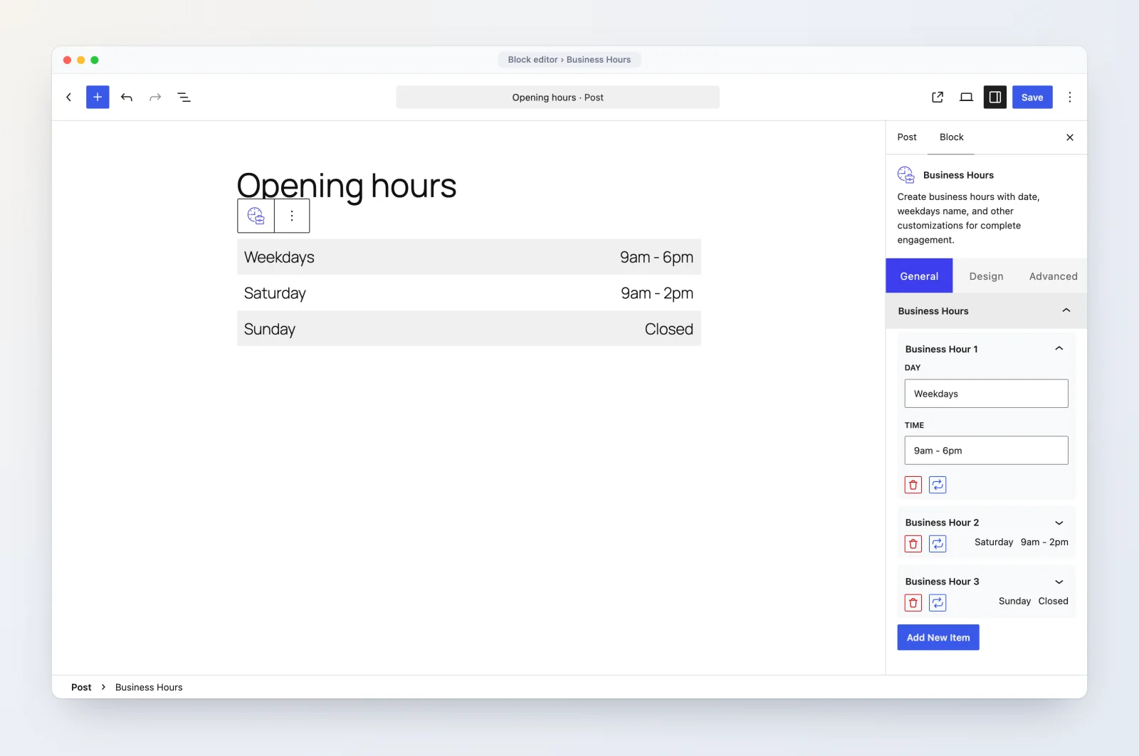
Repeater fields are the lists of rows inside a block’s settings, such as the hours in Business Hours, the menu items in Dropdown Button, and the feature list in Pricing Table. Each row now has a Duplicate button next to Remove, which places a copy right below the original. This saves retyping when rows share most of their content, like opening hours that repeat across weekdays. Each row can also be collapsed and expanded from its header, which keeps long lists short while you work.
A new category picker
Blog Timeline, Team Slider, and Testimonial Slider now use a Select Categories field where you type a category name, pick it from the suggestions, and see your choices as tags you can remove. It replaces the multi-select list these blocks used before.
How to update to 1.9.0
WPMozo Blocks and Addons is free and is updated from WordPress.org:
- Take a backup of your site, as you would before any plugin update.
- Go to Dashboard, Updates (or Plugins, Installed Plugins) and update WPMozo Blocks and Addons to 1.9.0.
- Open a page in the block editor, search the inserter for “Progress Bar” or “Portfolio Slider”, and add the block.
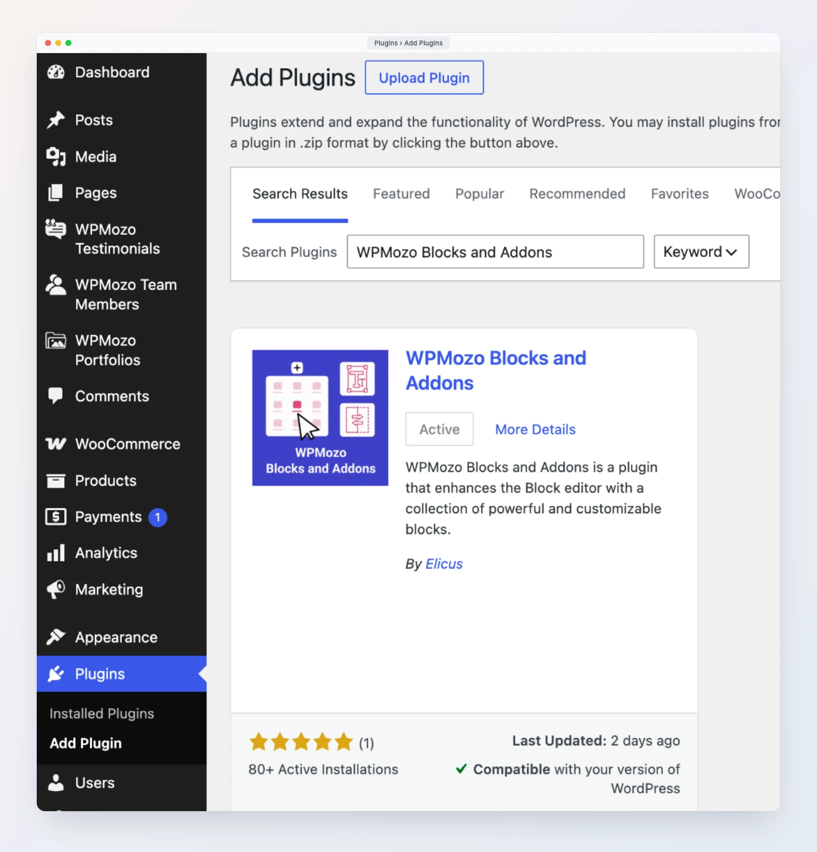
New to the plugin? Install it from Plugins, Add New by searching for “WPMozo Blocks and Addons”, or download it from the WordPress.org plugin page (opens in a new tab). If you have turned blocks off under the Blocks and Addons menu, check that the two new blocks are enabled there.
Need more? WPMozo Blocks and Addons Pro adds 22 blocks on top of the free ones, including WooCommerce product blocks, Ajax Search, and Instagram feeds, for $79 per year or $249 for a lifetime license, both for unlimited sites. Read what is in WPMozo Blocks and Addons Pro for the full list.
Frequently asked questions
Is WPMozo Blocks and Addons 1.9.0 free?
Yes. The Progress Bar, the Portfolio Slider, and every fix and improvement in this post are part of the free plugin on WordPress.org.
Can I use the Progress Bar block to show skill levels?
No. The Progress Bar follows how far the visitor has scrolled down the page. To show a fixed value such as a skill level, use the Bar Counter block.
Why does my progress bar stay at 0%?
The bar fills as the page scrolls. If the whole page fits on the screen, there is nothing to scroll, so it stays at 0%. It is meant for long posts and pages.
Where do the Portfolio Slider’s projects come from?
From the WPMozo Portfolios post type that the plugin adds to your dashboard. Each item has a title, content, excerpt, Portfolio Image, categories, and a Project URL field.
Can I show only some projects in the slider?
Yes. Use Includes Categories to limit the slider to one or more portfolio categories, and Number of Portfolios and Offset to choose how many to show and how many to skip.
How many blocks does the free plugin have now?
56 blocks you can add from the inserter, including the two new ones in 1.9.0.
Try the new blocks
Update to 1.9.0, add a Progress Bar to your longest post, and put your best projects in a Portfolio Slider. For the full list of blocks, see the WPMozo Blocks and Addons product page, and for setup guides, the plugin documentation.

Leave a Reply