Content Toggle
The free Content Toggle block allows you to display content in a collapsible format, making it easier to organize and present information clearly and efficiently.
Adding the block
To add the Content Toggle block:
- Click the “+” button to add a new block.
- Search for “Content Toggle” and select it.
- For detailed instructions on how to add blocks in Gutenberg, please refer to the official WordPress Block Editor documentation.
Content toggle block settings
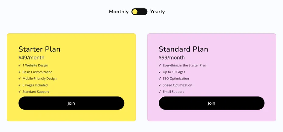
This section shows the configuration options for the Content Toggle block. It allows you to switch between two different content sections—ideal for scenarios like pricing plans (e.g., Monthly vs Yearly).
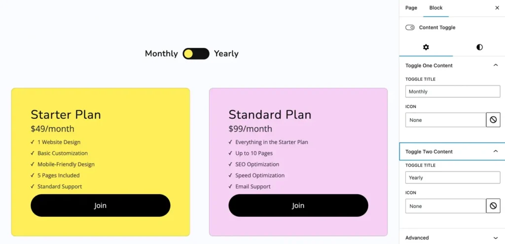
Toggle one content
- Toggle Title: Set the label for the first toggle option (e.g., Monthly).
- Icon: Choose an icon to display alongside the title (optional).
Toggle two content
- Toggle Title: Set the label for the second toggle option (e.g., Yearly).
- Icon: Choose an icon to display alongside the title (optional).
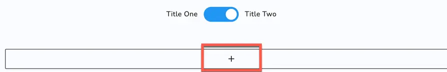
Adding content inside each toggle
Once you add the Content Toggle block and set titles for Toggle One and Toggle Two, you’ll see a “+” (plus) button inside each toggle section.
This allows you to insert content blocks (text, images, buttons, etc.) under each toggle.
For example, you can add pricing details under “Monthly” and “Yearly” toggle sections separately.
This flexible layout lets you display different content based on the selected toggle—perfect for comparisons, plans, FAQs, and more.
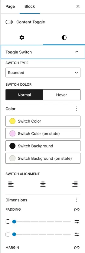
Toggle switch settings
The Toggle Switch panel allows you to customize the appearance and behavior of the switch between the two toggle titles.
Switch type
- Rounded / Rectangle / Toggle – Choose the shape of the toggle switch button.
Switch color
- Customize the color of the toggle switch in both Normal and Hover states.
Color options
- Switch Color – Color of the switch knob in normal state.
- Switch Color (on state) – Color of the switch knob when it’s toggled ON.
- Switch Background – Background color of the switch in the OFF state.
- Switch Background (on state) – Background color of the switch when toggled ON.
Switch alignment
- Align the toggle switch and labels: Left, Center, or Right.
Dimensions
- Padding – Adjust the spacing inside the toggle switch container.
- Margin – Adjust the spacing around the toggle switch block.
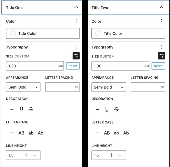
Toggle titles style settings
You can customize the look of both toggle titles (“Title One” and “Title Two”) using the following options:
- Color: Choose the text color for each title.
- Typography:
- Size: Set the custom font size (in REM).
- Appearance: Choose font weight like Regular, Semi Bold, Bold, etc.
- Letter Spacing: Add space between letters (in pixels).
- Decoration: Apply underline, strikethrough, or italic styles.
- Letter Case: Transform text to UPPERCASE, lowercase, or Capitalize.
- Line Height: Adjust the space between lines of text.
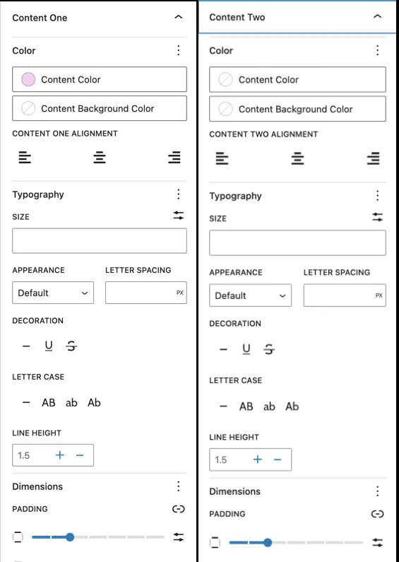
Toggle content style settings
These settings let you customize the appearance of the content displayed under each toggle:
Color
- Content Color: Set the text color.
- Content Background Color: Choose a background color for the content area.
Content alignment
- Align the text to the left, center, or right using the alignment options.
Typography
- Size: Define the font size.
- Appearance: Choose font weight (Default, Bold, etc.).
- Letter Spacing: Add spacing between letters.
- Decoration: Apply underline, strikethrough, or italic styles.
- Letter Case: Set text to uppercase, lowercase, or capitalize.
- Line Height: Adjust the spacing between lines for better readability.
Dimensions
- Padding: Set padding inside the content block for spacing.