List
The List block for Gutenberg is a free block that enables users to create structured, customizable lists with versatile styling options ideal for organizing information, highlighting key points, or presenting data clear.
Adding the block
To add the block:
- Click the “+” button to add a new block.
- Search for “List” and select it.
- For detailed instructions on how to add blocks in Gutenberg, please refer to the official WordPress Block Editor documentation.
Configuration options
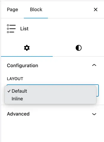
Layout
- Options:
Default,Inline- Default: Lists are displayed vertically, one below the other.
- Inline: List items appear horizontally in a single line (useful for navigation-style lists).
Adding list items
- After adding the List Block, use the “+” (plus) button to insert individual List Items.
- You can press Enter to quickly add new list items.
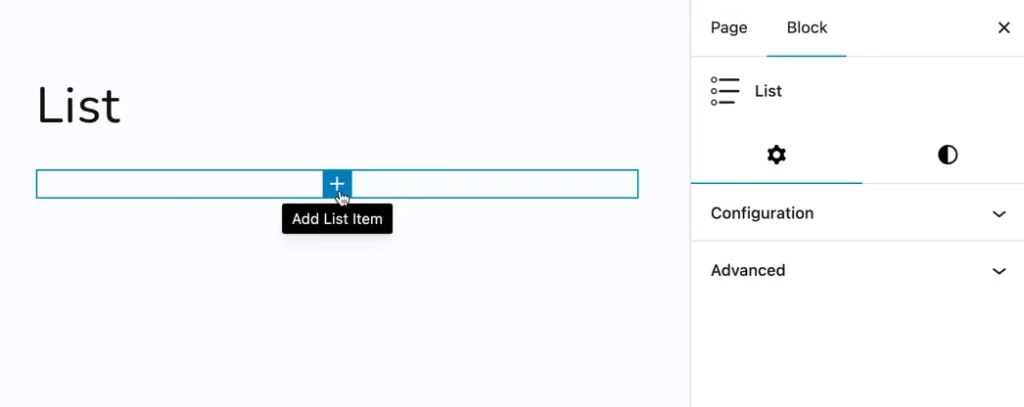
For a each list item, a dedicated input box appears to directly enter the text.
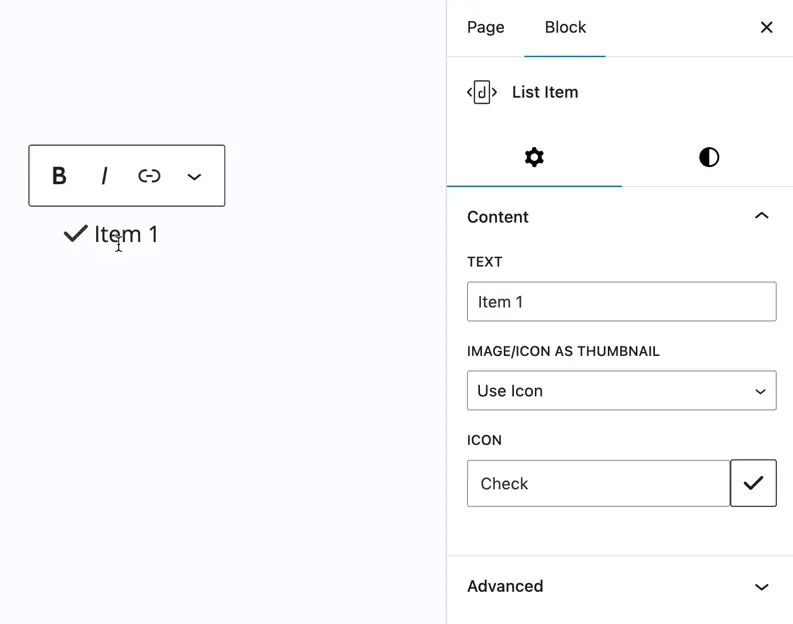
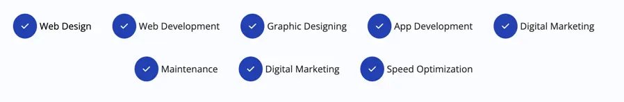
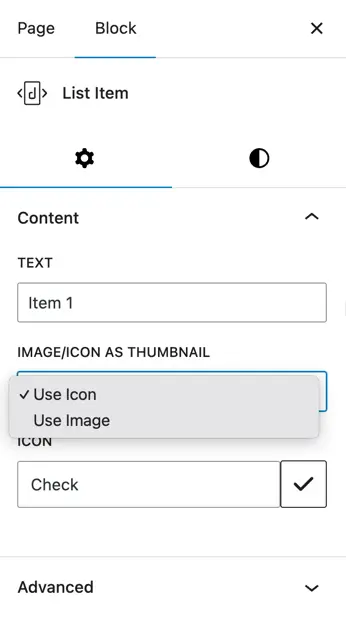
Thumbnail type (Icon/Image)
- Thumbnail Option: Choose between displaying an Icon or an Image beside each list item.
- Image: Upload an image to display as the thumbnail.
- Icon: Select an icon from given drop down.
Design options for list items
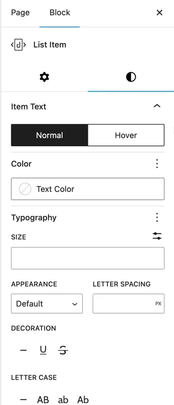
Item text settings
- Text Color: Set the color of the list text.
- Typography: Font family, weight, and style.
- Font Size: Adjust the size of the text.
- Appearance: Customize font appearance like bold or italic.
- Text Decoration: Underline, strikethrough, etc.
- Letter Case: Uppercase, lowercase, or capitalize.
- Text Spacing: Adjust the spacing between letters and words.
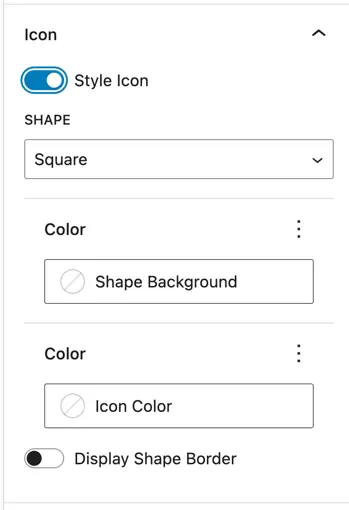
Icon settings
Icon Style: Customize the look of the icon.
Shape: Choose the shape surrounding the icon.
Options: Square, Circle, Hexagon
Shape Background Color: Color behind the icon shape.
Icon Color: Color of the icon itself.
Display Shape Border: Toggle on/off to show or hide a border around the shape.
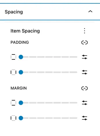
Spacing controls
Item Spacing
Margin: Outer space between the list item and surrounding elements.
Padding: Inner space around the list item content.
Global design options
These settings apply globally to the entire List Block, affecting all list items unless individually overridden.
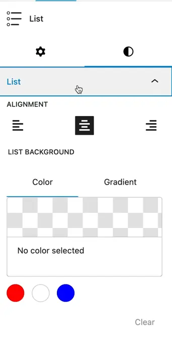
Alignment
Align Left / Center / Right: Controls the overall alignment of the entire list within the block.
List background
Background color: Set a background color for the full list block container.
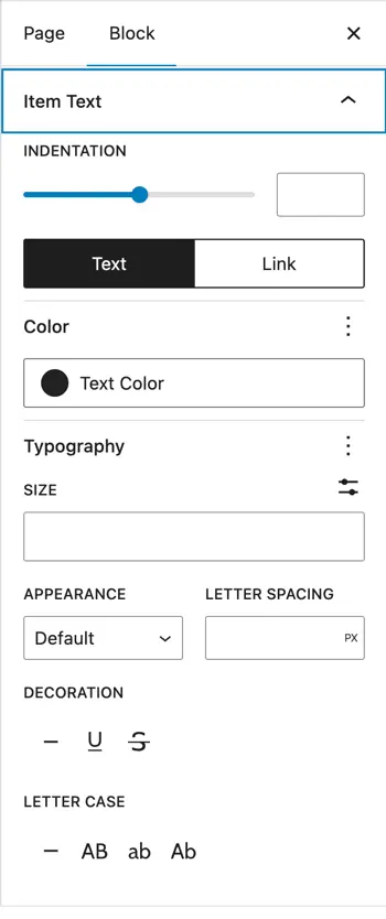
Item text customization
Indentation
Adjust the horizontal space between the thumbnail (icon/image) and the list text.
Text styling
- Color: Set the default text color for all list items.
- Typography: Choose the font family and weight.
- Size: Set the font size for the list text.
- Appearance: Apply font styles such as italic, bold, etc.
- Decoration: Underline, strikethrough, etc.
- Letter Case: Control capitalization (
uppercase,lowercase,capitalize).
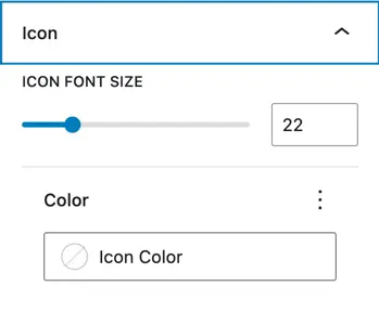
Icon settings (Global)
- Icon Font Size: Sets the default size for all icons in the list.
- Color: Sets the color for all icons globally (can be overridden per item if needed).
Image settings (Thumbnail)
- Thumbnail Width: Controls the width of image thumbnails used in list items.
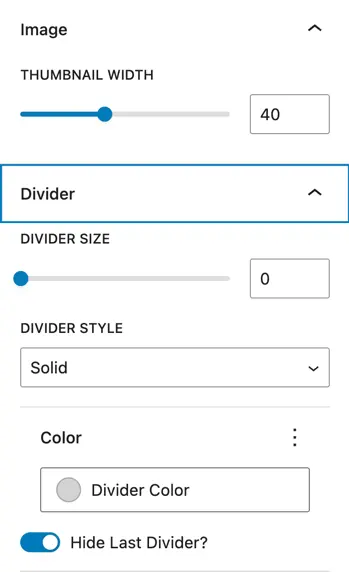
Divider settings (Between List Items)
- Divider Size: Thickness of the dividing line between items.
- Divider Style: Line style e.g., solid, dashed, dotted.
- Divider Color: Set the color of the divider.
- Hide Last Divider: A toggle option to hide the divider after the last list item for a cleaner finish.