If you want a versatile tool to display content interactively while using Elementor, WPMozo Content Toggle Widget is the perfect choice. It is a smart tool to display information-rich content in a confined space. This Elementor widget also helps visitors compare and differentiate between certain pieces of information easily. The interesting thing about Content Toggle in Elementor is that it can be used for various applications on your website. We only need to tune it up according to our needs.
In this post, we will discuss some useful cases where we can use Content Toggle widget that comes bundled with WPMozo Addons for Elementor plugin. Read the post till the end and explore the unique ways to make the content more appealing and space-efficient. on your WordPress website.
Let’s start discussing those smart ways.
1. Text Sections with Image
This is the most common way to display two sections of important content in the same pattern on your website. The text content can also be complemented with relevant images to boost visitor engagement. The visitors can view the content split into sections using the toggle switch. This is also a smart way to break content into segments for a more responsive view on mobile screens.
You can write lengthy product descriptions in a condensed form using the Content Toggle. Let’s see how you can do it. We took two auto products and used Content Toggle to showcase them along with their features interactively in a limited space.
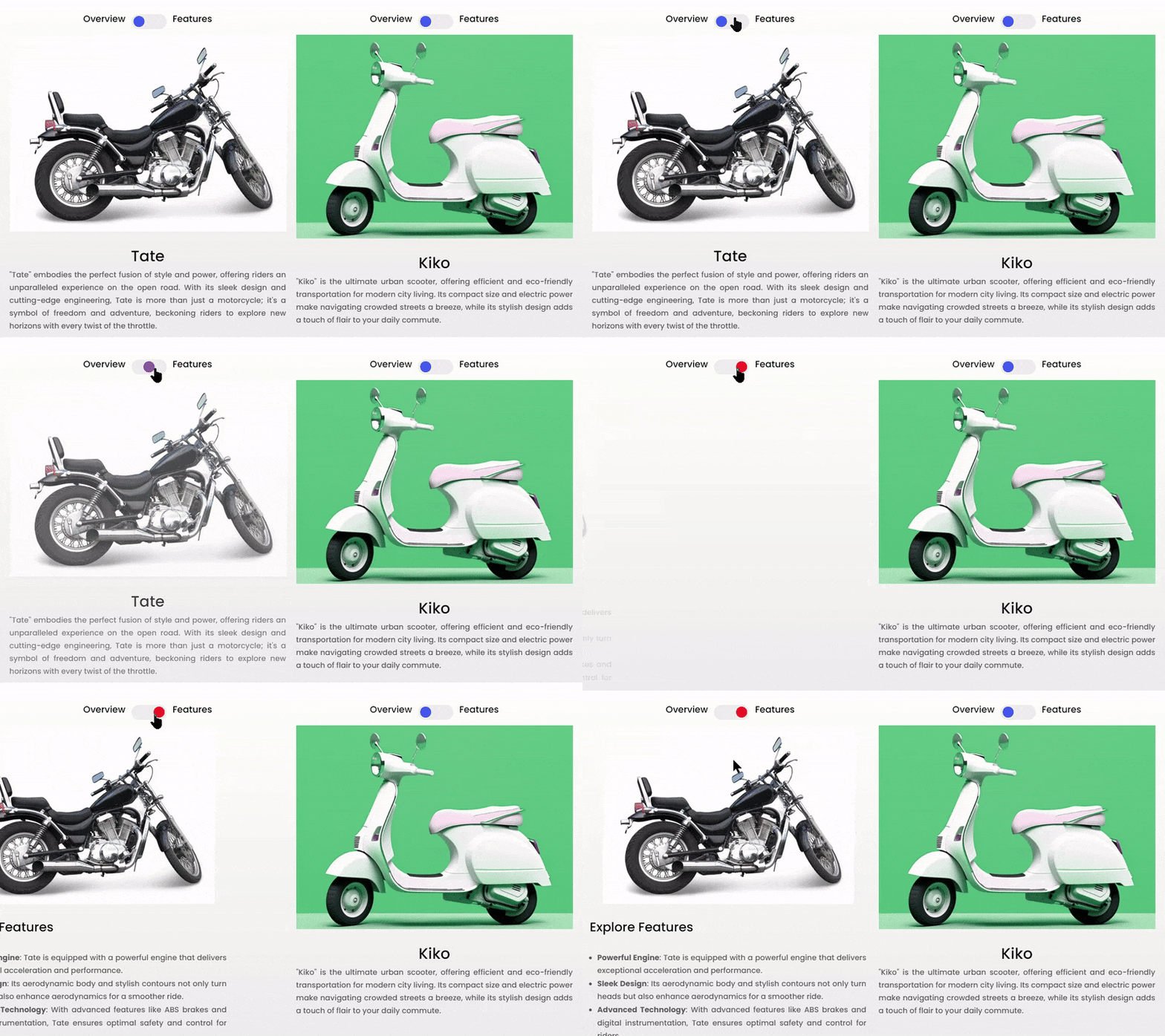
You can also create a grid of products using Content Toggle in Elementor to provide an overview of your products in a confined space.
How to create this design:
1. To create this design we used a Content Toggle widget with a two-column layout of Elementor builder.
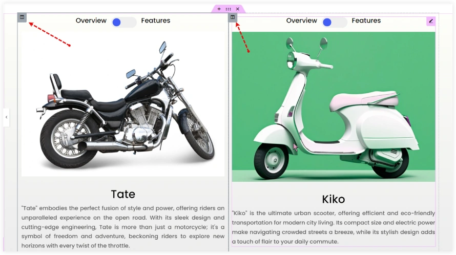
2. In the Toggle One section, we mentioned ‘Overview’ as the title, selected Content Type as ‘text’, and placed the image using the add media section.
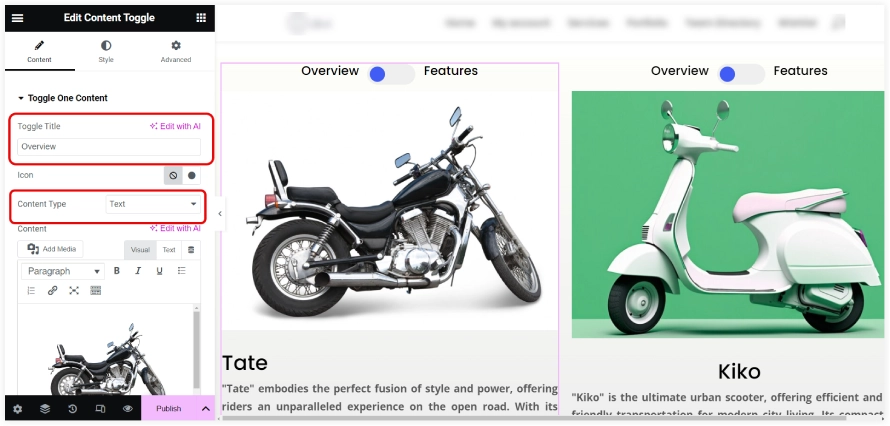
3. Similarly, edit the Toggle Two section with product features. Use a bulleted list to highlight the features.
4. After that, we included the product name as a heading and the product description as a paragraph.
5. You can also use the following code to place the image, product headings, and text description. Open the text editor of the widget and just replace the image URL, headings, and description in the code. That’s done.
<center><img class="alignnone size-medium" src="https://example.com/tate-motorbike.png" alt="" width=" " height=" " /></center>
<center><h2>Tate</h2></center>
<p>"Tate" embodies the perfect fusion of style and power, offering riders an unparalleled experience on the open road. With its sleek design and cutting-edge engineering, Tate is more than just a motorcycle; it's a symbol of freedom and adventure, beckoning riders to explore new horizons with every twist of the throttle.</p>
2. Pricing Tables
This is another application of content toggle. You can display pricing and plans on your website appealingly using it. The users can view the plans and can compare them easily using the content toggle switch. The Content Toggle widget also organizes the pricing information in a limited space on your website.
You can select a layout with suitable styling and add the Content Toggle widget to display two plans.
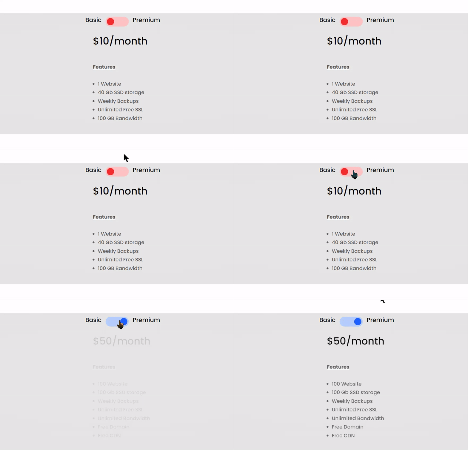
How to create this design:
1. Select a layout with one column and add suitable gradient background colors to it.
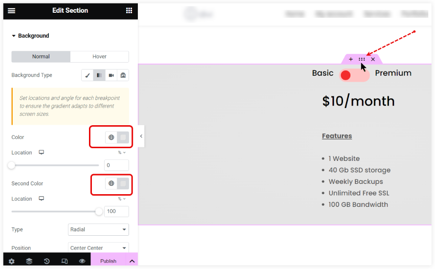
2. In the Toggle One Content section of the Content Toggle widget, add the plan’s name in Toggle Title, and select Content Type as Text.
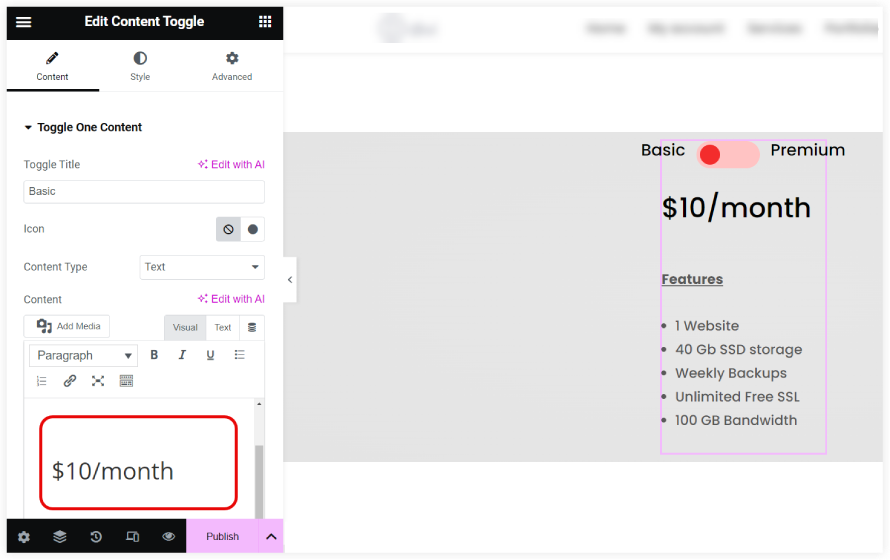
3. Mention the pricing in H2 and keep the features in bulleted points. Adjust the spacing between them.
4. Do the same thing in the Toggle Two Content section to display the Premium plan.
5. Style the colors of the Toggle switch and its background.
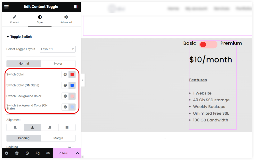
That’s done. You have created a wonderful pricing table with the Content Toggle widget which can be used on your website. For a more stunning appearance you can tune up the styling option. If you are using Divi Theme you can explore Divi Extended Pricing Table layouts.
3. Dual Galleries
You can display two galleries at the same time using the Content Toggle widget. This can be done using Elementor templates. You can create two Elementor templates with two different galleries and those galleries would be showcased in the same space. This is a smart way to display and categorize galleries on your website.
Take a look at this amazing gallery section which shows employees from the two departments at the same space using the Content Toggle. You can use it on a wide range of websites to display two galleries with a toggle switch.

How to create this design:
1. First of all, you need to create two Elementor templates and use the basic Elementor gallery widget. Include the relevant photos of different categories with caption as their names on both templates.
2. Enter the Toggle Title in the Toggle One section which is the department name in this design. Now select the Content Type as Template and pick the template having the gallery from the drop-down.
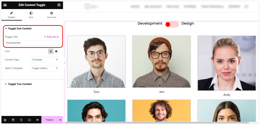
3. Repeat the above step with the second template in the Toggle Two section.
4. Do the necessary styling of the Toggle switch from the style section.
This is a brilliant way to showcase galleries in a confined way on your website.
4. Video Sections
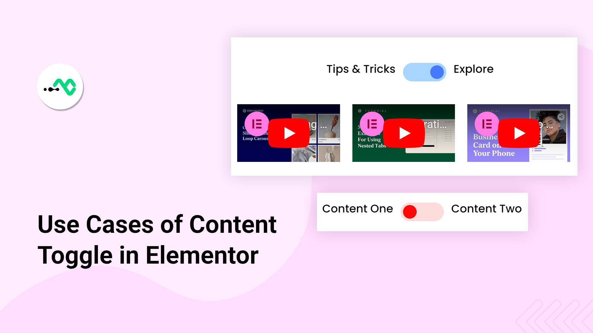
Content Toggle can also be used to display multiple videos on your website. From the above application of galleries, you would have understood that the Content Toggle widget can display Elementor templates. This gives a superb method to use the basic video widget of Elementor and create a template showcasing video playlists. So now you can display two video categories for playlists. The users can explore both the playlists using the toggle switch. This is helpful when you want to display recent and popular videos related to your products and services in the same space.
Take a look at this interactive video playlist section created using the content toggle.

How to create this design:
1. First of all, you need to create two Elementor templates. You can use a three, four, or five-column layout depending on your needs.
2. Insert the video widget in all the columns and use the Video URLs.
3. Now select the Content Type as Template, mention the Toggle Title, and choose the Elementor template which you had created in step one.
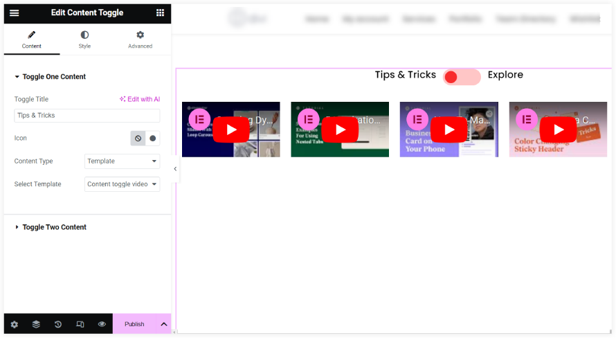
4. Repeat the above step for the second template.
After following all these easy steps you can create a video playlist section using the Content Toggle widget to showcase popular and recent videos on your website.
5. Tutorials
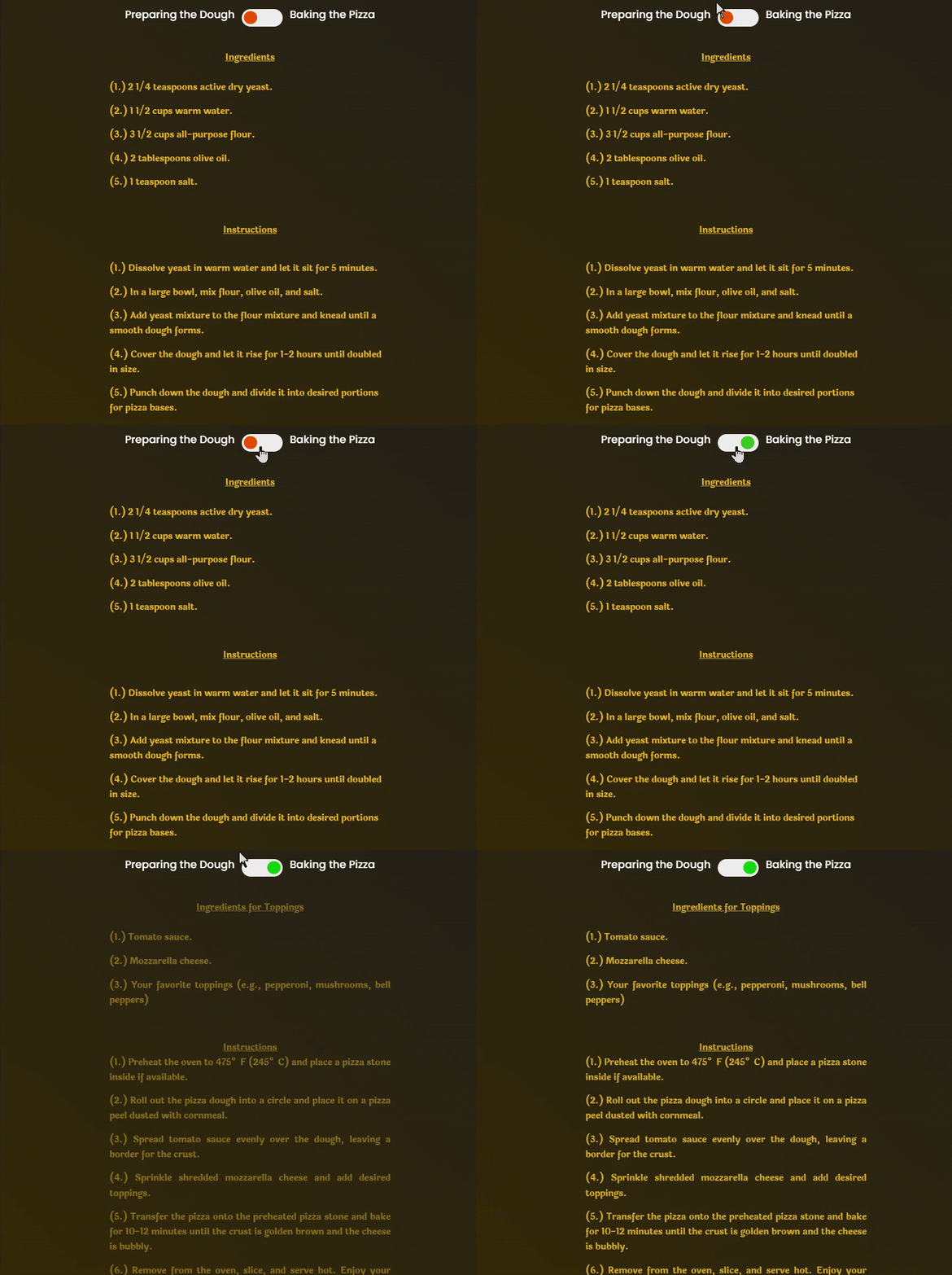
Going through a lengthy tutorial is a tiresome job. The Content Toggle widget is the perfect choice to make it interactive for the users. It splits the entire tutorial into two segments improving its readability aspect. This allows the users to go through the entire tutorial in a convenient way using the toggle switch. You only need to break up the tutorial into two segments. This is also helpful in saving space on the website.
Let us take an example of a pizza cooking tutorial. Here the tutorial is divided into two segments and the user can view these two segments separately using the toggle switch.
How to create this design:
1. First of all, pick a single-column layout and keep its width around 500.
2. Pick the Content Toggle widget from the dashboard.
3. Go to the Toggle One Content. Mention Toggle One title. Keep the Content Type as Text.
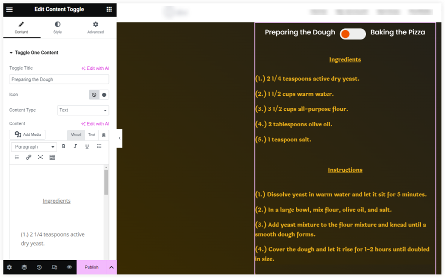
3. Insert the content with proper spacing. Here we have used <p> </p> for that.
4. Repeat the above step for the Toggle Two Content.
5. Select the Toggle Switch color, Pick a suitable text color for Content, and select the “Laila” Font family in the typography styling settings of both Content One and Content Two.
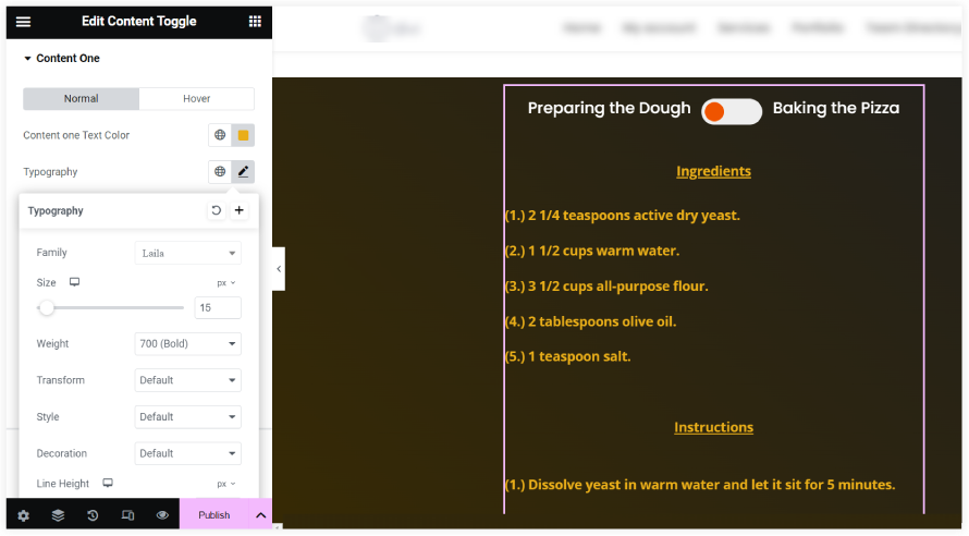
You can also tune the Toggle Animation from the style section as per your needs to give a final touch to your interactive tutorial.
The final takeaway is that instead of filling the content in a lengthy manner, we can make it more interactive and improve space efficiency using Content Toggle. We have tried to cover some of the major application areas of the Content Toggle Widget on our websites. The stunning styling and animation options make this widget a smart choice for websites built using Elementor. At last, we can conclude that Content Toggle is a superb widget to save valuable space on your website by displaying the content smartly.
0 Comments