The homepage serves as the first impression and is a digital front door to your website. This first interaction must be appealing and informational to the visitors for an exceptional user experience. A well-planned functional homepage draws visitors’ attention, guides and encourages them to explore the essential content on your WordPress website. Before setting your WordPress homepage live, you should strategically design the layout, and implement the right elements to ensure it aligns with the brand and user expectations.
In this post we will guide you through the key steps to plan, create, and set up an effective WordPress homepage on your website.
Before starting let’s quickly understand the goals of your WordPress website’s homepage.
Set the Goals of Your WordPress Homepage
It’s essential to define the goals of your website clearly and specifically. These act as the foundation of the design, content, and functionality of the homepage of your WordPress website. Every element on the homepage works to achieve the business objective of your website. Let’s overview a few goals that a WordPress homepage is built to achieve.
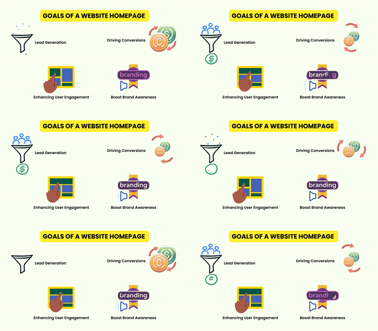
Goal – Lead Generation
The homepage of a WordPress website should be optimized to collect visitor information and use it to convert them into potential customers. Forms, CTAs, free material, consultations, or interactive sessions can encourage them to share contact information.
Goal – Boost Brand Awareness
The WordPress homepage should perfectly match your brand’s identity to make it memorable for visitors. A prominent logo, uniform color scheme, and clear messages establish your brand. You can also place a dedicated hero section to spread awareness about a new product or service.
Goal – Enhancing User Engagement
Interactive elements like videos, sliders, and quizzes on the homepage attract visitors and encourage them to explore content on your WordPress website. Comment sections and live chat are other options to keep visitors on your site for a long time.
Goal – Driving Conversions
Generally, the sales and signups on the homepage are counted as conversions. The homepage layout must be intuitive with compelling CTA sections, popular products, and customer review highlights. The Countdown timers and limited stock alerts drive visitors to prompt action.
Plan Your WordPress Homepage Layout
After getting a proper idea about the functions and goals of a homepage let’s plan it before starting its design.
Identifying Your Target Audience
Design a homepage in WordPress that perfectly serves the audience’s needs. Do detailed research on what the audience is looking for. Make a checklist that includes their needs, preferences, behavior, and interests. Based on all these factors we can decide how to address the requirements on the homepage.
For example – If you are designing the homepage of an online fitness coaching website, you should target busy professionals interested in looking fit despite their hectic schedules. Quick workout routines, healthy meal plans, and time management tips can be prominently showcased in different sections and captivating headings like “Stay Fit, Even on a Busy Schedule” followed by links.

Deciding on the Structure
Plan the important sections of the WordPress homepage such as the hero section, value proposition, service or product overview, client reviews, and call to action.
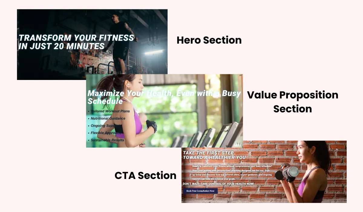
If we go with the previous example of an online fitness coaching website, the homepage structure will start with a compelling hero section. It will feature a bold headline “Transform Your Fitness in Just 20 Minutes a Day” with an inspirational background image. A clear value proposition can be positioned below that highlighting the benefits of your coaching. Give an overview of your services, like personalized workout routines, meal plans, and time-saving tips beneath. A client testimonial section below will help in building trust among the audience. A strong CTA section like “Get Started Today” or “Book a Free Consultation” will finalize the user engagement with an action.
Content Hierarchy and Flow
To provide a smooth user experience the content should be organized in a logical sequence. The key messages and information should be prioritized so that users can easily find what they are looking for.
Considering the previous example, you can feature the crucial message on the hero section as “Transform Your Fitness in Just 20 Minutes a Day“. This instantly grabs the user’s attention and encourages them to scroll and explore the value proposition sections highlighting the benefits of your fitness services. The fitness services are organized in an easy-to-read list with icons. After they have read the service list and understood the benefits, the client testimonial section appears which imparts a credibility and trust factor in their mind. Finally, they end up in the CTA section to subscribe to the fitness program. This content hierarchy and flow of different sections lead to a successful conversion.
Visual Design Elements
The fonts, color scheme, and images on the WordPress homepage must reflect your brand’s identity and appeal. They should be consistent and properly aligned with the website’s context and perspective.
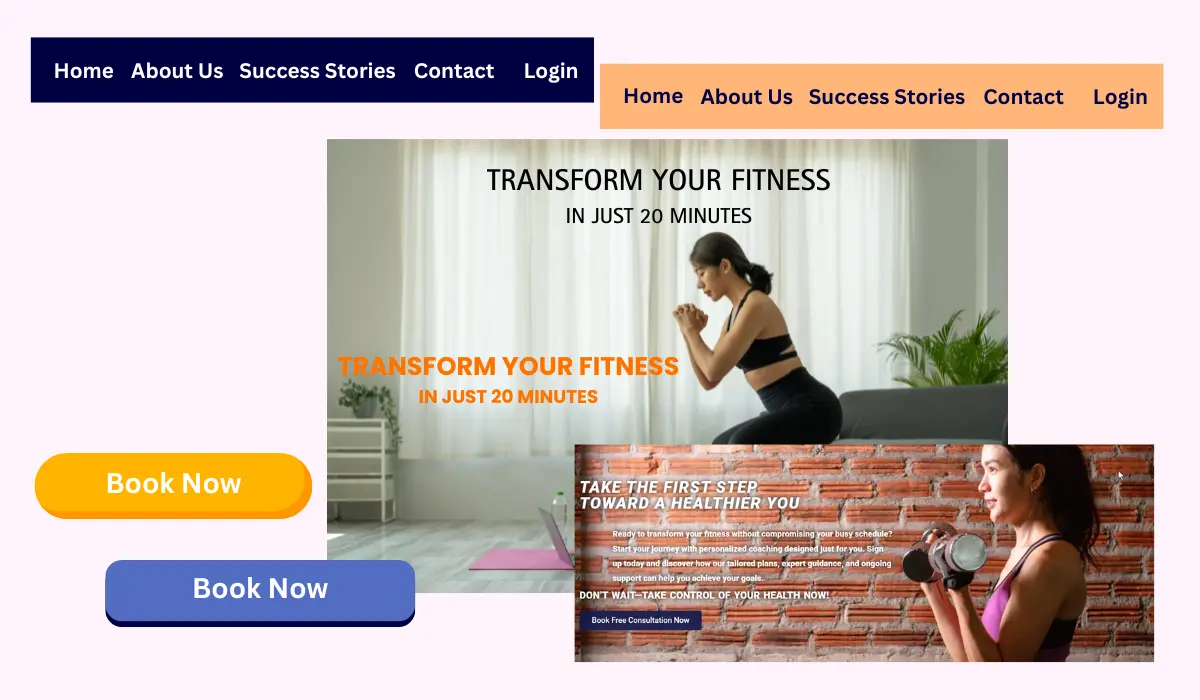
The online fitness coaching website needs a color scheme blending energetic tones like vibrant black or white with calm neutrals to reflect health and balance. Modern and clean fonts such as Sans-Serif will be easy to read across a wide range of devices. The images should show active and busy professionals integrating fitness into their lives. This will reflect the message of your website. The buttons, headers, and background images should appear consistent to provide a unified look to the homepage.
Create a Homepage for your WordPress Website
After planning the homepage layout for your WordPress website, we have a rough sketch of our homepage in our mind. Now we will bring that homepage layout to life in the design phase. We are designing the homepage of an online fitness coaching website that communicates with the target audience to introduce the offered services. Let’s start the homepage design process on your WordPress website.
1. Choose the Right WordPress Theme
The selected theme for your online fitness coaching website should reflect the energy, motivation, and professionalism to represent your brand. WordPress themes with bold and dynamic layouts and loaded with high-quality images will do the job perfectly. Divi, Astra, and Ocean WP are good choices.
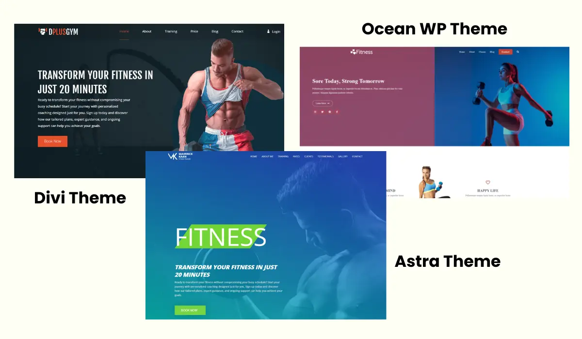
We recommend Divi as it comes with many features, functionalities, and tools. In minutes, you can use prebuilt Divi homepage layouts and child themes to create a full-fledged professional fitness coaching website. The Divi homepage layouts are completely customizable and you can personalize them to match your brand. These Divi layouts are responsive and look great on mobile devices.
Divi Layouts Extended plugin provides you with a gigantic pack of prebuilt Divi layouts containing 2400+ layouts. These layouts include header, footer, homepage, landing page, gallery, portfolio, and many other kinds of layouts for different industries and niches.
We have selected a prebuilt Divi layout from this pack to design and make the WordPress homepage of your online fitness coaching website.
Note: Make sure you have installed and activated the Divi theme on your website before starting the design process. Also, install the Divi Layout Extended plugin if you want prebuilt homepage layouts from that pack.
Using Divi Extended Layout Plugin
First, we will show you how to use a prebuilt layout from the Divi Layout Extended pack.
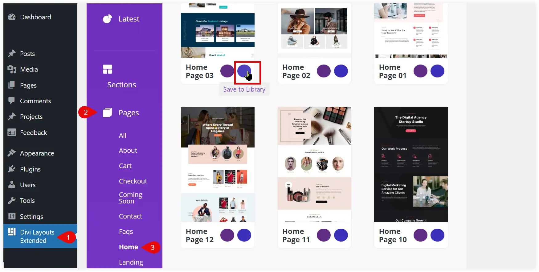
After installing the Divi Layout Extended plugin, open it from the WordPress dashboard and navigate to the Home section to explore the available homepage layouts. Choose the homepage layout you want to use and click on the Save to Library icon.
Now the selected homepage layout is saved in Divi Library. Check if it is saved in the Divi Library or not.
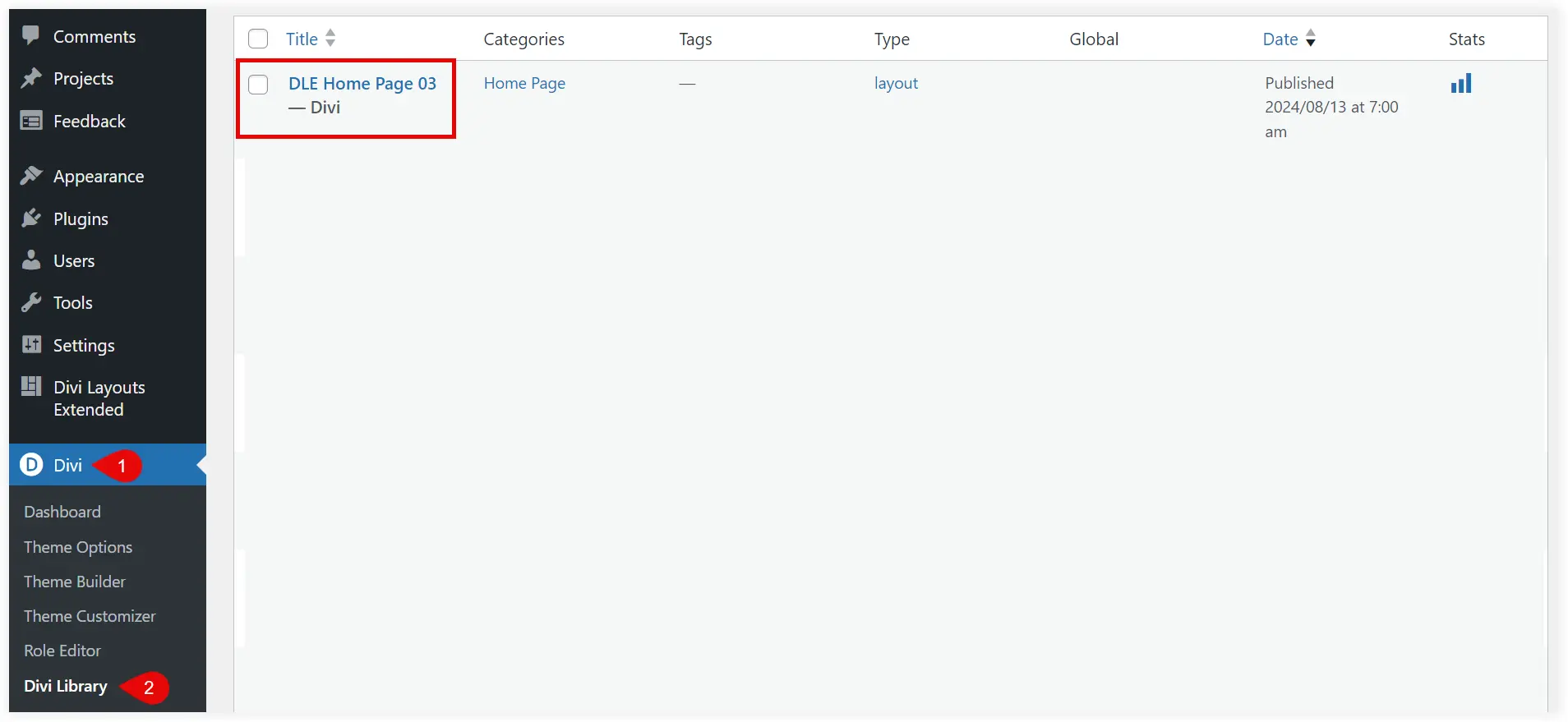
From the Divi Library you can use it on your homepage and customize it using Divi Page Builder.
Using a Prebuilt Homepage Layout
If you don’t want to use Divi Layout Extended, then download the JSON file of the desired homepage layout and import it on your WordPress website using Divi Library.
Let’s see how we can import a homepage layout on your website.
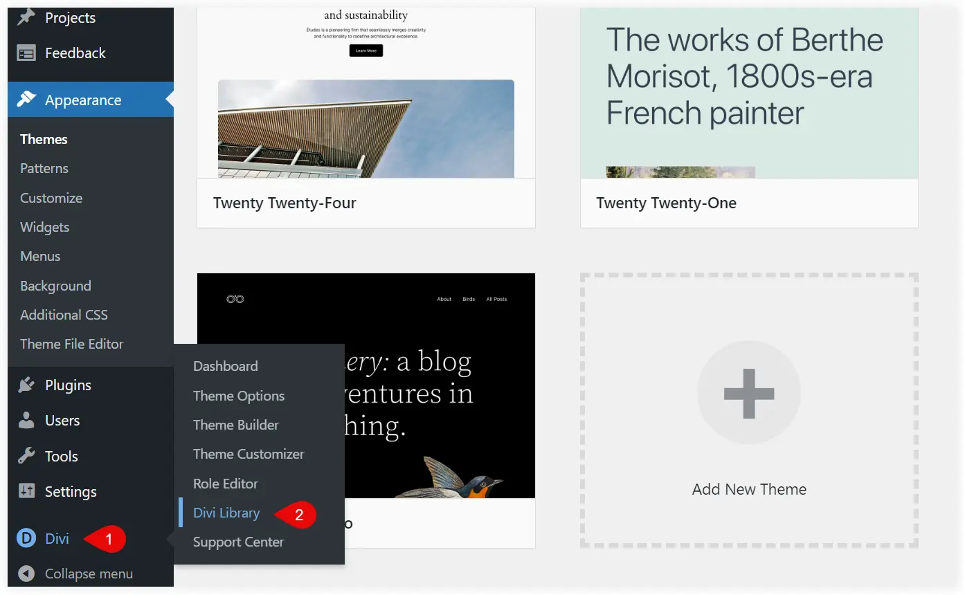
Navigate to the Divi Library from your WordPress dashboard.
Select Import and Export.
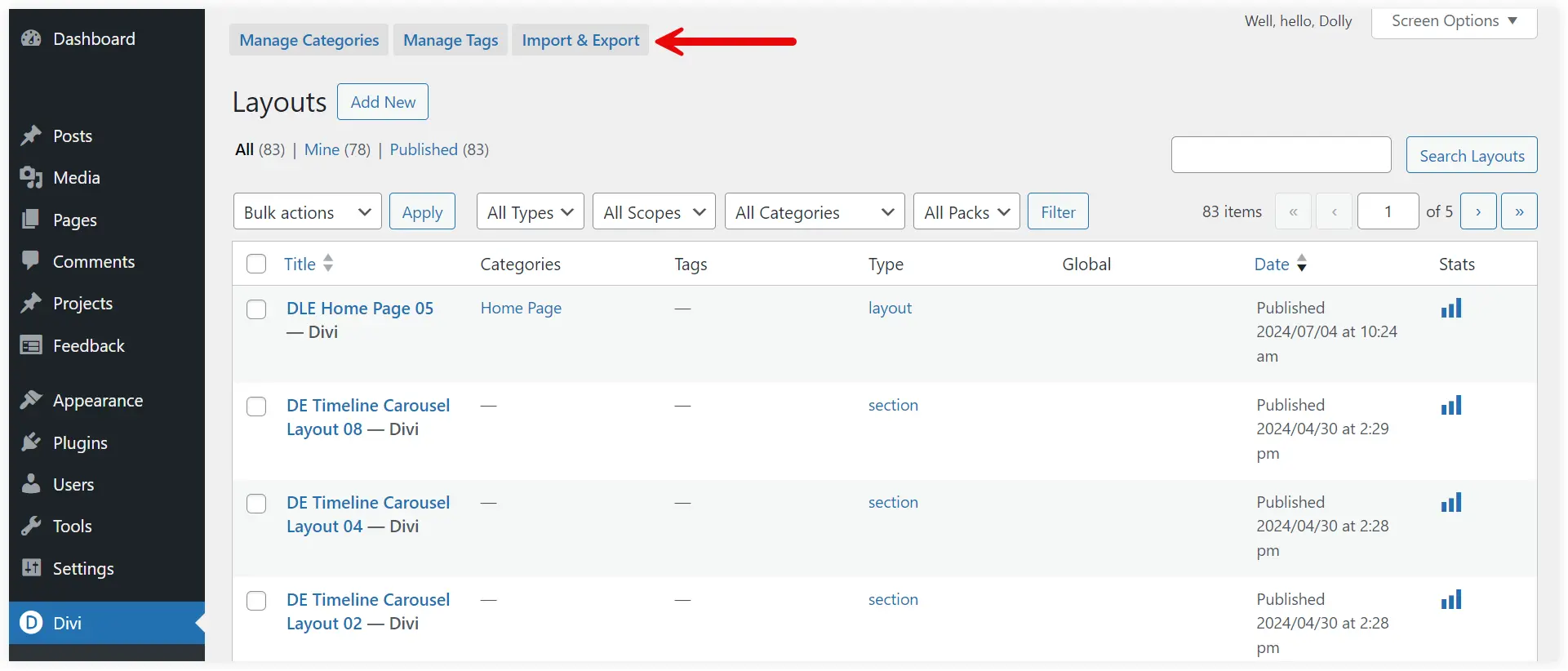
Select Import, choose the layout file of the prebuilt homepage that you want to use, and click ‘Import Divi Builder Layouts’.
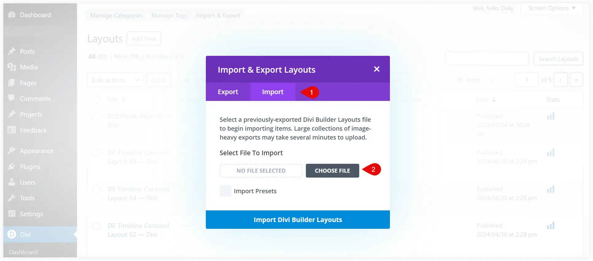
The uploaded layout is saved in Divi Library and you can further use it to make your homepage using Divi Page Builder.
2. Customize the Homepage using a Page Builder
There are a lot of page builders such as Divi and Elementor, that provide easy and useful options to build a WordPress homepage. You don’t need to be a coding expert and you can craft it with simple drag-n-drop features.
If you have chosen the Divi theme to create your website, then we prefer you to use the Divi Page Builder. It comes integrated with the Divi theme and works seamlessly to design your WordPress website.
In Divi Page Builder, you can use several modules to display all your content. Whether it’s pictures, text, call-to-action buttons, and so on. There is a dedicated module for everything you want to display on your homepage.
Create Homepage Design using Divi Page Builder
Let’s start designing your WordPress homepage.
In the previous step we had already saved a prebuilt layout in Divi Library. Now its time to use that layout and customize it to create our homepage.
Go to the WordPress dashboard. Create a new page, add title and click ‘Use the Divi Builder’.
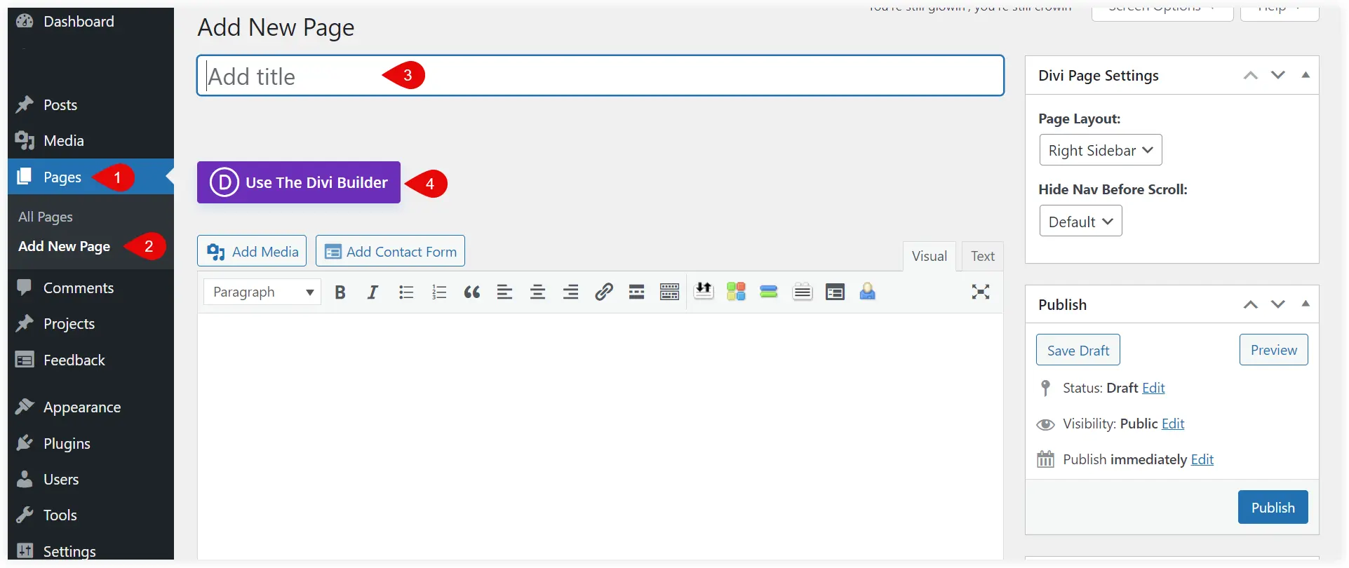
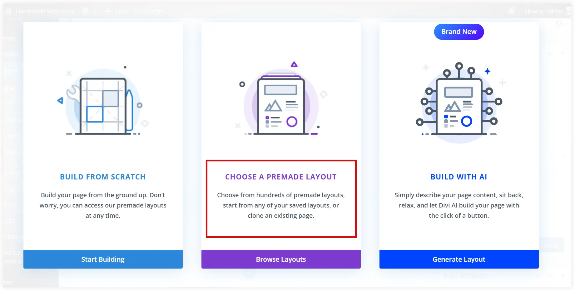
Select ‘Choose a Premade layout’.
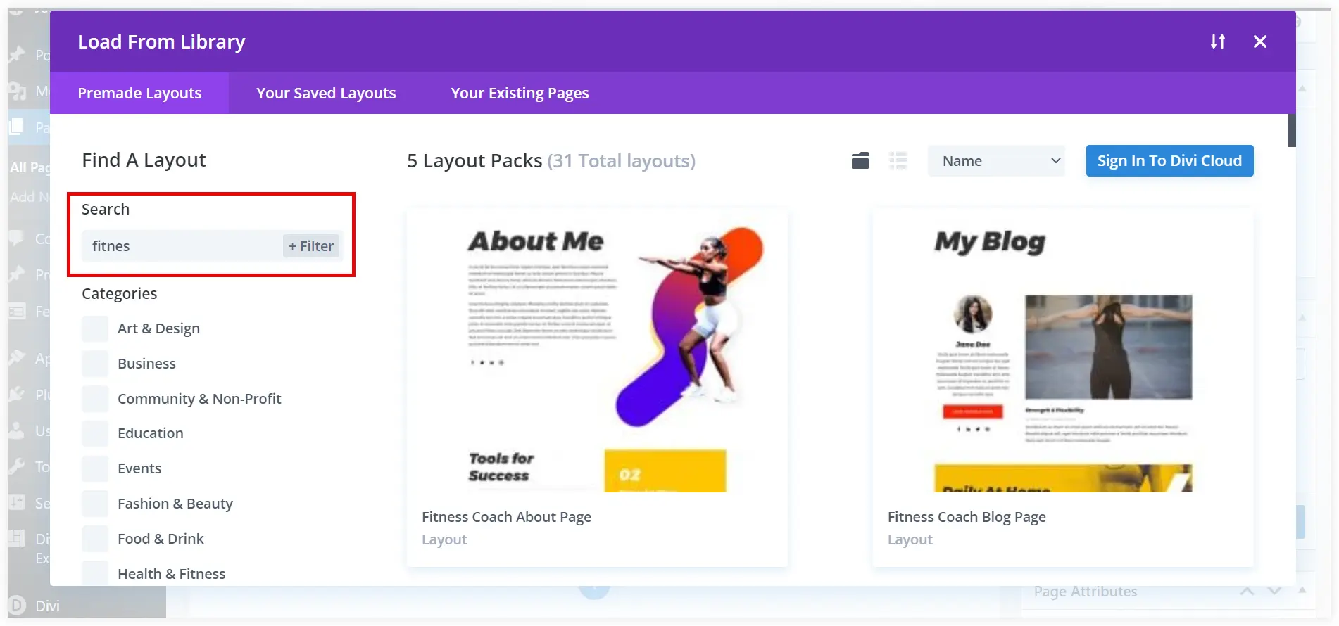
We searched for ‘fitness’ and there were 31 relevant layouts. Now you can also use any of these page layouts that can reflect your fitness website’s brand image. Select any layout.
Click on Use This Layout to utilize it on your homepage.
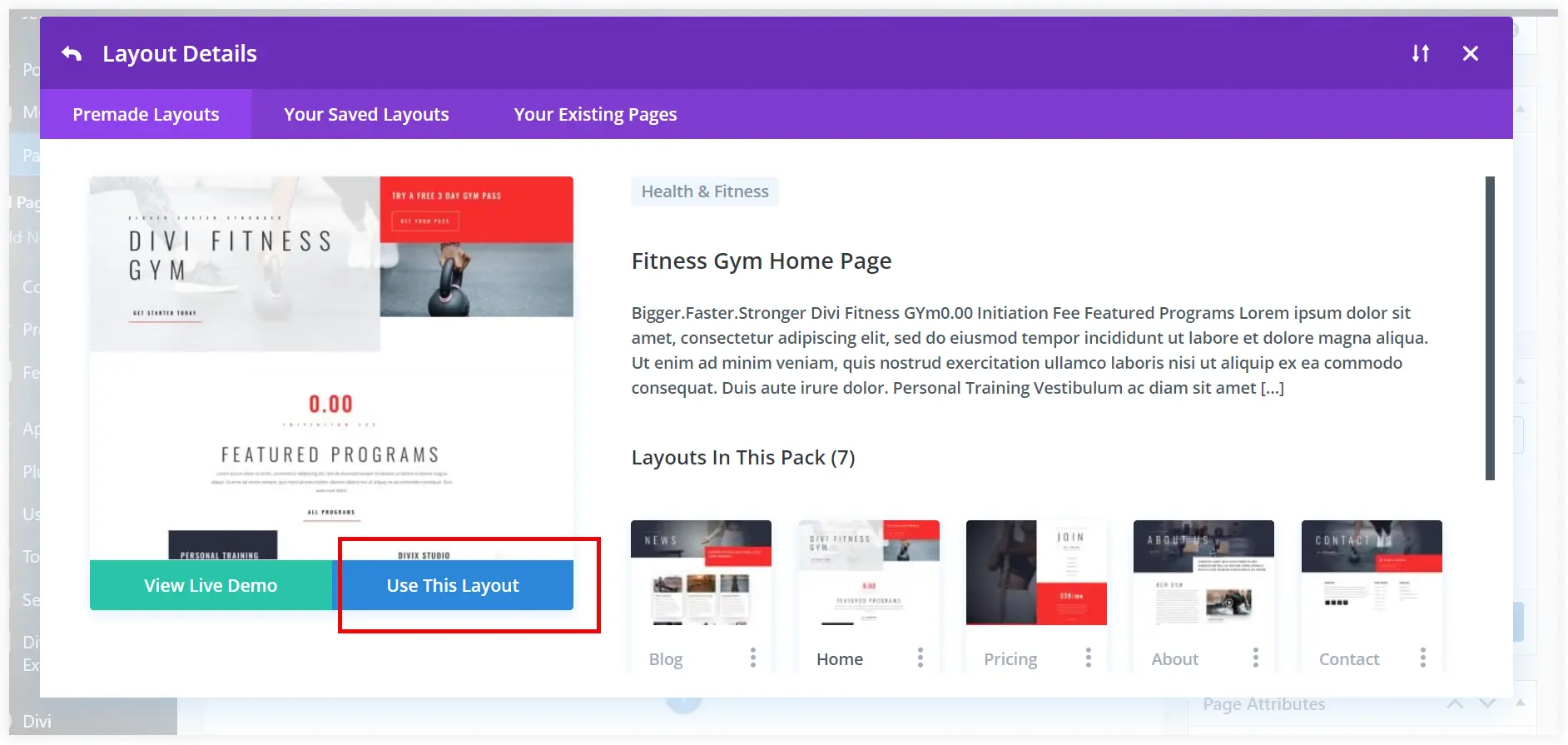
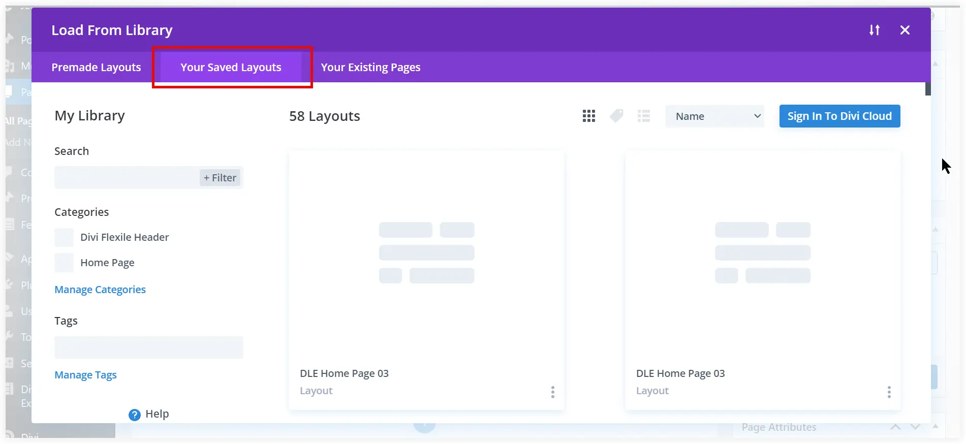
But we have decided to use the layout saved in Divi Library in the previous step. To do that click Your Saved Layouts tab and select the prebuilt WordPress homepage layout you saved in Divi Library. Use it.
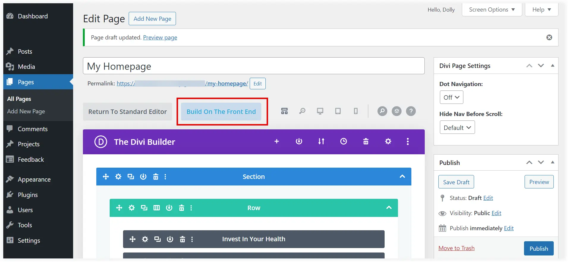
When you click Use This Layout, the entire layout will be carried to your homepage. Now click on the Built On The Front End button to start the editing and customization.
By default it will open in Wireframe mode of Divi Builder. Choose the desktop mode to view and edit elements with a better visual understanding.
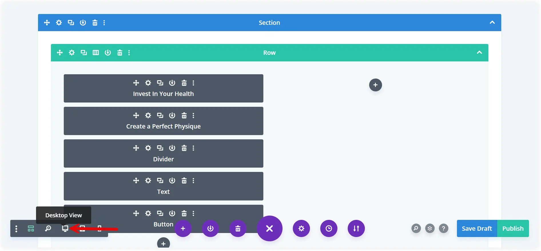
Select any Divi module in the desktop mode, edit the content and customize the styling. First change the heading as we planned earlier in the Divi Text module.
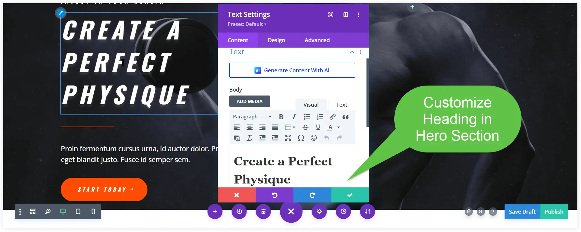
Change the content of the hero section according to the planned layout.
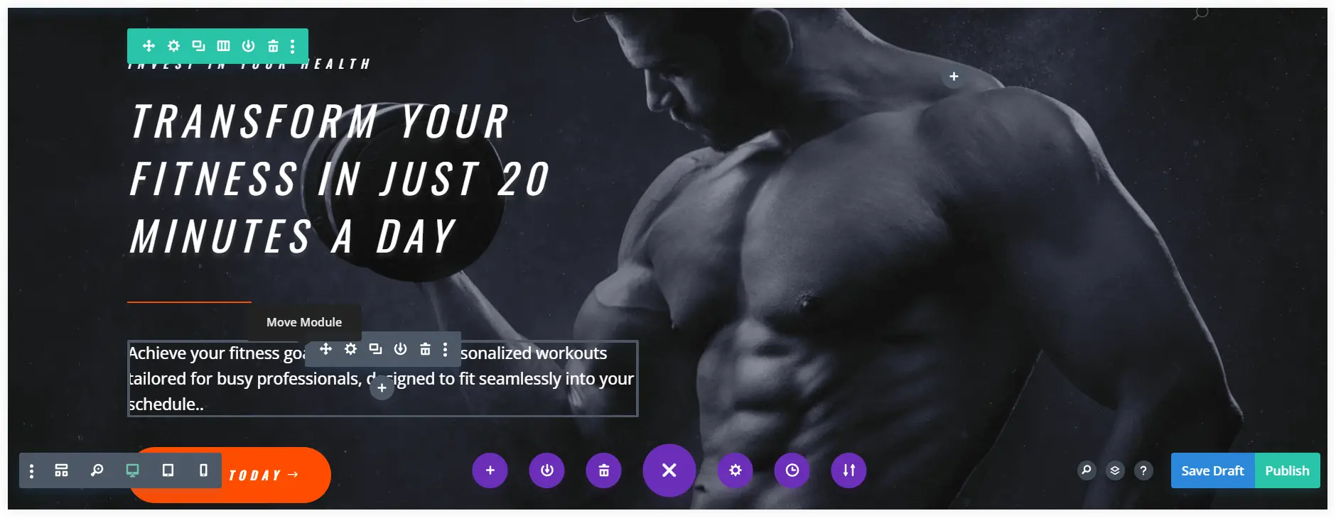
Similarly, you can modify the content of the value proposition section. Use the design options to customize the styling of a Divi module.
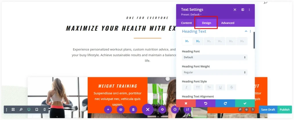
You can make the same customizations to each section of this premade homepage layout. The whole homepage design process is easy and interesting for beginners. Divi Builder allows you to show your creativity and make your website homepage stand tall in competition.
Create Homepage Design using Elementor Builder
If you use Elementor Page Builder, prebuilt Elementor templates are the perfect and easy solution. These ready-to-use homepage templates are customizable and can be personalized to align with your brand’s identity.
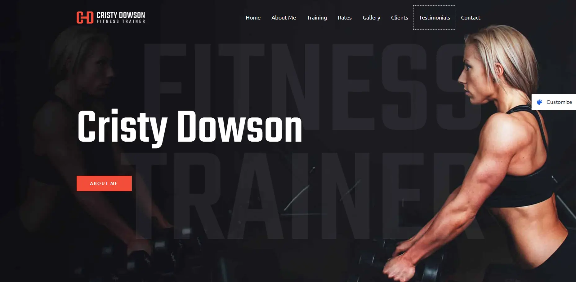
This time we will create a homepage using the premade Elementor templates and Elementor builder.
Ensure you have installed the Elementor page builder on your website before proceeding.
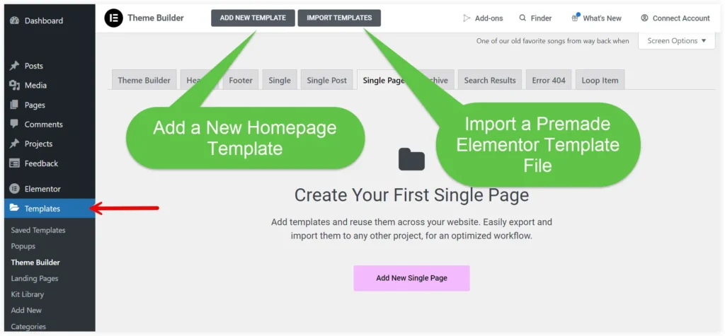
Go to the Template section of Elementor Builder from your WordPress dashboard. Now If you have downloaded an Elementor template file for your homepage, import it. If you want to explore the Elementor template library, click Add New Template to create a new page template. We will use this page template to create our homepage.
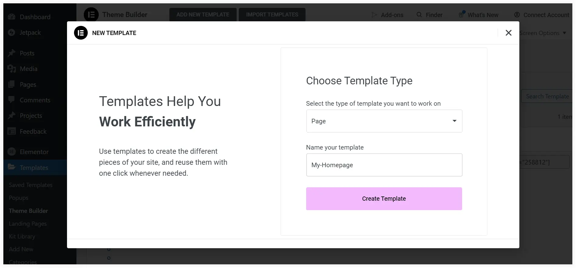
Select Template Type as ‘Page’ and give a unique name to your template. Click on Create Template.
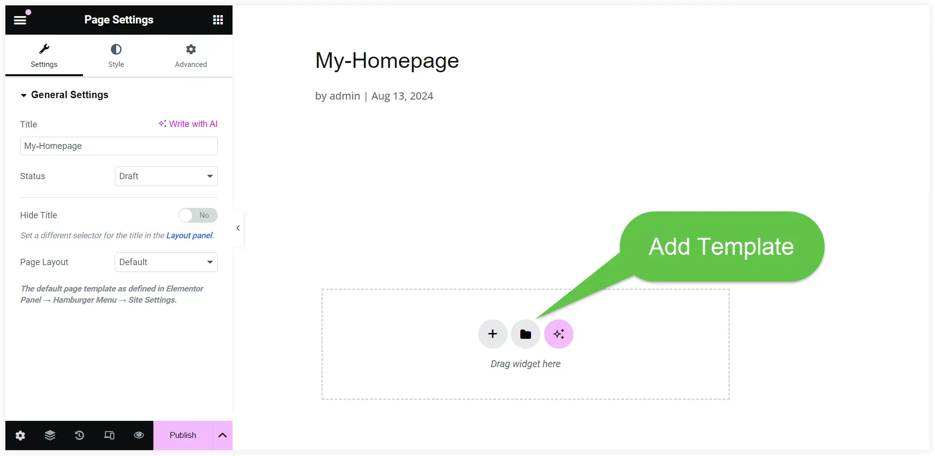
You will be redirected to the Elementor Page Builder area. Click on the Add Template icon.
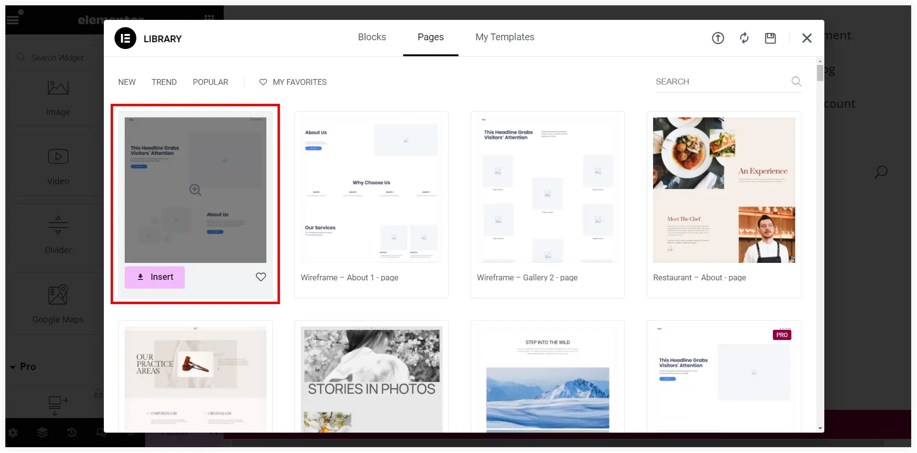
You can now search for a premade Elementor page template that fits the requirements of the homepage of your fitness coaching website. Click Insert to use it.
Edit the hero section of the premade homepage template with the planned content and style it to match for an instant remarkable introduction of your brand. Modify content in the Text Heading widget.
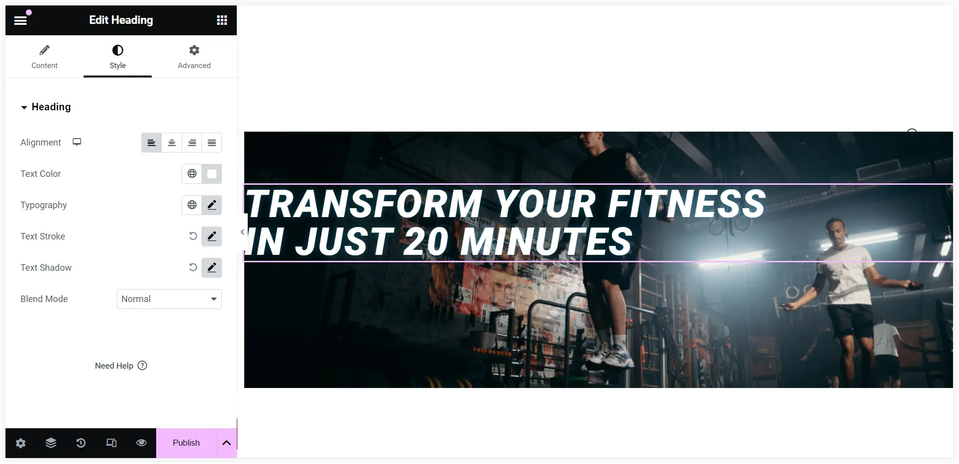
In the same way, you can customize the Value proposition and CTA section. In the CTA section, you can use the Inner Section widget to segment the container section into two columns.
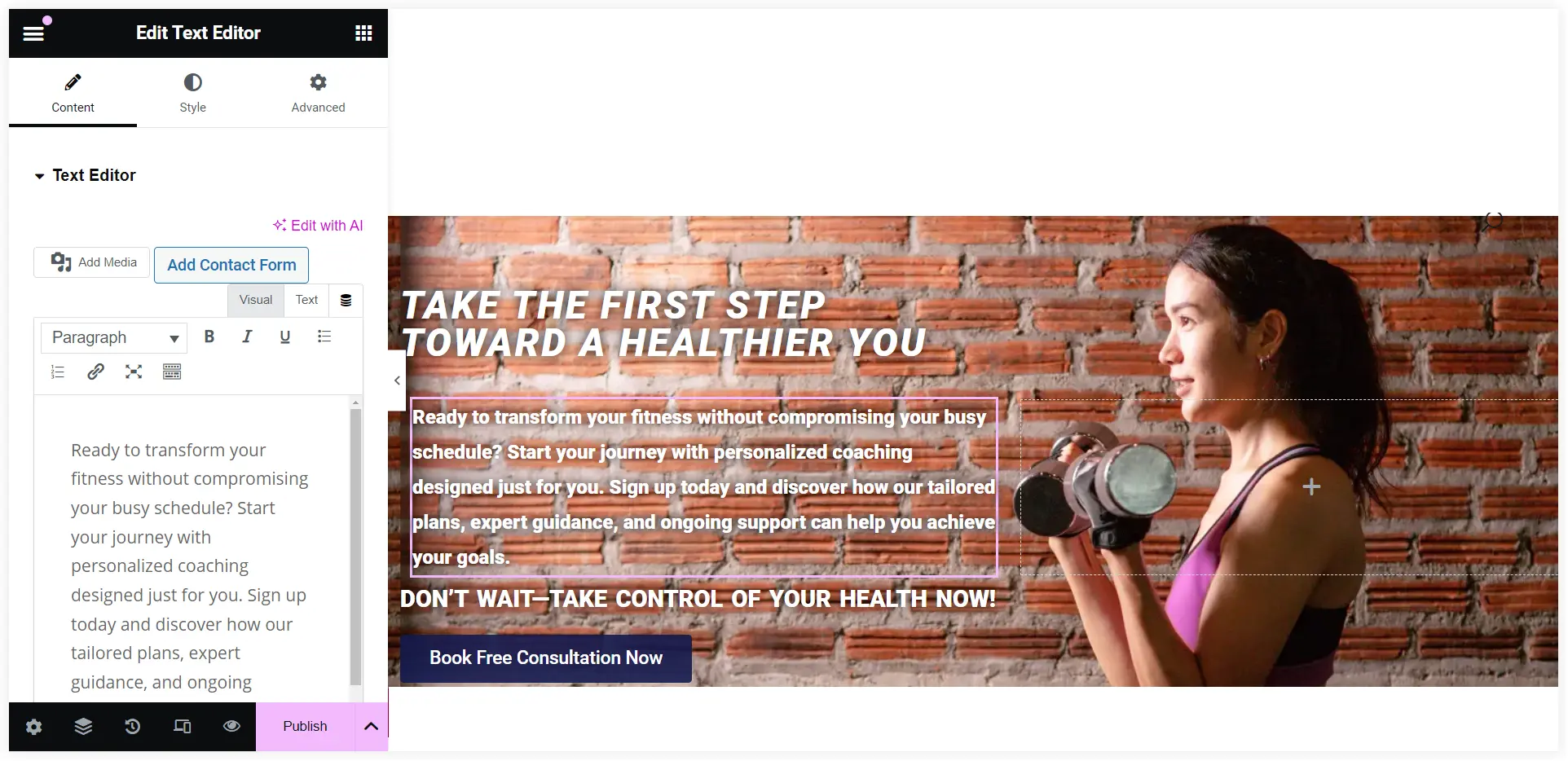
That’s simple. You can open your creativity and customize the homepage to make it look appealing and user-engaging. Explore more premade homepage templates to experiment with more customization possibilities.
You can also explore the WPMozo Addons for Elementor plugin to get some fantastic design elements that can take your WordPress homepage to the next level.
Set the Homepage of your WordPress Website
After designing let’s see how we can configure it to work as the homepage of your online fitness coaching website.
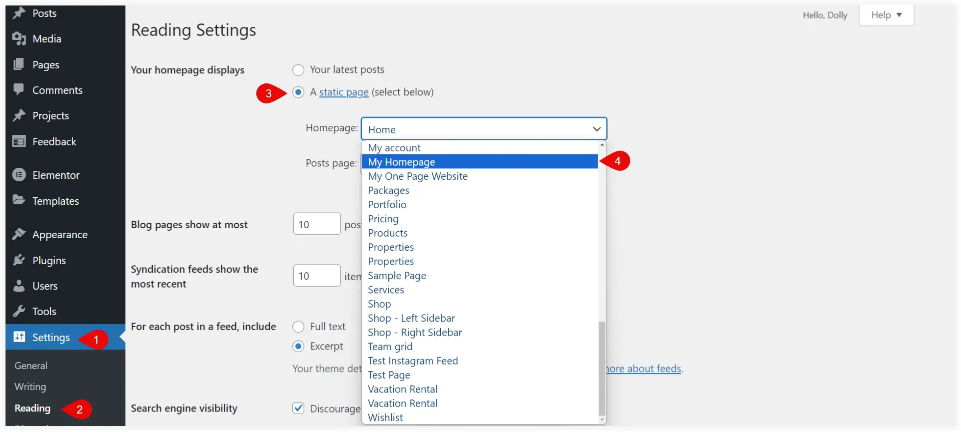
Go to your WordPress dashboard and navigate to Settings >> Reading. Select the ‘Static page’ option. Choose your created homepage and click Save Changes at the bottom.
Final Takeaway
Planning, creating, and setting homepage of a WordPress site is a crucial first step towards establishing your online brand. You should create a homepage that meets your business goals and looks excellent by understanding your audience, structuring your content efficiently, and designing with purpose. This step-by-step tutorial gives you a clear understanding of using WordPress themes, prebuilt layouts and page builders to create an ultimate WordPress homepage for your business website.
0 Comments