Addons for Elementor Documentation
Search for answers or browse our knowledge base.
Image Stack
The Elementor Image Stack Widget by WPMozo Addons lets you create a fun and interactive display of images, text, or icons in a stacked, card-like layout. It reveals content on hover, making your website more engaging for visitors. Perfect for showcasing portfolios, teams, or services with a modern design!
This widget comes free with WPMozo Addons Lite. To use it, simply install and activate the free version of plugin.
https://wordpress.org/plugins/wpmozo-addons-lite-for-elementor
How to add widget on page
To add the Image Stack widget, follow these steps.
- Create/edit a page/post that uses Elementor builder.
- Create/edit container.
- Search widget WPMozo Image Stack under WPMozo.
Content settings
Display options
Alignment: Choose left, center, or right to position your image stack on the page.
Image/Icon Size: Use a slider to set how big the images or icons appear in the stack.
Image/Icon Shrink: Adjust how much the images or icons shrink when they stack, using a slider.
Image/Icon Spacing: Set the gap between each image or icon in the stack with a slider.
Enable Tooltip: Select “YES” to show a small pop-up text when users hover over the stack.
Show Tooltip On: Choose the trigger option hover or click for displaying tooltip.
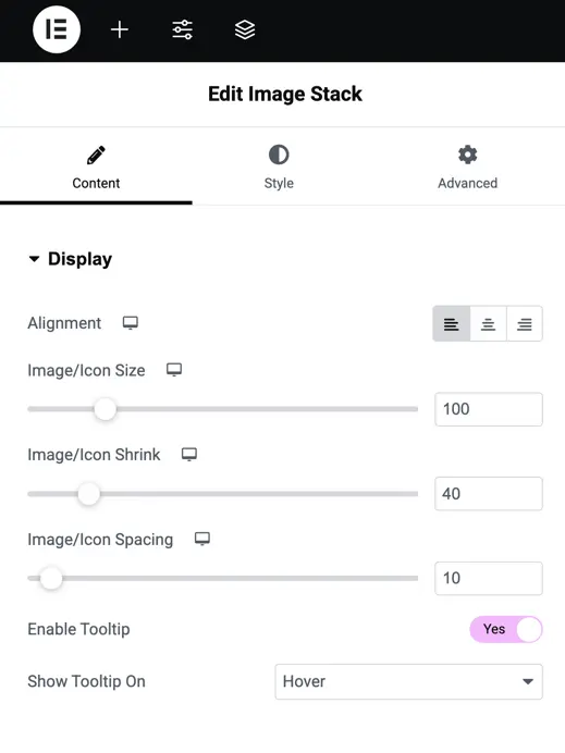
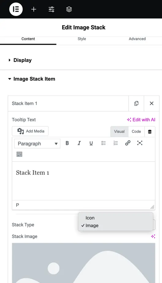
Image stack item settings
Tooltip Text: Add text for the tooltip that appears when users hover or click.
Stack Type: Choose between “Icon” or “Image” for the stack item content.
Stack Image: Upload or select an image for the stack item if “Image” is chosen as the stack type and select the icon for the stack item if icon is chosen as the stack type.
Customization options
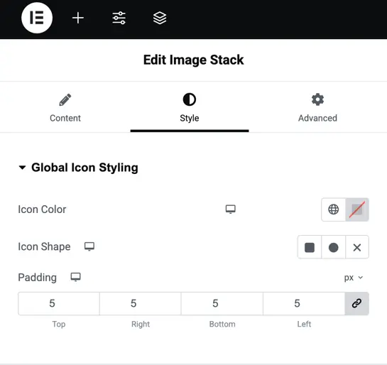
Global icon styling settings
- Icon Color: Choose a color for the icons in the stack using the color picker.
- Icon Shape: Select a shape for the icons, like square, circle, or none, from the dropdown.
- Padding: Adjust the space inside the icon area by setting values for top, right, bottom, and left.
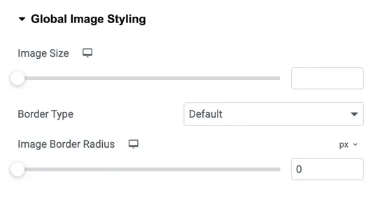
Global image styling settings
- Image Size: Adjust the size of all images in the stack using a slider.
- Border Type: Choose a border style for the images, like solid, dashed, or none, from the dropdown.
- Image Border Radius: Set how rounded the image corners are using a slider.
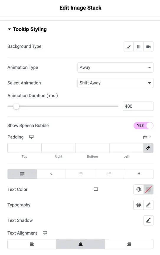
Tooltip styling settings
- Background Type: Choose a background style for the tooltip, like solid color or gradient.
- Animation Type: Select how the tooltip appears, such as “Away” from the dropdown.
- Select Animation: Pick a specific animation effect for the tooltip, like “Shift Away.”
- Animation Duration (ms): Set how long the animation takes using a slider.
- Show Speech Bubble: Choose “YES” to add a speech bubble style to the tooltip.
- Padding: Adjust the space inside the tooltip by setting values for top, right, bottom, and left.
- Text Color: Pick a color for the tooltip text.
- Typography: Change the font style of the tooltip text, like bold or italic.
- Text Shadow: Add a shadow behind the tooltip text to make it stand out.
- Text Alignment: Set the text position inside the tooltip to left, center, or right.