Addons for Elementor Documentation
Search for answers or browse our knowledge base.
Gravity Forms Styler
Transform your standard Gravity Forms into beautiful, on-brand contact elements with our powerful styler widget. Take full control over the design without writing a single line of CSS.
Prerequisites
Pre-installed “Gravity Forms” plugin.
- Install/Activate the Gravity Forms plugin.
Once the WPMozo Addons plugin is activated, it introduces several widgets to the Elementor builder. To add the Gravity Forms Styler widget, follow these steps:
- Open or edit a page or post that uses the Elementor builder.
- Create or edit a container.
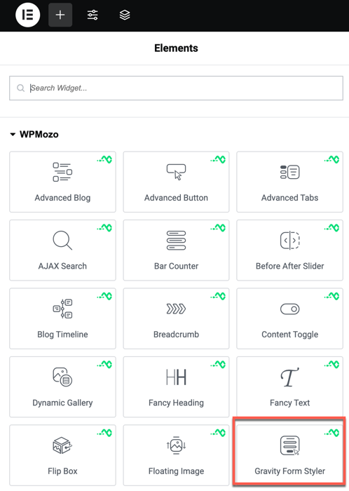
- In the widget search bar, type “Gravity Forms Styler” under WPMozo.
Overview
Gravity Forms is a powerful tool, but its default styling can be limited. Our styler widget gives you full control over every aspect of your form’s appearance, from input fields to the submit button.
Content settings
- Select Form: Choose any of your existing Gravity Forms from the dropdown list.
- Show Title & Description: Toggle whether to display the form’s native title and description.
Style settings
Form elements
- Input Field Styling: Customize background color, borders, and typography for all form fields.
- Submit Button Styling: Apply custom colors, gradients, and padding to the submit button.
- Label Typography: Control the font and color of the field labels.
- Error/Success Messages: Style the validation and confirmation messages.