Addons for Elementor Documentation
Search for answers or browse our knowledge base.
Image Hotspot
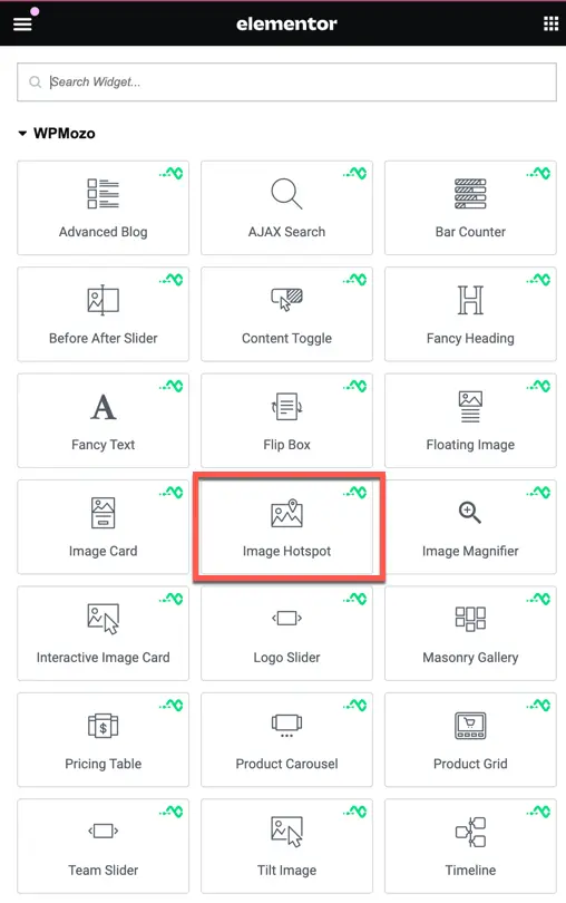
Once WPMozo Widgets is activated it adds a number of widgets to the Elementor builder. To insert the widget, use the following steps.
- Create/edit a page/post that uses Elementor builder.
- Create/edit container.
- Search widget Image Hotspot under WPMozo.
Content
The Image Hotspot Widget allows you to create interactive images with clickable hotspots. These hotspots can be used to display additional information.
Hotspot marker
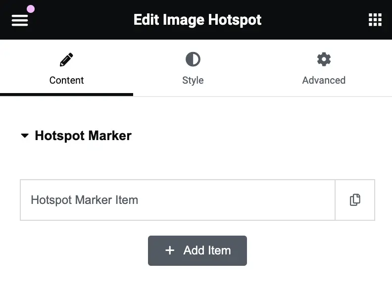
Hotspot Marker Item
This is where you add individual hotspot markers on your image. You can add multiple items by clicking the “Add Item” button. Each item represents a clickable point on the image.To create a new marker, click on “Add Item”, and customize its position, content, and style in subsequent settings.
Hotspot marker type
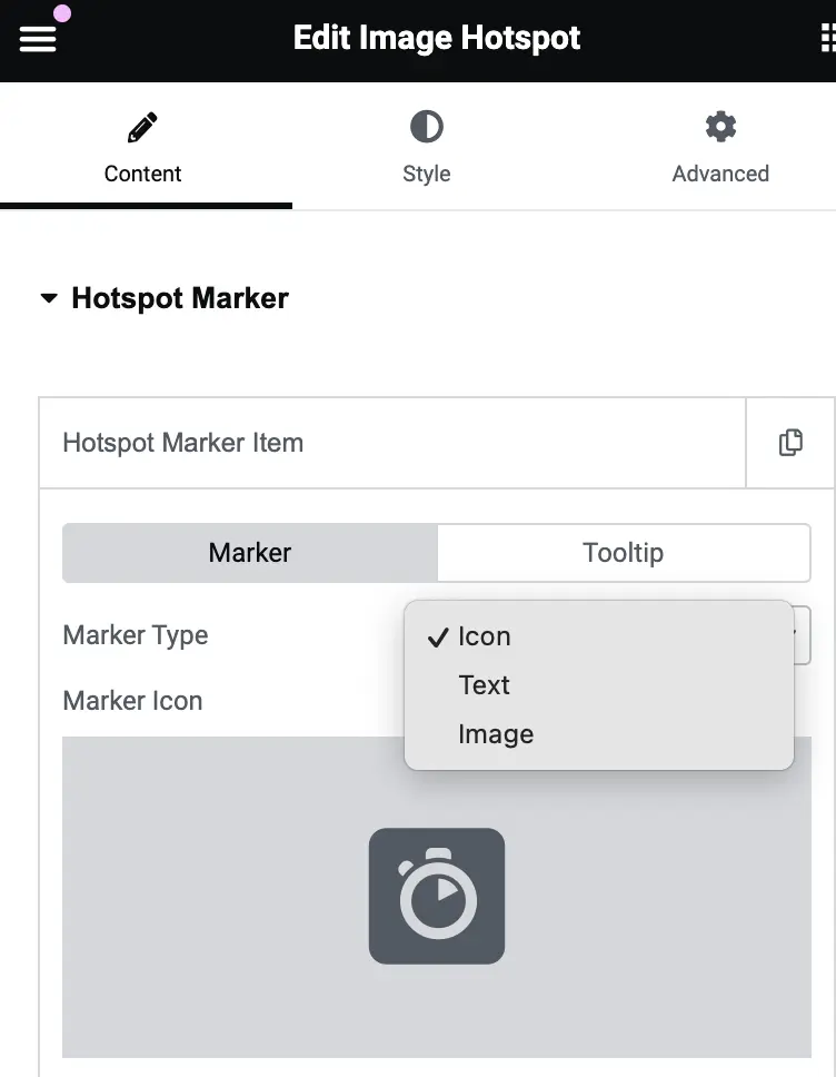
Marker Type:
- Defines the type of marker used to indicate the hotspot on the image.
- You can choose from the following options:
- Icon: Select a pre-defined icon to represent the hotspot.
- Text: Add a text label as the hotspot marker.
- Image: Upload an image to use as the marker.
Marker Icon
- When the Icon marker type is selected, this setting allows you to choose the specific icon to display. You can browse a selection of icons and pick one that best represents your hotspot.
Marker Text (Visible when Text is selected as Marker Type)
- Allows you to enter the text that will be displayed as the hotspot marker. This text will appear directly on the image and can be customized with different fonts, sizes, and styles (in the Style tab).
Marker Image (Visible when Image is selected as Marker Type)
- Enables you to upload a custom image to serve as the hotspot marker. This can be any image that best suits the design of your website or represents the specific hotspot area.
Marker settings
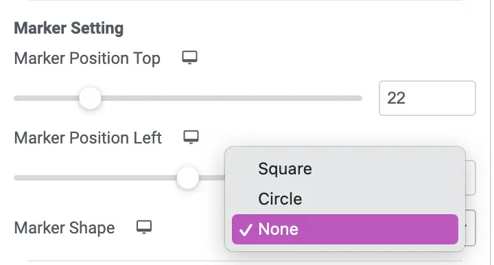
Marker Position Top: Adjust the top position of the marker on the image using the slider or entering a specific value.
Marker Position Left: Adjust the left position of the marker on the image. You can drag the slider or type in the exact value for precision.
Marker Shape: Choose the shape of the marker from the dropdown options:
- Square: Displays the marker with a square shape.
- Circle: Displays the marker with a circular shape.
- None: Removes any shape, leaving the marker without a background.
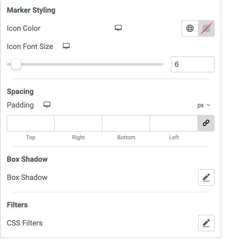
Marker styling
Icon Color: Allows you to select a color for the marker’s icon. Clicking the color box opens the color picker to customize.
Icon Font Size: Adjust the size of the marker’s icon using the slider or manually inputting a number.
Spacing
Padding: Customize the padding around the marker (Top, Right, Bottom, Left). You can input values or link them to apply uniform padding.
Box shadow
Box Shadow: Apply shadow effects to the marker, such as color, position, blur, and spread. This adds depth to the marker’s appearance.
Filters
CSS Filters: Apply CSS filters such as blur, brightness, contrast, or grayscale to modify the marker’s visual appearance.
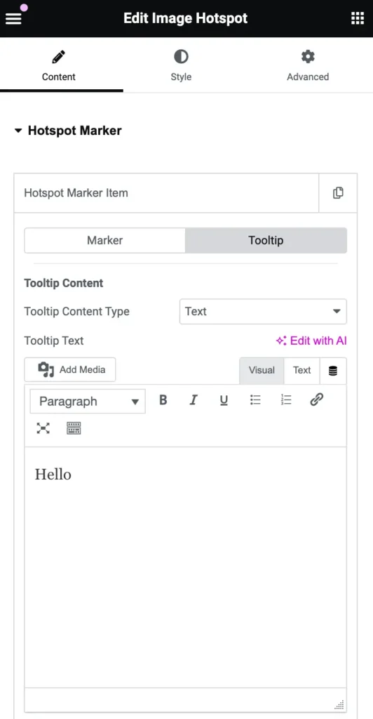
Tooltip content
Tooltip Content Type: Choose the type of content you want to display inside the tooltip. You can select between:
- Text
- Template
Tooltip Text: This is where you can input the text that will appear inside the tooltip when users hover over the marker. You can format the text using the editor options, such as adding bold, italics, or links.
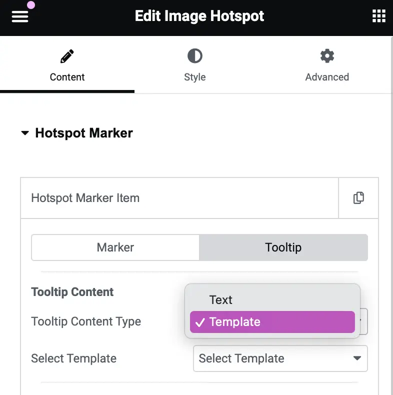
Select Template: If you choose the “Template” option for Tooltip Content, this dropdown lets you select which template to use from the available options.
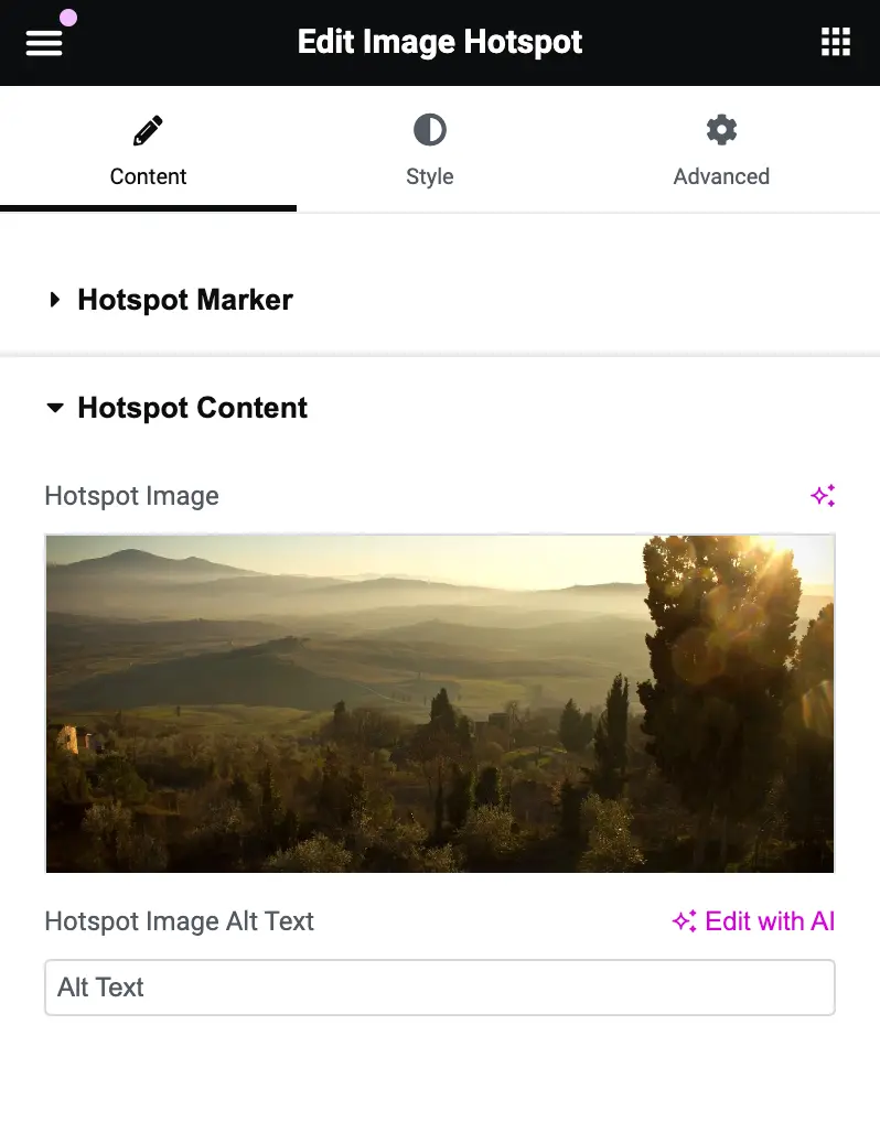
Hotspot content
Hotspot Image
This setting allows you to upload an image that will appear when someone interacts with the hotspot marker. The image will be displayed in the content section of the hotspot.
Hotspot Image Alt Text
In this field, you can provide a brief description (alternative text) for the hotspot image.
Design
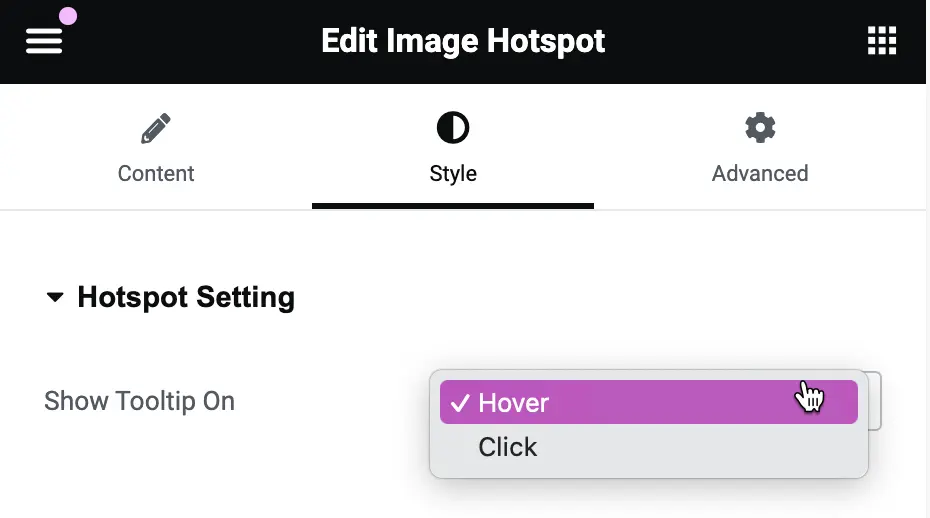
Show Tooltip On
This setting controls when the tooltip appears on the image hotspot.
Click: The tooltip will only appear when someone clicks on the hotspot.
Hover: The tooltip will appear when someone hovers over the hotspot with their mouse.
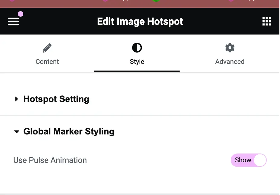
Global marker styling
Use Pulse Animation
This option controls whether the marker (hotspot) will have a pulsing animation effect.
Show: The marker will have a pulse effect that draws attention to it.
Hide: The marker will be static without any animation.
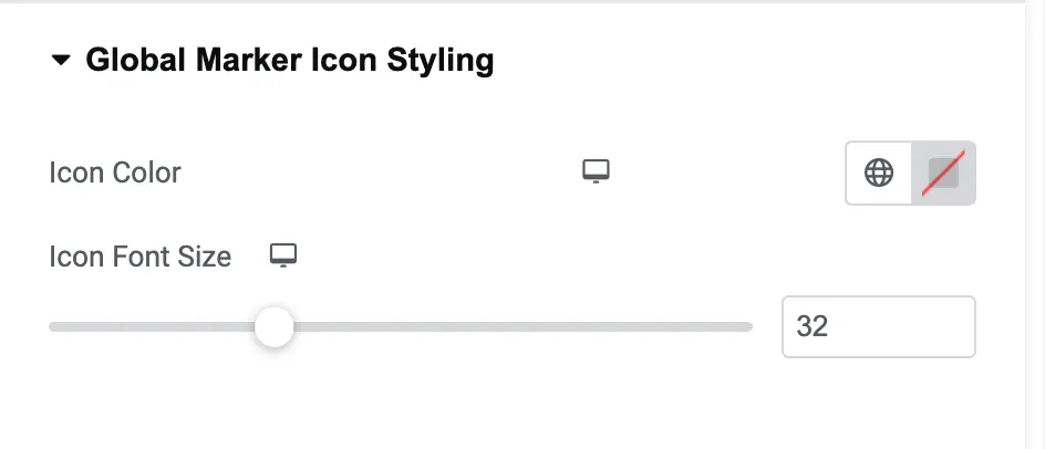
Global marker icon styling
Icon Font Size
This setting adjusts the size of the icon on the hotspot. You can change the size by dragging the slider or inputting a specific number.
Icon Color
This setting allows you to change the color of the icon displayed on the hotspot. Clicking the color box opens a color picker where you can select a new color.
Global marker image styling settings
Image Size
This setting allows you to adjust the size of the marker image. You can increase or decrease the image size depending on how prominent you want the marker to appear.
Border Type
This option lets you choose the type of border for the marker image. The default border type is “None,” but you can change it to a solid, dashed, or dotted border depending on your design preference.
Marker Image Border Radius
This setting controls the roundness of the marker image’s corners. A higher value will give the marker a more rounded appearance, while a lower value will make the corners sharper.
Global marker text styling settings
Marker Text Color
This setting allows you to choose the color of the text that appears on the marker. You can customize it to match your design by selecting any color from the color picker.
Typography
This option lets you control the typography of the marker text, including font style, weight (boldness), size, and spacing. You can adjust these settings to improve the readability and appearance of the text.
Text Shadow
This setting allows you to add a shadow effect to the marker text. You can control the color, strength, and direction of the shadow, giving the text a more dynamic or highlighted appearance.
Marker Text Alignment
This option allows you to adjust the alignment of the text within the marker. You can align the text to the left, center, or right depending on your design preference.
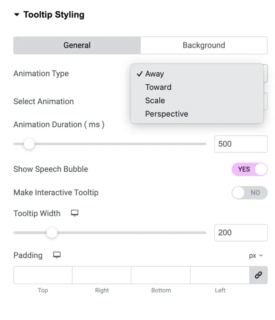
Tooltip styling settings
Select Animation
This option allows you to choose the type of animation for your tooltip. You can select from:
- Shift Away: The tooltip shifts away from the element.
- Shift Away Subtle: A more subtle version of the “Shift Away” animation.
- Shift Away Extreme: A more exaggerated version of the “Shift Away” animation.
Animation Type
This option lets you define how the tooltip will animate in relation to the element. You can choose from:
- Away: The tooltip will move away from the element.
- Toward: The tooltip will move toward the element.
- Scale: The tooltip will grow or shrink in size.
- Perspective: The tooltip will animate with a 3D perspective effect.
Animation Duration (ms)
This option allows you to set how long the tooltip animation will take. The time is in milliseconds. For example, 500ms means the animation will last half a second.
Show Speech Bubble
You can toggle this option to show or hide a speech bubble effect on the tooltip.
- Yes: Shows the speech bubble.
- No: Hides the speech bubble.
Make Interactive Tooltip
This option allows you to make the tooltip interactive. When enabled, users can hover over and interact with the tooltip.
- Yes: The tooltip will be interactive.
- No: The tooltip will not be interactive.
Tooltip Width
This setting allows you to adjust the width of the tooltip. You can increase or decrease the width based on how much content you want the tooltip to display.
Padding
This option lets you set the amount of space around the content inside the tooltip. You can set padding for the top, right, bottom, and left sides separately, giving you more control over the spacing.