Search for answers or browse our knowledge base.
Dropdown Button
This widget comes free with WPMozo Addons Lite. To use it, simply install and activate the free version of plugin.
How to add widget on page
Once the WPMozo Addons plugin is activated, it introduces several widgets to the Elementor builder. Among them, you can use the widget by simply dragging and dropping it into your layout. To add the widget, follow these steps:
- Create/edit a page/post that uses Elementor builder.
- Create/edit container.
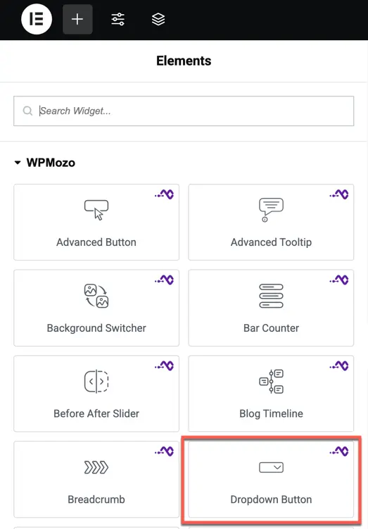
- Search widget Dropdown Button under WPMozo.
Content options
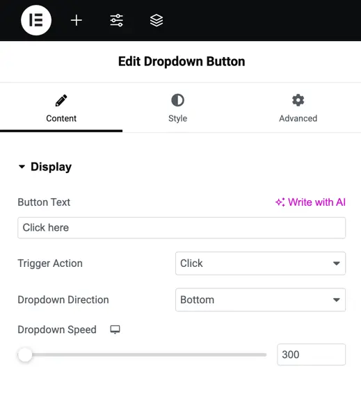
Display
- Button Text – Set the text displayed on the dropdown trigger button.
- Trigger Action – Select whether the dropdown opens on Click or Hover.
- Dropdown Direction – Decide where the dropdown will appear: Bottom, Top, Right, or Left.
- Dropdown Speed – Control how quickly the dropdown opens and closes.
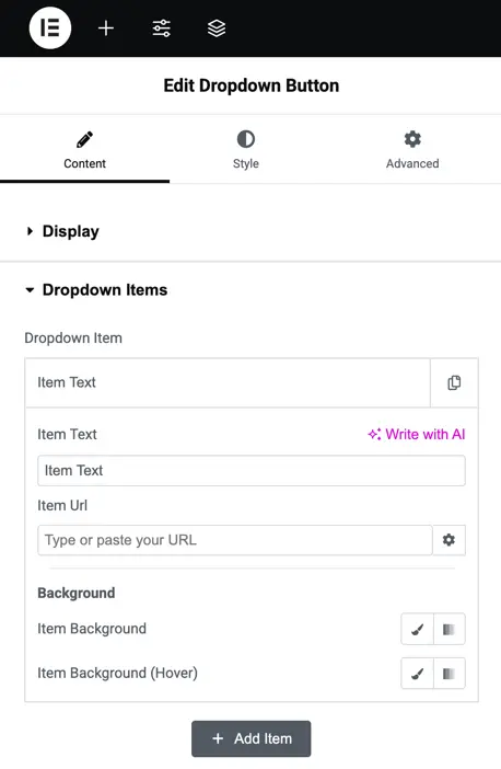
Dropdown items
Dropdown Items settings let you manage the content and style of each item in your dropdown menu.
- Dropdown Item – Add and configure each menu item.
- Item Text – Enter the label that will be displayed in the dropdown.
- Item URL – Set the link for the item.
- Background – Choose the background style for the dropdown list.
- Item Background – Select the background color for each item.
- Item Background Hover – Set the background color that appears when hovering over an item.
- Add Item – Click to create and configure a new dropdown item.
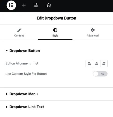
Style options
Dropdown Button – Adjust the button alignment (left, center, right) and enable custom styling for the button to change its typography, colors, borders, and hover effects.
Dropdown Menu – Customize the menu’s appearance, including background color, borders, padding, and shadow for the dropdown container.
Dropdown Link Text – Style the text inside dropdown items by changing typography, size, color, spacing, and hover effects for better readability and design.