WPMozo Addons for Elementor Documentation
Search for answers or browse our knowledge base.
Hero Slider
The Hero Slider widget allows you to create engaging hero sections with text, images, videos, and buttons in a sliding format. You can fully customize each slide’s content, layout, and style to fit your design needs.

Add widget on page
Once WPMozo Addons is activated it adds a number of widgets to the Elementor builder. To insert the widget, use the following steps.
- Create/edit a page/post that uses Elementor builder.
- Create/edit container.
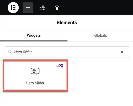
- Search widget Hero Slider under WPMozo.
Content settings
Items
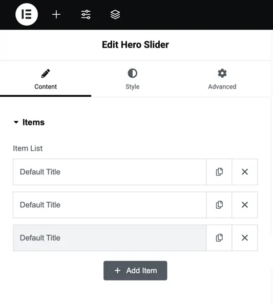
- Item List – Add multiple slides with unique content. Each item can include a title, subtitle, description, image/video, and buttons.
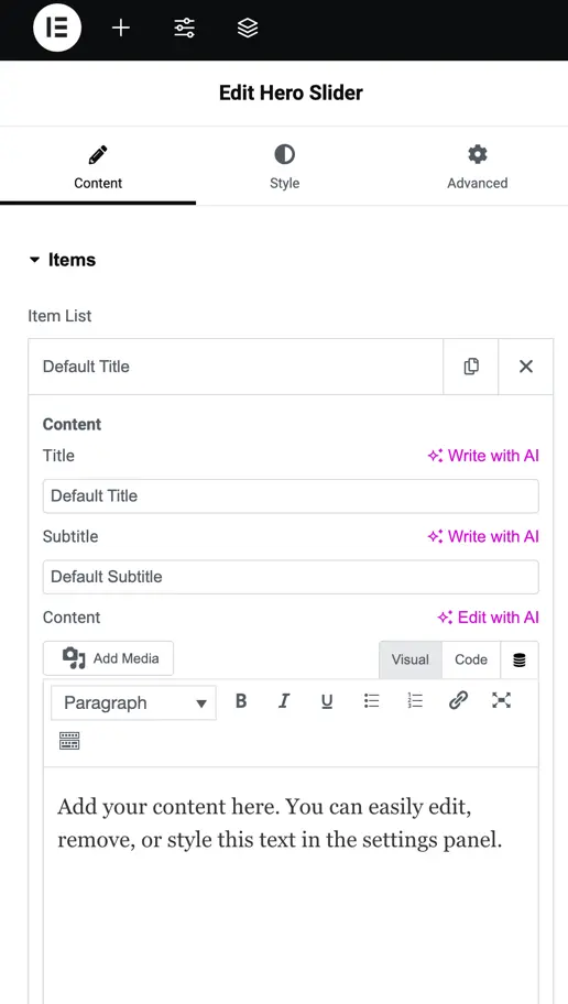
- Title / Subtitle / Content – Enter text for each slide. You can also style it later in the Style tab.
- Image/Video – Choose to use an image or enable video as the slide background.
- Primary Button – Toggle on/off, customize text, and link to any URL.
- Secondary Button – Optionally enable a second button with its own text and link
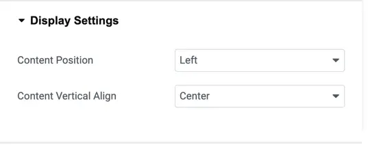
Display settings
- Content Position – Align content to the Left, Right, or Alternate (slides will switch sides automatically).
- Content Vertical Align – Choose whether the content should appear at the Top, Center, or Bottom of the slide.
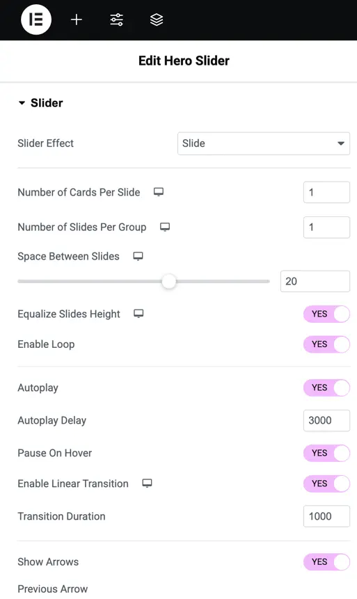
Slider settings
- Slider Effect – Select from effects such as Slide, Cube, Overflow, or Flip.
- Number of Cards Per Slide – Define how many slides appear at once.
- Number of Slides Per Group – Move multiple slides together when sliding.
- Space Between Slides – Adjust the gap between slides (in px).
- Equalize Slides Height – Keep all slides at the same height.
- Auto Height – Enable automatic height adjustment based on content.
- Loop – Restart slides continuously.
- Autoplay – Automatically cycle through slides.
- Linear Transition – Smooth slide effect.
- Transition Duration – Set the speed of slide transitions (in ms).
- Navigation Arrows – Show or hide previous/next arrows.
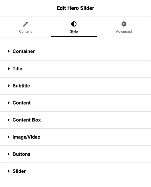
Style settings
Container
- Justify Content – Control spacing/alignment of the content inside the slide.
- Gap – Set space between slide elements (in px).
Title / Subtitle / Content
- Heading Level – Choose heading tag (H1–H6).
- Alignment – Align text left, center, or right.
- Normal / Hover Styles – Separate styling for static and hover states.
- Text Color & Typography – Customize font, weight, size, letter spacing, and shadow.
Content box
- Customize background color, padding, borders, and spacing for the content box wrapping the slide text and buttons.
Image/Video
- Adjust image size, overlay, background color/gradient, and video fit settings.
Buttons
- Customize both primary and secondary buttons with text color, background color, hover effects, border radius, typography, and spacing.
Slider
- Control arrow size, color, positioning, pagination dots styling, and spacing.