Addons for Elementor Documentation
Search for answers or browse our knowledge base.
Timeline
Once the WPMozo Addons plugin is activated, it adds several widgets to the Elementor builder. To insert the Timeline widget, follow these steps.
- Create/edit a page/post that uses Elementor builder.
- Create/edit container.
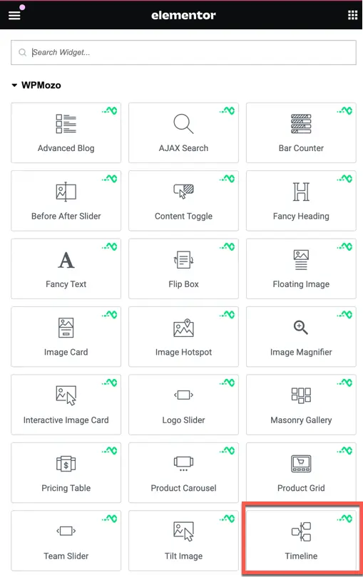
- Search widget Timeline under WPMozo.
Content
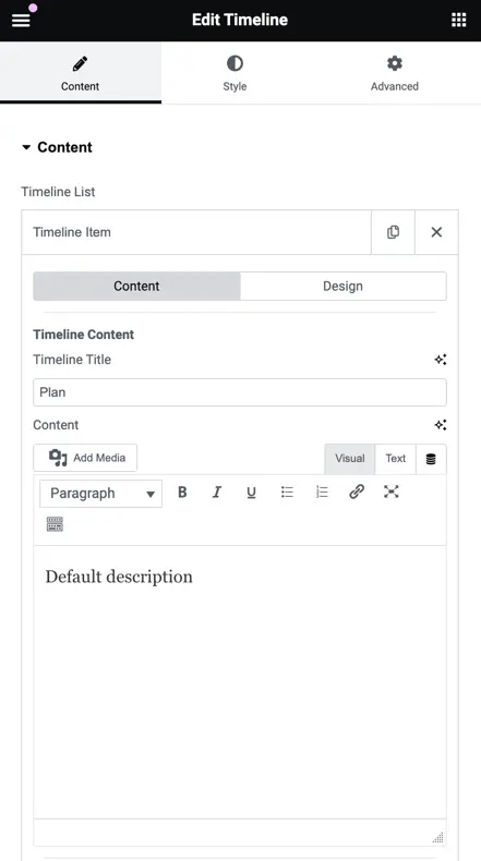
Timeline List
The Timeline List section allows you to manage timeline items efficiently. To add a new item to the timeline, simply click on the “Add Item” button. After adding an item, you will have access to both content and design options, enabling you to customize each timeline entry to fit your needs perfectly.

For each timeline item, you have the option to specify a title and content, allowing you to provide detailed information and context for each point in the timeline.
Once you have added the title and description of the timeline item, you can include the time on your timeline. To do this, use the “Display Time” toggle. Once enabled, you can choose to add time using either the Custom option or the Date Picker.
Additionally, you can set a timeline icon or image and customize the background type for the timeline. The background type options include Classic, Gradient, and Video:
- Classic: Choose a solid color or set an image as the background.
- Gradient: Select two colors and set the type and position of the gradient.
- Video: Use a video as the background for dynamic and engaging timeline entries.

If you have set the background type to Video, you will have several additional options. You can set the video link and specify the start and end times. Further options include:
- Play Once: Choose whether the video should play only once.
- Play on Mobile: Decide if the video should play on mobile devices.
- Privacy Mode: Enable privacy mode for the video.
- Background Fallback: Select a background image to replace the video if it is unavailable.

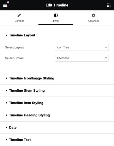
Style
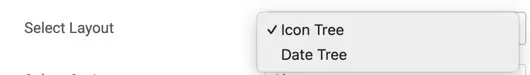
In the Global Design options for the timeline, you can customize the overall layout. You have two layout choices: Icon Tree and Date Tree. Additionally, you can select the alignment for the timeline content with the following options:
- Alternate: Content alternates sides for each timeline item.
- Content Right: All content is aligned to the right.
- Content Left: All content is aligned to the left.

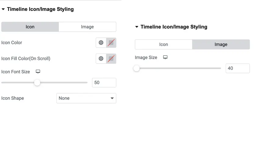
Timeline Icon/Image styling
In the Timeline Icon/Image Styling section, you can customize the appearance of icons and images in your timeline.
- Icon Customization:
- Icon Color: Choose the color of the icon.
- On Scroll Icon Fill Color: Set the fill color of the icon when scrolled.
- Icon Font Size: Define the size of the icon font.
- Icon Shape: Choose between a square or circle shape for the icon.
- Image Customization:
- Image Size: Set the size of the image.
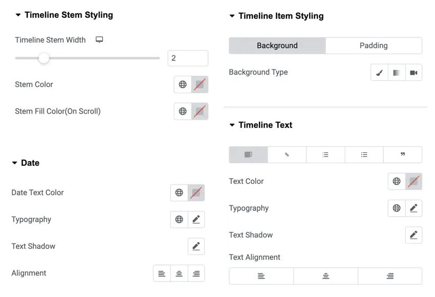
Timeline stem and item styling
In this section, you can customize various aspects of the timeline stem and timeline item styling:
Timeline Stem Customization:
- Stem Width: Set the width of the timeline stem.
- Stem Color: Choose the color of the stem.
- On Scroll Stem Fill Color: Set the fill color of the stem when scrolled.
Timeline Item Styling:
- Background Type: Choose the background type for timeline items, with options including Classic, Gradient, and Video.
Date Customization:
- Date Text Color: Choose the color of the date text.
- Typography: Customize the typography for the date text.
- Text Shadow: Add a shadow to the date text.
- Alignment: Set the alignment for the date text.
Timeline Text Styling:
- Text Color: Choose the color of the timeline text.
- Typography: Customize the typography for the timeline text.
- Text Shadow: Add a shadow to the timeline text.
- Text Alignment: Set the alignment for the timeline text.
Heading styling
In the Heading Styling section, you can customize the appearance of your headings with the following options:
- Heading Text Color: Choose the color of the heading text.
- Typography: Customize the typography for the heading text.
- Text Shadow: Add a shadow to the heading text.
- Alignment: Set the alignment for the heading text.
