Addons for Elementor Documentation
Search for answers or browse our knowledge base.
Split Image
The Split Image widget allows you to divide an image into multiple interactive segments, creating a unique and engaging visual effect. You can customize the number of rows and columns, adjust spacing, and style each split portion effortlessly. This widget is completely free and ideal for creative layouts, galleries, and hover-based designs.
How to add widget on page
Once the WPMozo Addons plugin is activated, it adds several widgets to the Elementor builder. To insert the Before After Slider widget, follow these steps.
- Create/edit a page/post that uses Elementor builder.
- Create/edit container.
- Search widget Split Image under WPMozo.
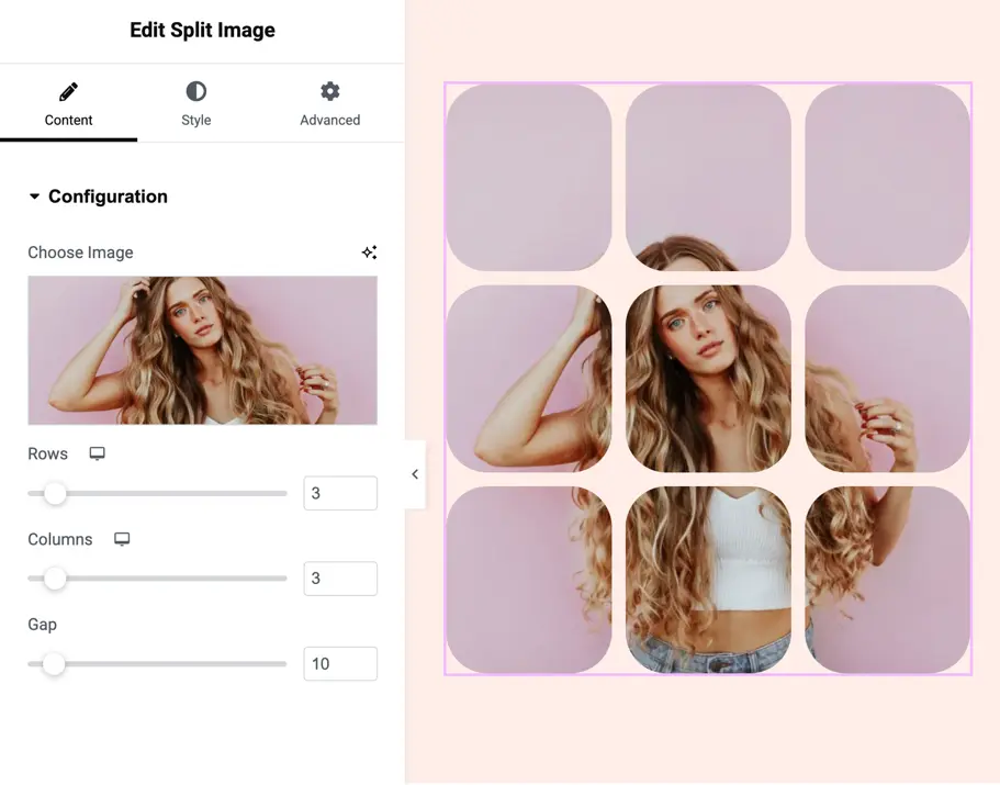
Configuration
Choose image
Upload or select the image you want to split into multiple parts.
Rows
Set how many horizontal divisions the image should have.
Default: 3
Columns
Define how many vertical divisions the image should have.
Default: 3
Gap
Controls the spacing between split portions in pixels.
Default: 10px
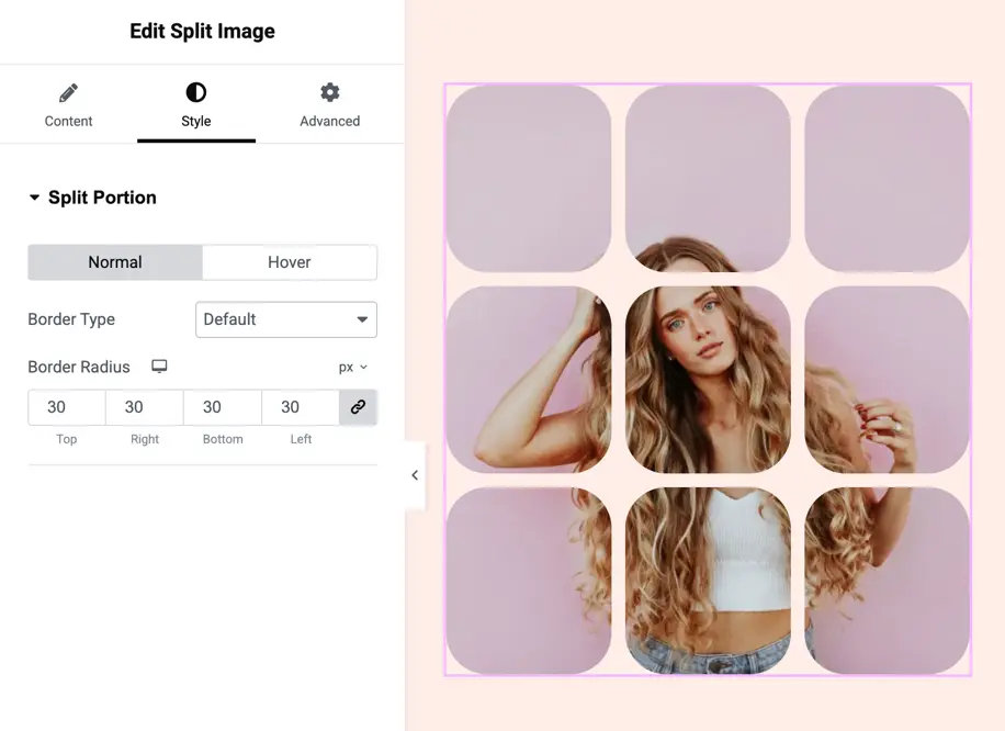
Split portion settings
These settings control how each image portion looks in Normal and Hover states.
Border Type
Choose the border style for image segments:
- Default
- None
- Solid
- Double
- Dotted
- Dashed
- Groove
Border radius
Round the corners of each image portion individually.
You can set radius for:
- Top
- Right
- Bottom
- Left