Addons for Elementor Documentation
Search for answers or browse our knowledge base.
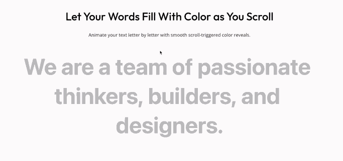
Scroll Text
This widget is included in the free version of WPMozo Addons for Elementor. To display animated scrolling text on your site, simply install and activate the WPMozo Addons Lite plugin. Download link:
https://wordpress.org/plugins/wpmozo-addons-lite-for-elementor
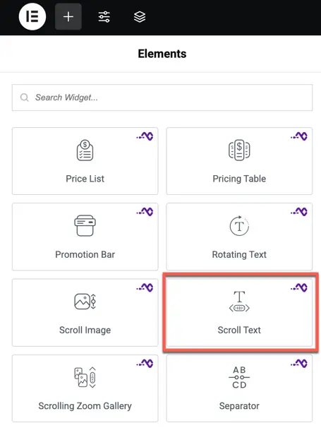
How to add widget on page
Once the WPMozo Addons plugin is activated, it adds a number of widgets to the Elementor builder. To insert the widget, use the following steps.
- Create/edit a page/post that uses Elementor builder.
- Create/edit container.
- Search widget Scroll Text under WPMozo.
- Drag and drop the widget onto your page.
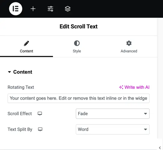
Content settings
Text options
Text
This is where you enter the main text that will be animated.
This text will be used for applying scroll and rotation effects.
Rotation text
Use this setting to enable rotating animations for specific parts of the text.
Options may include:
- Rotate by Word
- Rotate by Letter
This makes your text dynamic and eye-catching as it scrolls.
Scroll effect
Add visual effects that activate while scrolling.
- Fade – Text gradually appears or disappears.
- Blur – Text becomes sharp or blurred during scroll.
- Color – Color of the text changes as it scrolls into view.
Text Split By
Control how the text breaks for the scroll animation.
Options:
- Word – Each word animates separately.
- Letter – Each letter animates individually.
Animation settings
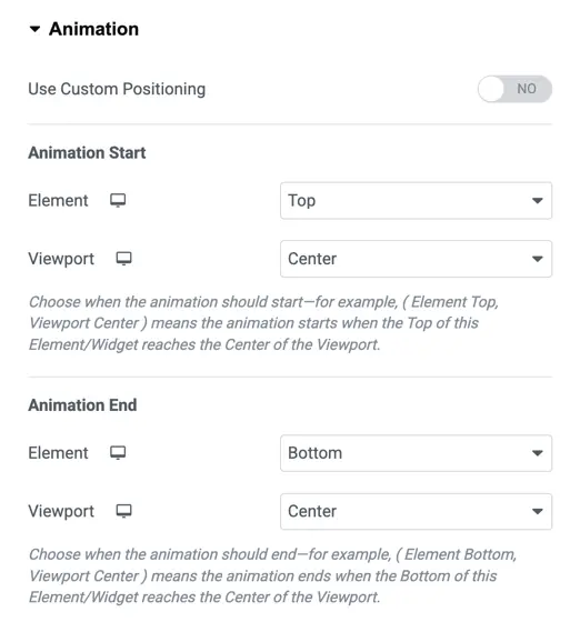
This section explains how to control when and how the scroll animation starts and ends, based on the element’s position in the viewport.
Use custom positioning
Toggle this setting to enable or disable custom animation positioning.
- YES – You can manually define when the animation starts and ends.
- NO – Default animation behavior will be applied.
Animation start
Define when the animation should begin as the element enters the screen.
You’ll need to set:
Element
This refers to the part of the element used as the reference point for the animation to start.
Options:
- Top
- Center
- Bottom
Viewport
This refers to where in the user’s screen the animation should trigger in relation to the element.
Options:
- Top
- Center
- Bottom
Example: If you choose Element: Top and Viewport: Bottom, the animation will start when the top of the element reaches the bottom of the screen.
Animation end
Define when the animation should finish.
You’ll again set both:
Element
- Bottom
- Top
- Center
Viewport
- Center
- Top
- Bottom
This lets you fine-tune how long the animation stays in effect as the user scrolls.
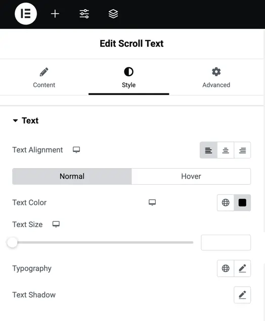
Style options
This section helps you style your scroll text to match your design, with controls for alignment, size, colors, typography, and shadows.
Text alignment
Set the horizontal position of your text inside the container.
Options:
- Left – Aligns text to the left side.
- Center – Places text in the middle.
- Right – Aligns text to the right side.
You can set different alignments for Normal and Hover states.
Text color
Choose the color of your text.
- Set a color for normal view.
- You can also set a different color when hovered.
Use this to highlight your text during interaction.
Text size
Control how big or small the text appears.
You can:
- Choose a value in
px,em, or% - Set different sizes for desktop, tablet, and mobile devices
Typography
Customize how the text looks with detailed font settings:
- Font Family – Choose the font style (e.g., Roboto, Montserrat)
- Font Weight – Make the text thin, normal, bold, etc.
- Line Height – Space between lines of text
- Letter Spacing – Space between each letter
- Text Transform – Make text all uppercase, lowercase, or capitalize the first letter of each word
- Font Style – Set the text to normal, italic, or oblique
Text shadow
Add a shadow effect behind the text for depth or focus.
Customize:
- Shadow Color
- Horizontal Position
- Vertical Position
- Blur Strength
This is helpful to make text stand out from background images or colors.