Addons for Elementor Documentation
Search for answers or browse our knowledge base.
Scroll Stack Cards
The Scroll Stack Cards widget allows you to display multiple cards in scrolling stack layout, create a modern visual experience. Each card can include a title, description, image, icon, and button, all fully customizable. It is perfect for showcasing services and features with interactive scrolling effects.
This widget comes free with WPMozo Addons Lite. To use it, simply install and activate the free version of plugin.
How to add widget on page
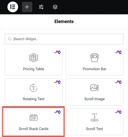
Once the WPMozo Addons plugin is activated, it introduces several widgets to the Elementor builder. Among them, you can use the widget by simply dragging and dropping it into your layout. To add the widget, follow these steps:
- Create/edit a page/post that uses Elementor builder.
- Create/edit container.
- Search widget Scroll Stack Cards under WPMozo.
Content options
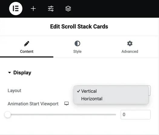
Display
Layout – Select the arrangement of the cards: Vertical or Horizontal.
Animation Start Viewport – Set the point in the viewport where the animation begins as the user scrolls.
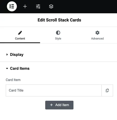
Card Items
Card Item – Represents each individual card in the widget.
Card Title – Set the title text for the card.
Item Content – Add descriptive text or details for the card.
Card Image – Upload or select an image to display on the card.
Show Icon – Toggle to display or hide an icon on the card.
Show Button – Toggle to display or hide a button on the card.
Background – Choose a background color or image for the card.
Card Background – Apply a background fill effect for the card (if available).
Color Image – Adjust or apply color styling to the card image.
Add Item for New Item – Use this option to add additional cards to the widget.
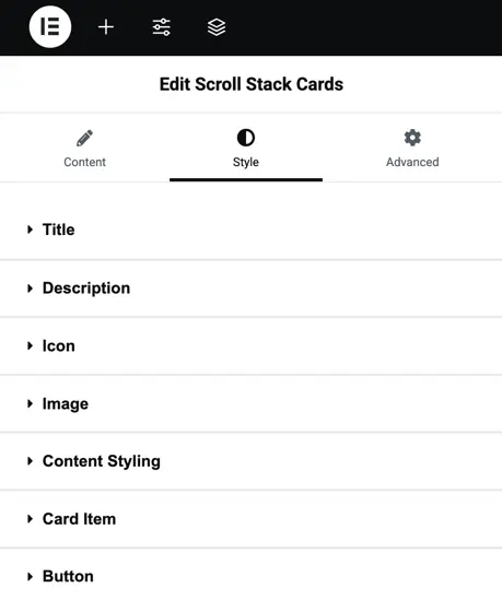
Style options
Title – Customize the card title by adjusting its typography and color to match your design.
Description – Style the text content under the title with options for font, size, color, and alignment.
Icon – Modify the icon’s size, color, padding, and alignment for better visual appeal.
Image – Control the image’s size, border, radius, and shadow to enhance its appearance.
Content Styling – Adjust the padding, alignment, and background for the card’s content area.
Card Item – Customize each card item’s background, border, and shadow for a unique card design.
Button – Style the button by setting its typography, colors, borders, and hover effects.