Addons for Elementor Documentation
Search for answers or browse our knowledge base.
Scroll Image
This widget comes free with WPMozo Addons Lite. To use it, simply install and activate the free version of plugin.
https://wordpress.org/plugins/wpmozo-addons-lite-for-elementor
How to add widget on page
Once WPMozo Addons is activated it adds a number of widgets to the Elementor builder. To insert the widget, use the following steps.
- Create/edit a page/post that uses Elementor builder.
- Create/edit container.
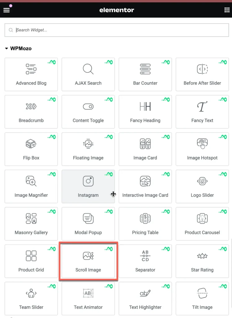
- Search widget Scroll Image under WPMozo.
Content tab – image settings
Image
Upload or choose the image you want to display in the Scroll Image module. This is the main image that will appear on your page.
Image Alt Text
Enter a short description of the image content. This helps with accessibility and SEO. It is displayed when the image fails to load or when a screen reader is used.
Image Title Text
Enter a title for the image. This is often shown as a tooltip when the user hovers over the image.
Configuration settings
Scroll Direction
Choose the direction in which the image should scroll. Options typically include Top, Bottom, Left, or Right.
Scroll Speed
Set how fast the image scrolls, measured in milliseconds (ms). A higher number means slower scrolling.
Image Container Width
Adjust the width of the image container in percentage (%). For example, 100% makes it full width of the container.
Image Alignment
Align the image within the container. You can align it to the left, center, or right.
Image Container Height
Set the height of the image container in pixels (px). This defines how tall the image display area will be.
Link settings
Widget Link URL
Enter the URL you want the image to link to. When users click the image, they will be redirected to this web address.
Widget Link Target
Choose how the link will open:
- In The New Tab or In the Same tab
Image border style settings
Border Type:
Select the type of border you want to apply to the image. Available options include:
- None – No border will be applied.
- Solid – A single solid line border.
- Dashed – A border with dashed lines.
- Dotted – A border with dotted lines.
- Double – Two solid lines forming a double border.
- Groove – Gives a carved effect to the border.
Border Radius:
Use this setting to control the roundness of the image corners. You can individually set the radius for:
- Top Left
- Top Right
- Bottom Right
- Bottom Left