Addons for Elementor Documentation
Search for answers or browse our knowledge base.
Product Accordion
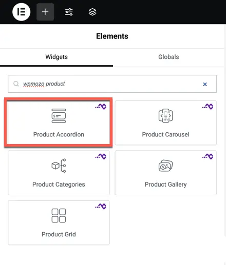
Once the WPMozo Addons plugin is activated, it adds multiple widgets to the Elementor builder. To insert the Product Accordion widget, follow these steps:
- Create or edit a page/post using the Elementor builder.
- Add or edit a container.
- In the Elementor sidebar, search for the ‘Product Accordion’ widget under WPMozo.
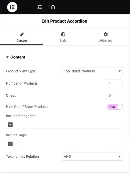
Content tab configuration
- Product View Type: Select the type of products to display.
- Number of Products: Specify how many products to display.
- Offset: Set a product offset if needed (use 0 for none).
- Hide Out of Stock Products: Toggle this option to hide products that are out of stock.
- Include Categories: Choose specific product categories to include in the accordion.
- Include Tags: Optionally, add specific tags to filter products.
- Taxonomies Relation: Define how taxonomies (categories/tags) are related, using options like AND/OR.
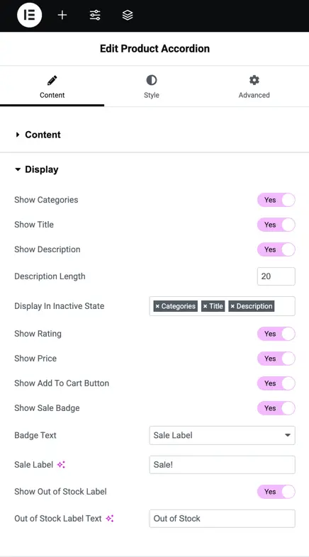
Display options in Product Accordion widget
This section of the Product Accordion widget’s Display Settings allows you to manage how the product information is presented in the accordion. Below are the settings you can configure:
- Show Categories: Toggle this option to display the product categories in the accordion.
- Show Title: Enable this to show the product title.
- Show Description: If enabled, the product description will be shown.
- Description Length: Set the number of characters to display for the product description.
- Display in Inactive State: Define which elements should remain visible when the product is inactive in the accordion. You can choose between categories, title, and description.
- Show Rating: Enable to show the product rating within the accordion.
- Show Price: Toggle this setting to display the product price.
- Show Add to Cart Button: Enable this option to allow users to add products to the cart directly from the accordion.
- Show Sale Badge: Display a sale badge on products that are on sale.
- Badge Text: Customize the text that will appear on the sale badge.
- Sale Label: Customize the text displayed for products on sale.
- Show Out of Stock Label: Enable this to show an “Out of Stock” label on products that are not available.
- Out of Stock Label Text: Customize the text that appears for out-of-stock products.
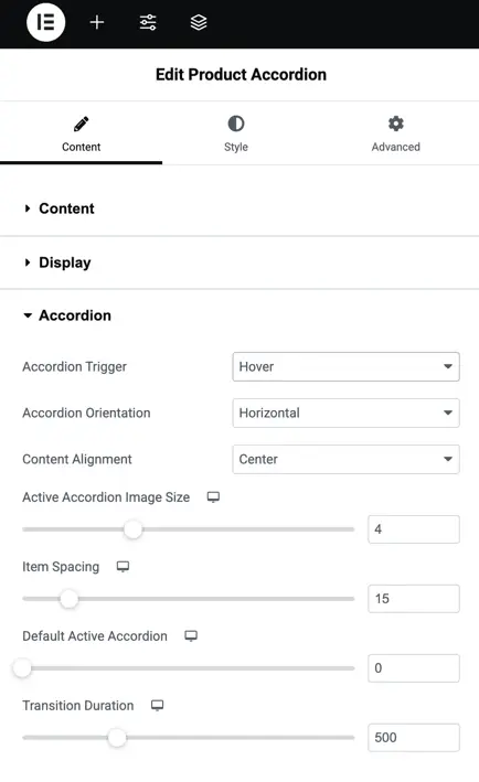
Accordion settings
The Accordion Settings section allows you to configure the behavior and layout of the product accordion. Below are the settings available in this section:
- Accordion Trigger: Choose how the accordion opens. You can select between options like Hover (opens when hovered over) or Click (opens when clicked).
- Accordion Orientation: Define the direction of the accordion layout, either Horizontal (products slide horizontally) or Vertical (products stack vertically).
- Content Alignment: Set how the content inside the accordion is aligned. Options include Left, Center, and Right.
- Active Accordion Image Size: Adjust the size of the image when a product is active in the accordion. Use the slider to set the size.
- Item Spacing: Set the amount of space between each product item in the accordion.
- Default Active Accordion: Choose which accordion item will be active by default when the page loads.
- Transition Duration: Define how fast the accordion transitions between items. This value is in milliseconds (e.g., 500ms for half a second).
Customization of Product Accordion
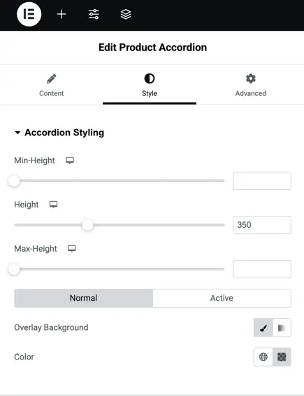
Accordion styling
This section allows you to style the accordion’s appearance, including setting the min, max, and fixed height values, along with background overlay color settings. You can also toggle between normal and active states for customization and adjust padding and margins.
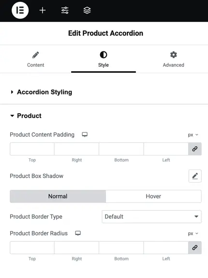
Product styling
Here, you can adjust the padding around product content, apply shadows for both normal and hover states, and set border styles and radius. This enables full control over how the product content is displayed inside the accordion.
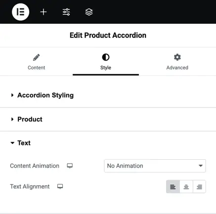
Text styling
In this section, you can control the content animation and text alignment within the accordion. It allows for adjusting text properties to fit within the accordion’s style, ensuring a consistent and polished look.
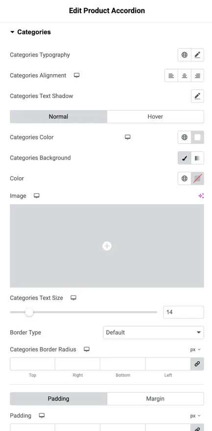
Categories styling
This panel lets you manage the appearance of product categories. You can modify the text typography, alignment, shadow, and color, as well as set background images and control text size. Additionally, you can apply border radius and padding to ensure categories are displayed properly.
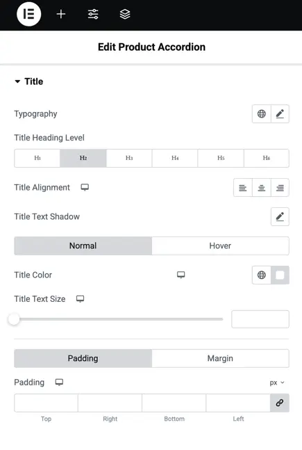
Title styling
This section allows you to configure the heading level (H1-H6), set the alignment, and apply text shadow to titles. You can also control the title color and text size, along with padding options for better layout management.
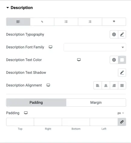
Description styling
Here, you can adjust the typography for product descriptions, including font family, text color, and shadow. You can align the description text and customize its padding and margin settings to make sure it fits well within the accordion.
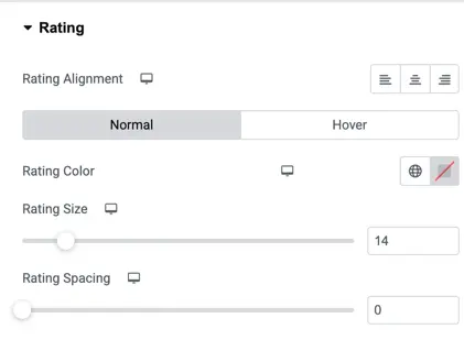
Rating styling
In this section, you have control over the rating element. You can align the rating, choose different colors for normal and hover states, and adjust the size and spacing of the rating stars for better visual appeal.
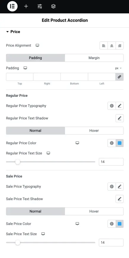
Price styling
This part is dedicated to styling the product price. It includes options for setting the alignment, text shadow, typography, and colors for both regular and sale prices. You can also adjust padding and margins around the price text.
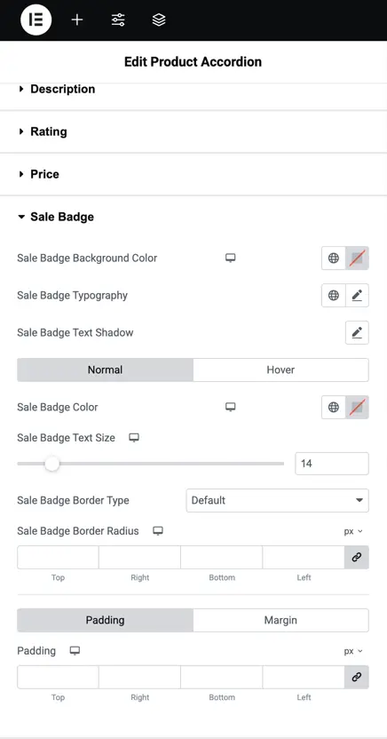
Sale badge styling
This section allows you to customize the appearance of the sale badge. You can change the background color, typography, shadow, text size, and border settings for both normal and hover states, along with adjusting the padding.
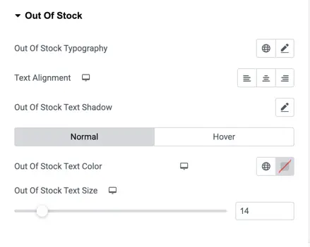
Out of stock styling
In this panel, you can control how the out-of-stock message appears. You can adjust the typography, alignment, shadow, color, and text size for both normal and hover states to make the out-of-stock indicator stand out effectively.