Search for answers or browse our knowledge base.
Product Gallery
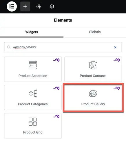
Once the WPMozo Addons plugin is activated, it adds multiple widgets to the Elementor builder. To insert the Product Gallery widget, follow these steps:
- Create or edit a page/post using the Elementor builder.
- Add or edit a container.
- In the Elementor sidebar, search for the ‘Product Gallery’ widget under WPMozo.
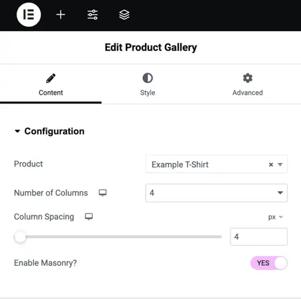
Product gallery configuration setting
Product: This dropdown allows you to select the specific product.
Number of Columns: Choose the number of columns to display. You can adjust the column count for desktop, tablet, and mobile views by clicking the respective icons.
Column Spacing: Use the slider to adjust the space between columns in pixels, or enter a custom value in the input box.
Enable Masonry: Click “Yes” to enable the masonry grid layout. This layout is ideal for displaying product gallery with varying image sizes.
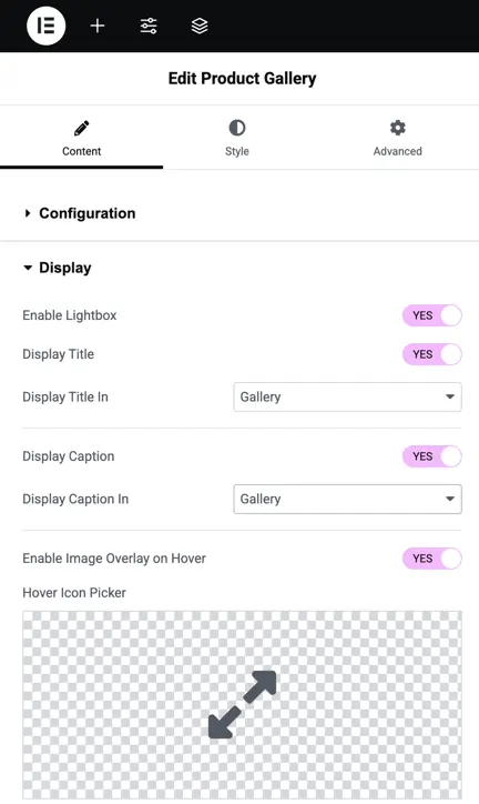
Display settings
Enable Lightbox: Activates a lightbox feature allowing to view larger versions of product gallery images when clicked.
Display Title: Turns on or off the display of product titles in the gallery.
Display Title In: Select where to display the product title, either in the gallery, lightbox or both.
Display Caption: Shows or hides the product captions beneath the product images.
Display Caption In: Select where the product captions should be shown, within the gallery, lightbox or both.
Enable Image Overlay on Hover: Activates an image overlay effect when hover over a product image.
Hover Icon Picker: Choose the icon to display as an overlay when hovering over a product image.
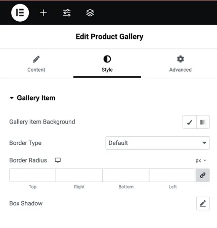
Style settings for gallery item
Gallery Item Background: Customize the background color or image for gallery items.
Border Type: Select a border style for the gallery item (e.g., solid, dashed, or none).
Border Radius: Adjust the roundness of the corners of the gallery item; you can set different values for top, right, bottom, and left sides.
Box Shadow: Add shadow effects to create depth and a layered effect for the gallery item.
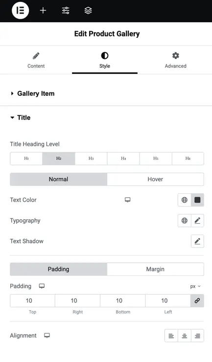
Title style settings
Title Heading Level: Choose the heading level (H1 to H6) for the gallery item title to define its size and importance.
Normal/Hover: Toggle between normal and hover states to customize the title appearance in each state.
Text Color: Select the color for the title text.
Typography: Adjust font settings like size, weight, style, and letter spacing for the title text.
Text Shadow: Add shadow to the title text to create depth or highlight the title.
Padding: Set padding around the title, adjusting the space on all sides (top, right, bottom, left).
Alignment: Align the title text to the left, center, or right.
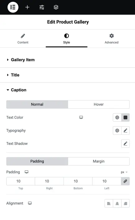
Caption styling
Normal/Hover: Allows you to customize the caption’s appearance for both normal and hover states.
Text Color: Provides an option to choose the color for the caption text.
Typography: Offers a range of typography settings, enabling you to modify the font size, style, and letter spacing for the caption.
Text Shadow: Lets you add a subtle or bold shadow effect to the caption text.
Padding: Enables you to adjust the spacing around the caption, setting values for the top, right, bottom, and left sides.
Alignment: Allows you to align the caption text to the left, center, or right, according to your design preference.
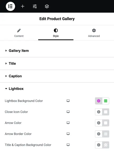
Lightbox customization options
Lightbox Background Color: Lets you choose a background color for the lightbox, allowing you to set a transparent or solid background.
Close Icon Color: Provides an option to select the color for the close icon, click to exit the lightbox view.
Arrow Color: Allows you to change the color of the arrows used for navigation within the lightbox.
Arrow Border Color: Enables you to adjust the border color around the navigation arrows.
Title & Caption Background Color: Lets you set the background color for the title and caption area displayed in the lightbox.
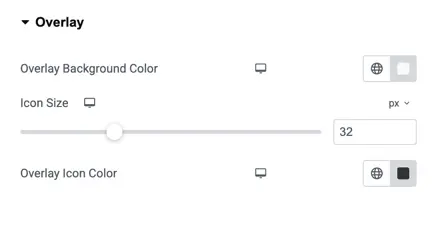
Overlay setting
Overlay Background Color: Adjusts the color of the background overlay that appears on hover, allowing you to customize the appearance.
Icon Size: Lets you control the size of the overlay icon by adjusting the pixel value.
Overlay Icon Color: Enables you to change the color of the icon displayed in the overlay, providing a consistent style with the background or contrast.