Addons for Elementor Documentation
Search for answers or browse our knowledge base.
Price List
This widget comes free with WPMozo Addons Lite. To use it, simply install and activate the free version of plugin.
https://wordpress.org/plugins/wpmozo-addons-lite-for-elementor
How to add widget on page
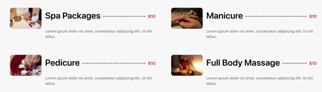
The WPMozo Price List Widget for Elementor comes packed with features to display your product pricing on your website. It offers a variety of layouts to add uniqueness to every price list you design. This widget makes it easy to create visually appealing price lists that enhance your site’s overall look and user experience.
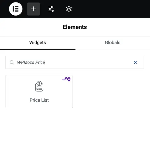
To add the Price List widget, follow these steps.
- Create/edit a page/post that uses Elementor builder.
- Create/edit container.
- Search widget WPMozo Price List under WPMozo.
Configuration settings
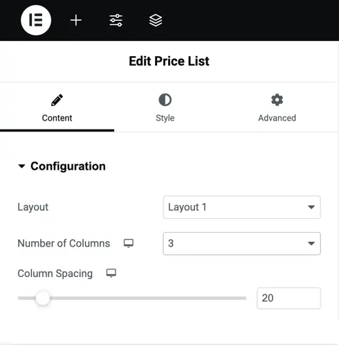
Content
These settings help you control the basic layout and spacing of your price list. You’ll find them under the Content tab when editing the widget in Elementor.
Layout
Select the visual structure for your price list items. You may try different layouts to see which one best fits your design.
Number of columns
Define how many price list items appear in a row. Use 1 column for vertical lists (ideal for mobile or simple menus. Use 3 or more columns for wider displays like service grids or product pricing.
Column spacing
Set the space between columns using a slider or by entering a number.
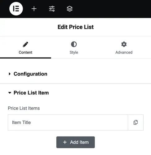
Price list settings
Item Title Field: Add the title for your price list item.
Add Item Button: Click this to add more items to your list. You can add multiple price list item.
Customization options
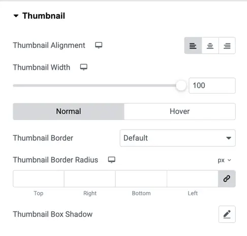
Thumbnail
- Thumbnail Alignment: Set the image alignment (Left, Center, Right).
- Thumbnail Width: Adjust image width using the slider.
- Normal / Hover: Style the thumbnail differently when hovered over.
- Border & Radius: Add a border and rounded corners.
- Box Shadow: Add a shadow around the image for more depth.
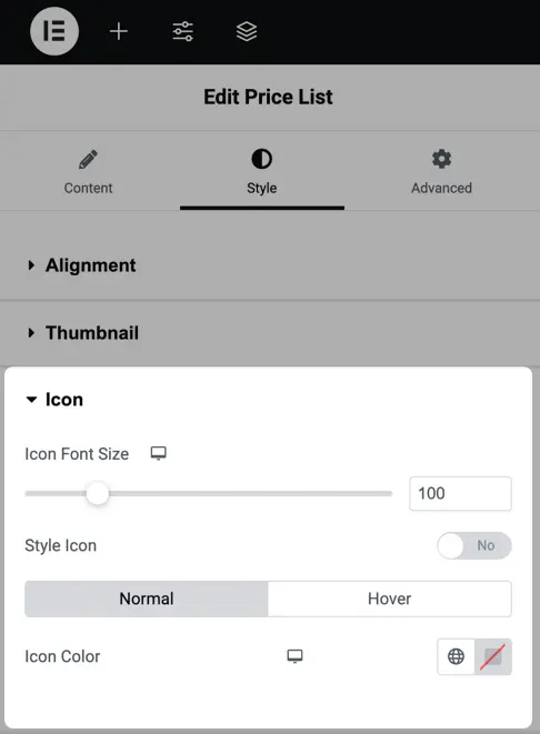
Icon styling
Icon Font Size: Adjust the size of the icons.
Style Icon Toggle: Choose whether to style the icon.
Icon Color: Set icon colors separately for normal and hover states.
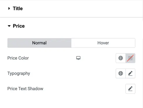
Price styling
Price Color: Set the color for the price text.
Typography: Customize font style and size.
Text Shadow: Add shadow effects to make the price pop.
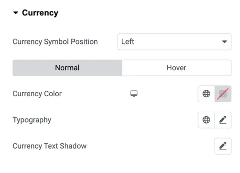
Currency
- Symbol Position: Place the currency symbol to the left or right of the amount.
- Color & Typography: Customize the appearance of the currency.
- Text Shadow: Add shadow for better readability or visual effect.
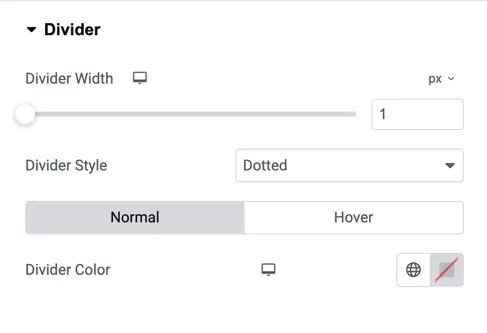
Divider
- Width & Style: Control the thickness and style (solid, dotted, dashed) of the divider between items.
- Divider Color: Customize color for both normal and hover states.
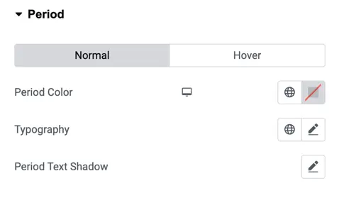
Period
Typography & Shadow: Fine-tune the font style and add shadows.
Period Color: Set the color for duration labels like “per month”.
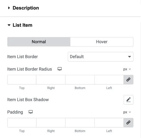
List Item
- Border & Radius: Style the box around each list item.
- Box Shadow: Add shadow around the entire item card.
- Padding: Control spacing inside the item box for a clean look.