Addons for Elementor Documentation
Search for answers or browse our knowledge base.
Image Magnifier
This widget comes free with WPMozo Addons Lite. To use it, simply install and activate the free version of plugin.
https://wordpress.org/plugins/wpmozo-addons-lite-for-elementor
How to add widget on page
Once WPMozo Addons is activated it adds a number of widgets to the Elementor builder. To insert the widget, use the following steps.
- Create/edit a page/post that uses Elementor builder.
- Create/edit container.
- Search widget Image Magnifier under WPMozo.
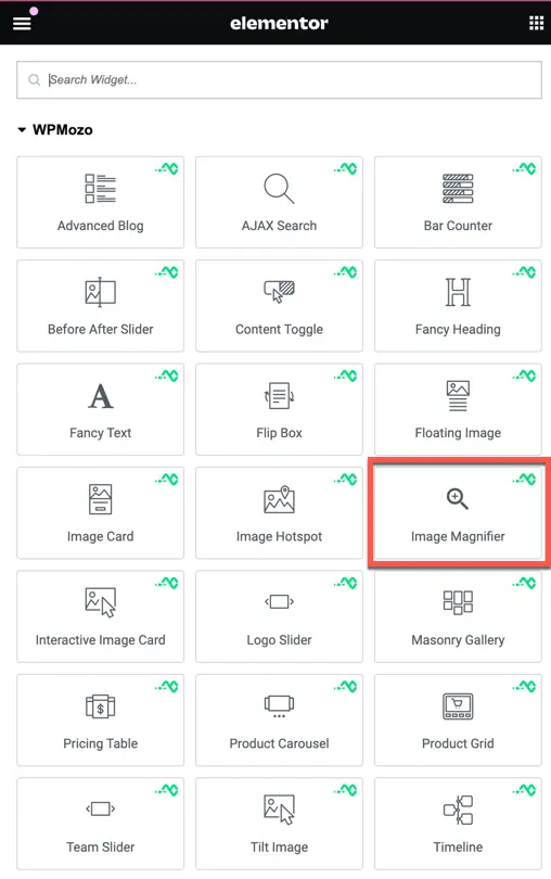
Content tab
Image
This is where you add and configure the image you want to display.
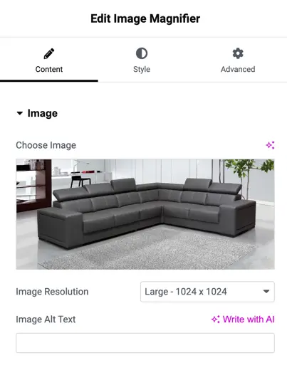
- Choose Image: Use this option to upload or select the image you want to magnify. Once selected, the image will appear in the widget.
- Image Resolution: Choose the resolution for your image. This allows you to select different sizes. In the dropdown, you can pick from options.
- Image Alt Text: Add a description of your image here. This is important for accessibility and SEO purposes. It helps describe the image to users who cannot see it and also to search engines.
Image alignment
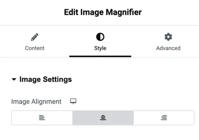
This setting lets you choose how the image is aligned within its container. You have three options to align the image:
- Left: Aligns the image to the left side.
- Center: Places the image in the center.
- Right: Aligns the image to the right side.
Lens settings
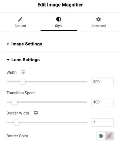
Width
This setting lets you control the width of the magnifier lens. You can adjust the width to make the lens larger or smaller depending on how much of the image you want to magnify.
Transition Speed
This setting allows you to adjust how fast the magnification transition occurs when moving the lens over the image. A higher number means a slower transition, while a lower number makes the transition quicker.
Border Width
This option lets you control the thickness of the border around the magnifier lens. You can increase or decrease the border width to change how prominent the border appears.
Border Color
This setting allows you to choose the color of the border around the magnifier lens. You can select any color using the color picker or leave it transparent if you don’t want a visible border.
Sizing Settings
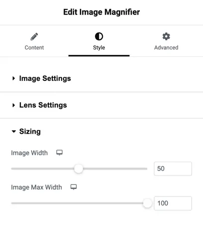
Image Width
This option lets you adjust the width of the image being displayed. You can either drag the slider or enter a number to set the image width as a percentage of its original size.
Image Max Width
This setting allows you to set the maximum width the image can grow to. It ensures that the image doesn’t become too large on bigger screens. You can adjust this by dragging the slider or entering a number.
Spacing Settings
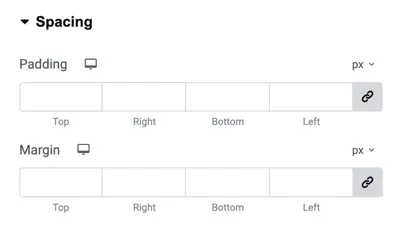
Padding
Padding is the space inside the element, between the content and the border. You can set the padding individually for the top, right, bottom, and left sides. The units are in pixels (px) by default, but you can change this.
Margin
Margin is the space outside the element, between the element’s border and other elements. Like padding, you can set the margin individually for the top, right, bottom, and left sides, and the units are in pixels (px) by default.
Border Settings
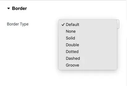
Border Type
This setting allows you to choose the type of border that will appear around the element. You can select from the following options:
- Default: The default border style for the element.
- None: No border will be applied.
- Solid: A solid line border.
- Double: A double line border.
- Dotted: A dotted border.
- Dashed: A dashed border.
- Groove: A groove-style border that creates an engraved effect.