Addons for Elementor Documentation
Search for answers or browse our knowledge base.
Image Carousel
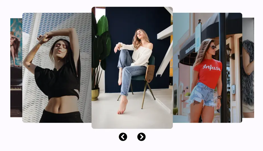
The Elementor Image Carousel widget allows you to create stunning, responsive image sliders for your website. With customizable settings, users can control the number of slides, transitions, and design elements. It can be used to present creative work in a photography portfolio, or create a slider of client logos.
Add widget on page
To add the widget, use the following steps.
- Create/edit a page/post that uses Elementor builder.
- Create/edit container.
- Search widget Image carousel under WPMozo.
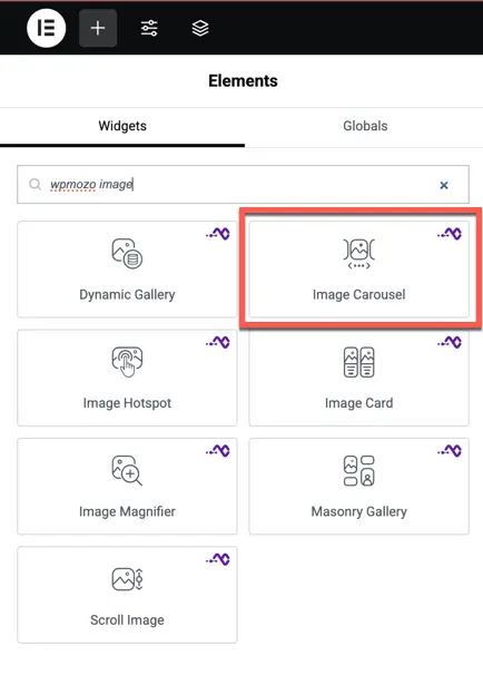
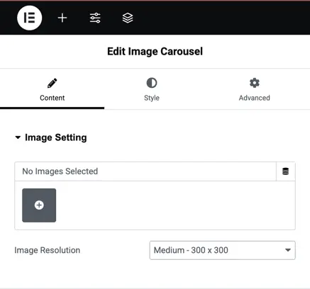
Image setting
Add Images: Add or upload images to the carousel by clicking the “+” icon.
Image Resolution: Lets you select the desired resolution for the carousel images. The dropdown provides multiple resolution options to choose from based on the display preference.
Slider settings
Slider Effect: Selects the type of transition effect for the slider (e.g., slide).
Number of Cards Per Slide: Specifies how many cards or images will be displayed per slide.
Number of Slides Per Group: Defines how many slides will be grouped together when navigating.
Space Between Slides: Controls the space between each slide in pixels.
Enable Auto Height: Automatically adjusts the height of the slider based on the content.
Enable Loop: Enables continuous looping of slides.
Autoplay: Allows the slider to automatically move through slides.
Autoplay Delay: Sets the time interval (in milliseconds) between automatic slide transitions.
Pause on Hover: Stops autoplay when the mouse hovers over the slider.
Enable Linear Transition: Ensures smooth and linear slide transitions.
Transition Duration: Defines the time it takes (in milliseconds) for a transition to complete.
Show Arrows: Toggles visibility of navigation arrows for the slider.
Previous Arrow: Lets you customize the design of the “Previous” navigation arrow.
Next Arrow: Lets you customize the design of the “Next” navigation arrow.
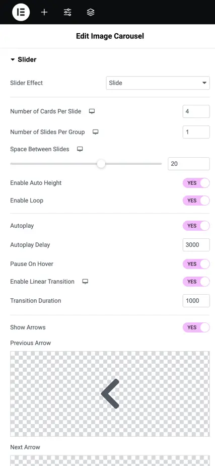
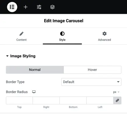
Image styling
Normal/Hover: Allows separate styling for normal and hover states of the images.
Border Type: Specifies the type of border to apply around the image (e.g., solid, dashed, none).
Border Radius: Adjusts the roundness of the image corners by specifying the radius in pixels.
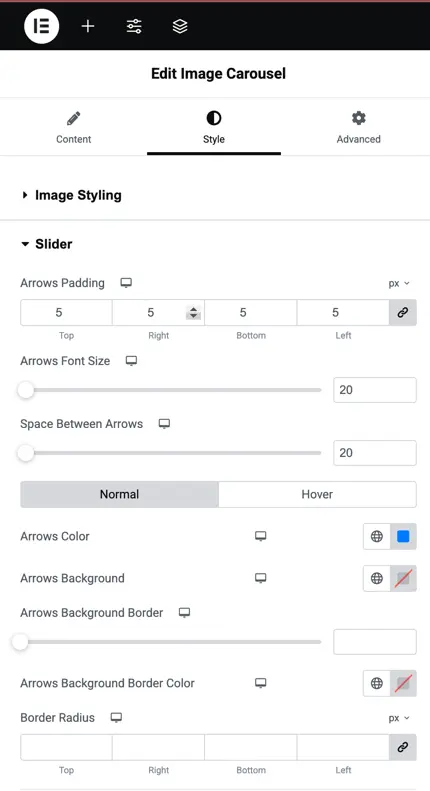
Slider display styling
Arrows Padding: Sets the padding for arrows, allowing individual control for top, right, bottom, and left sides.
Arrows Font Size: Defines the size of the arrows’ font in pixels.
Space Between Arrows: Adjusts the spacing between arrows for proper alignment and appearance.
Normal/Hover: Provides styling options for the arrows’ appearance in normal and hover states.
Arrows Color: Specifies the color of the arrows.
Arrows Background: Allows setting a background color for the arrows.
Arrows Background Border: Sets the border around the arrows’ background.
Arrows Background Border Color: Chooses the color for the arrows’ background border.
Border Radius: Adjusts the roundness of the arrow background’s corners, individually for each side.