Addons for Elementor Documentation
Search for answers or browse our knowledge base.
Horizontal Scrolling Posts
This widget is included in the free version of WPMozo Addons for Elementor. To display your blog posts in a horizontal scrolling layout, simply install and activate the WPMozo Addons Lite plugin. Download link:
https://wordpress.org/plugins/wpmozo-addons-lite-for-elementor
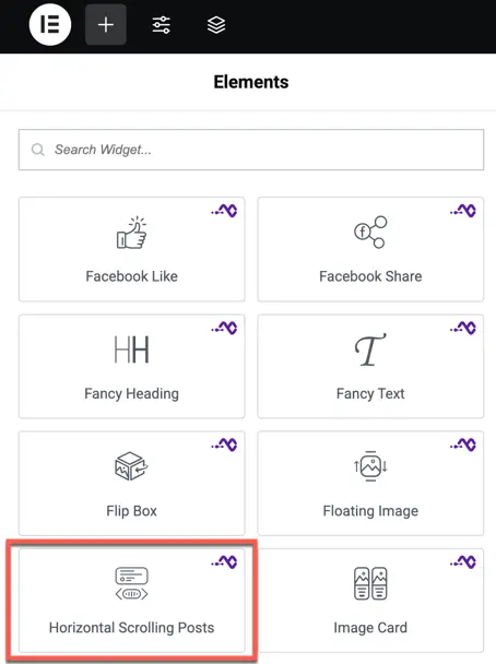
How to add widget on page
Once the WPMozo Addons plugin is activated, it adds a number of widgets to the Elementor builder. To insert the widget, use the following steps.
- Create/edit a page/post that uses Elementor builder.
- Create/edit container.
- Search widget Horizontal Scrolling Posts under WPMozo.
- Drag and drop the widget onto your page.
Content setting
Content
Layout
Choose how your posts will appear.
- Layout 1
- Layout 2
Number of posts
Enter the number of blog posts you want to display in the scrolling area.
Example:6 will show the latest 6 posts.
Order By
Choose the rule to decide how posts are ordered.
Options:
- Date (default)
- Title
- Author
- Random
- Comment count
Order
Set the direction of the post order.
Options:
- Ascending (ASC) – Oldest to newest
- Descending (DESC) – Newest to oldest
Ignore sticky posts
Toggle option is here:
If enabled, sticky posts will not appear in the scrolling list.
Use this if you want to show only regular posts.
Exclude password protected posts
Toggle option is here:
If enabled, any password-protected blog posts will be excluded from the list.
Exclude Posts by ID
Enter post IDs that you want to hide from the scrolling view.
Separate multiple IDs with commas.
Example: 24,57,89
Show excerpt
Toggle option
If enabled, a short summary (excerpt) of the post will be displayed under each title or image.
Excerpt length
Set the number of words to show in the excerpt.
Example:20 – Will show the first 20 words of each post.
Display settings
This section lets you control how the posts appear visually, how much space is between them, and how animations behave.
Space between posts
Set the amount of horizontal spacing between each post card.
- Enter a value in pixels (
px) or other units. - Example:
20pxwill leave 20 pixels of space between each post.
Animation start element
Choose which part of the post element triggers the start of the scroll animation.
Options:
- Top
- Center
- Bottom
Animation start viewport
Select which part of the screen (viewport) is used to compare with the post element for triggering animation.
Options:
- Top
- Center
- Bottom
Example: If you set Element: Top and Viewport: Bottom, the animation starts when the top of the post reaches the bottom of the screen.
Image resolution
Set the quality/resolution of post images.
Options may include:
- Thumbnail
- Medium
- Large
- Full
Higher resolution images look better but may load slower.
Show button
Toggle option is here:
Enable this to show a button on each post.
Button text
Enter the text you want to show on the button.
Example:Read More or View Post
Button link target
Choose how the link should open when the button is clicked.
Options:
- Same Tab – Opens the link in the current browser tab.
- New Tab – Opens the link in a new browser tab.
Style Widget element
This section allows you to style the post text content, including title and excerpt appearance, alignment, and typography settings.
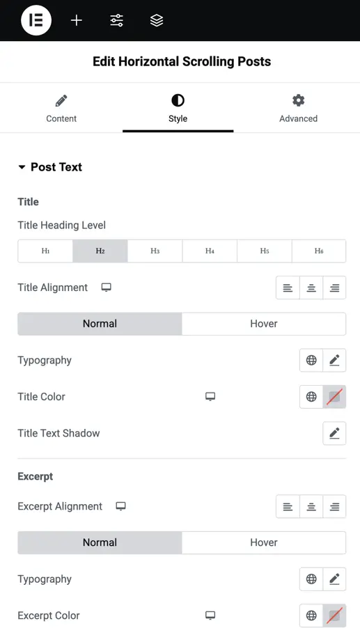
Post Text
Customize the appearance of the text inside each post item, such as the post title and excerpt.
Title Heading Level
Choose the HTML heading tag for the post title.
Title alignment
Set the horizontal alignment of the post title.
Options:
- Left
- Center
- Right
You can define alignment for both Normal and Hover states separately.
Typography (Title)
Customize the font appearance of the post title.
Includes:
- Font family
- Font weight (boldness)
- Font style (italic, normal)
- Text transform (uppercase, lowercase, capitalize)
- Letter spacing
- Line height
- Font size (responsive units)
Title color
Choose the text color for the title in normal and hover states.
Title text shadow
Add a shadow effect to the post title.
Customize:
- Shadow color
- Horizontal position
- Vertical position
- Blur strength
Excerpt
This is the short description or summary shown under each post title.
Excerpt alignment
Set the horizontal alignment for the post excerpt.
Options:
- Left
- Center
- Right
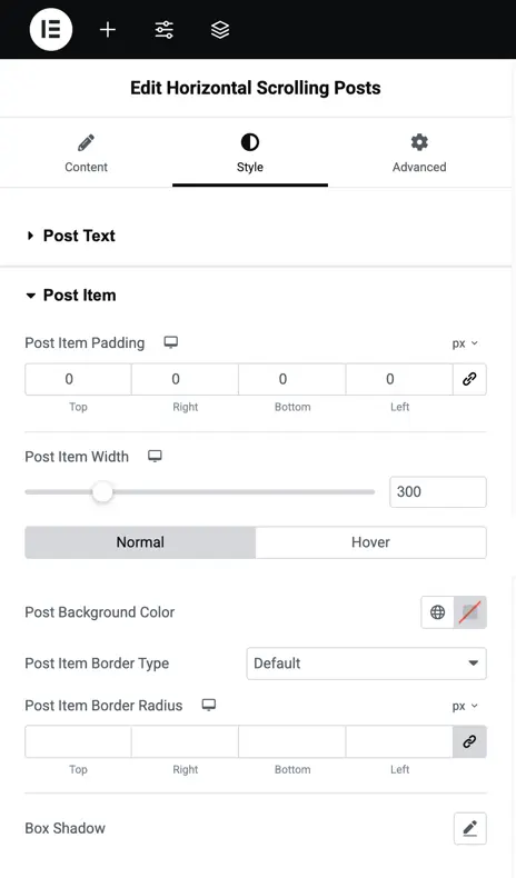
Post Item
Post Item padding
Set the inner space around the content inside each post item.
- Enter values in
px,em, or%. - Example:
20pxpadding adds space between the post content and its edges.
Post Item width
Define how wide each post card should be.
- Enter a value in
px,%, or other units. - Example:
300pxwill fix each post to that width in the scroll layout.
Post background color (Normal & Hover)
Customize the background color of each post item.
- Set one color for the normal state
- Set another for the hover state to add interactivity
Post Item border type
Select the border style for each post item.
Post Item border radius
Set how rounded the corners of the post card should be.
- Enter values like
10px(slightly rounded) or50px(very round or pill-shaped).
Box shadow
Add a shadow around the post card for visual depth and focus.
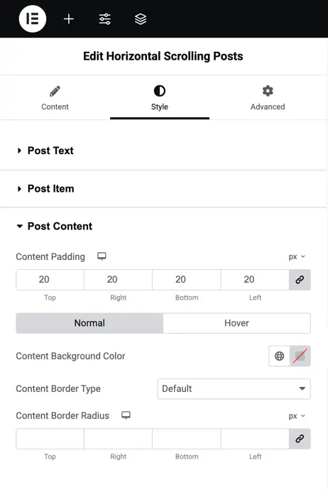
Post Content
Content padding
Define the space inside the content area, between the text and the content container edges.
- Use values like
20px,1em, etc. - You can control top, right, bottom, and left padding individually.
Example: 20px padding gives comfortable breathing room around the text and button.
Normal and hover styling
You can apply different styles for normal and hover states.
This includes background, text color, or border effects.
- Normal – How the content looks by default
- Hover – Changes applied when the user hovers over the content
Content background color
Set a background color for the content section (separate from the post item’s background).
- Choose one color for normal view
- Optionally set a different color for hover state
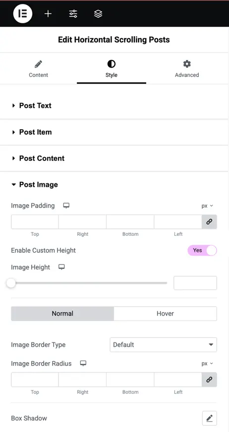
Post Image
Image padding
Set the space around the image inside the post card.
Enter values like 10px, 20px, etc.
You can set different padding for top, bottom, left, and right if needed.
Image custom height
Enable this option to set a fixed height for the image manually.
Useful for maintaining consistent image sizes across all post cards.
Image height
When custom height is enabled, enter the desired image height.
- Example:
250pxor20em