Addons for Elementor Documentation
Search for answers or browse our knowledge base.
Dynamic Gallery
The Dynamic Masonry Gallery widget lets you display your images in a stylish masonry grid layout that automatically adjusts based on image size. It offers customization options for titles, categories, pagination, borders, and shadows, helping you create a modern and visually engaging gallery. This widget is easy to use and perfect for showcasing portfolios or photo collections.
How to add widget on page
Once the WPMozo Addons plugin is activated, it adds several widgets to the Elementor builder. To insert the Dynamic Gallery widget, follow these steps.
- Create/edit a page/post that uses Elementor builder.
- Create/edit container.
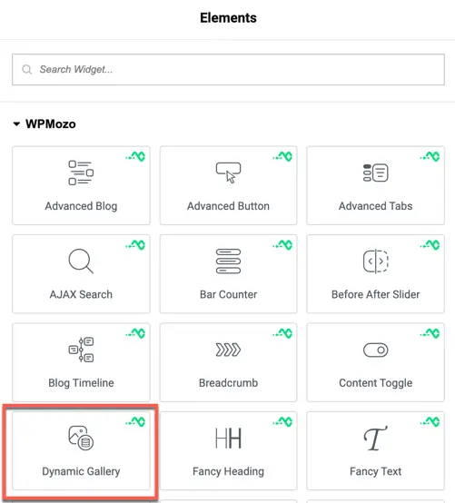
- Search widget Dynamic Gallery under WPMozo.
Content options
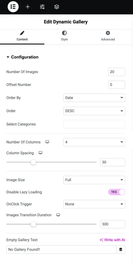
Configuration
This section allows you to control which images appear in the gallery, how they are organized, and how they behave. You can manage image count, sorting, categories, layout settings, and interaction behavior.
Number of Images: Set how many images should be displayed in the gallery.
Offset Number: Skip a specific number of images from the beginning.
Order By: Choose how to sort the images (e.g., by date, title, slug, id, random, etc.).
Order: Select the sorting direction ascending or descending.
Select Categories: Choose categories to filter which images appear.
Number of Columns: Set how many columns you want in the gallery layout.
Columns Spacing: Adjust the space between each column of images.
Image Size: Choose the size of the images shown in the gallery.
Disable Lazy Loading: Enable this to stop images from loading only as you scroll.
Onclick Trigger: Select what should happen when a user clicks on an image (like lightbox or go to link).
Image Transition Duration: Set how fast the image transition effect plays.
Empty Gallery Text: Enter a custom message to show when no images are available in the selected category.
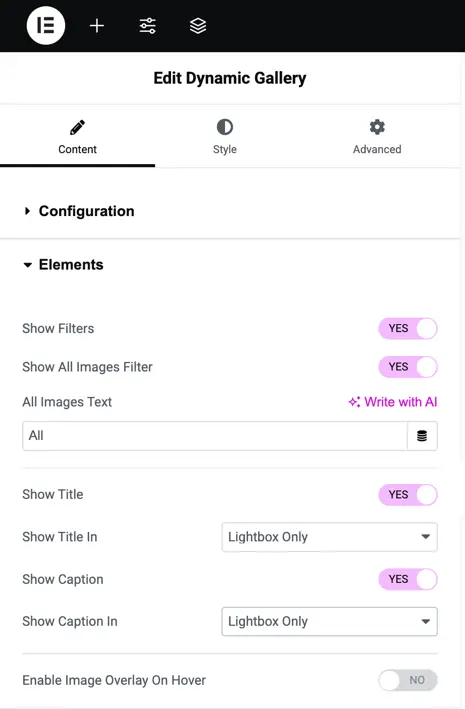
Elements
Show Filters – Toggle this option to display or hide the filter menu for organizing images.
Show All Images Filter – Enable or disable the filter that shows all images together.
All Images Text – Set custom text for the “All Images” filter label.
Show Title – Toggle to show or hide image titles.
Show Title In – Choose where the title should appear: Lightbox only, Gallery only, Overlay, or both Gallery and Lightbox.
Show Caption – Select where the caption should display with the same options as the title (Lightbox only, Gallery only, Overlay, or both).
Enable Image Overlay on Hover – Toggle this to apply an overlay effect on images when hovered.
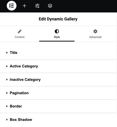
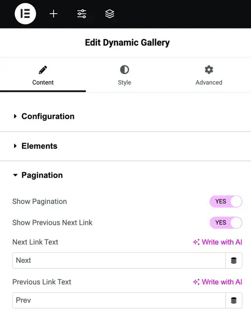
Pagination
Show Pagination – Toggle this option to enable or disable pagination for navigating through images.
Show Previous/Next Link – Turn this on to display navigation links for moving between pages.
Next Link Text – Enter custom text to display for the “Next” navigation link.
Previous Link Text – Enter custom text to display for the “Previous” navigation link.
Style option
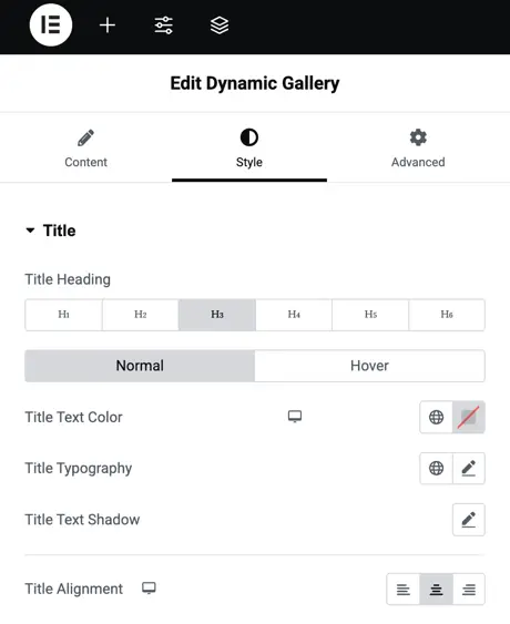
Title
Title Heading – Choose the heading level (H1, H2, H3, etc.) for the title.
Title Text Color – Select the color for the title text.
Title Typography – Customize the font style, size, weight, and spacing of the title.
Title Text Shadow – Add a shadow effect to the title text for better emphasis.
Title Alignment – Align the title to the left, center, or right.
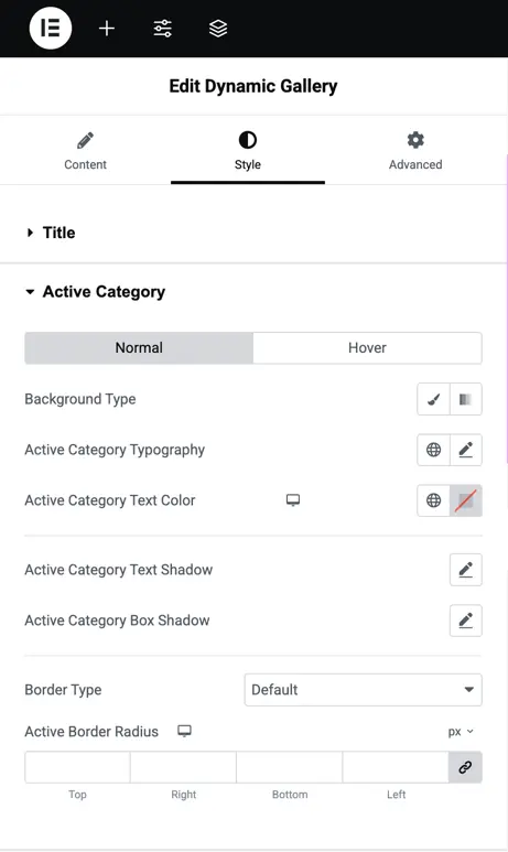
Active category
Background Type – Choose the background style (color or gradient) for the active category.
Active Category Typography – Adjust font style, size, weight, and spacing for the active category text.
Active Category Text Color – Set the color of the active category text.
Active Category Text Shadow – Apply a shadow effect to the active category text.
Active Category Box Shadow – Add a shadow around the active category box for emphasis.
Border Type – Select the type of border (solid, dotted, dashed, etc.) for the active category.
Active Border Radius – Adjust the roundness of the active category’s border corners.
Pagination – Style pagination links by customizing typography, text color, background, and alignment for next/previous navigation.
Border – Add borders to gallery items with options for border type, width, color, and radius.
Box Shadow – Apply and customize shadow effects on gallery items.