Addons for Elementor Documentation
Search for answers or browse our knowledge base.
Advanced Tooltip
The Advanced Tooltip widget lets you add interactive tooltips to your content, making it easier to provide extra information without cluttering the design. You can display text, images, or Elementor library layouts inside the tooltip and fully customize its appearance and behavior. This widget comes free with WPMozo Addons Lite. To use it, simply install and activate the free version of plugin.
https://wordpress.org/plugins/wpmozo-addons-lite-for-elementor

How to add widget on page
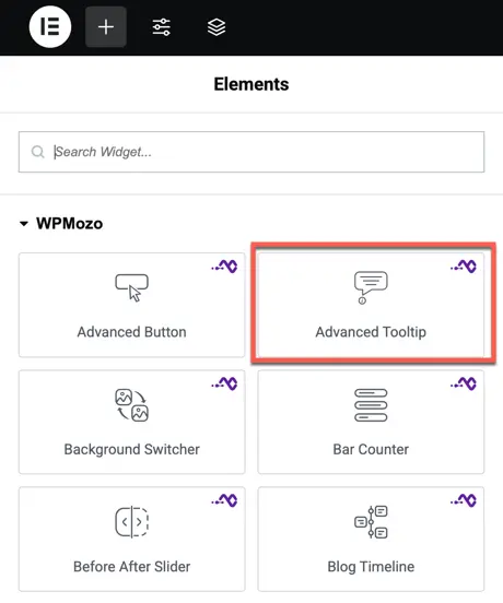
Once the WPMozo Addons plugin is activated, it introduces several widgets to the Elementor builder. Among them, you can use the Advanced tooltip widget by simply dragging and dropping it into your layout. To add the widget, follow these steps:
- Create/edit a page/post that uses Elementor builder.
- Create/edit container.
- Search widget Advanced Tooltip under WPMozo.
Content option
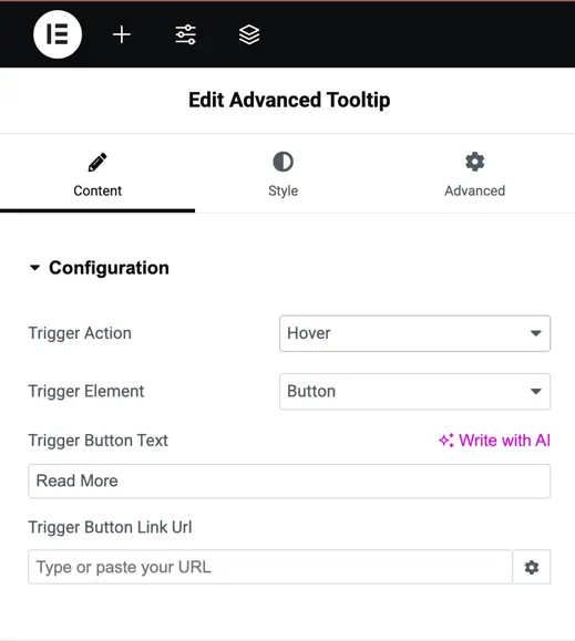
Configuration
- Trigger Action – Choose how the tooltip will be triggered. Options are Hover or Click.
- Trigger Element – Select the element that will display the tooltip. Options include Button, Image, Icon, Text, Element CSS ID, and Element CSS Class.
- Trigger Button Text – Enter the text to be displayed on the trigger button.
- Trigger Button Link URL – Add a link URL for the trigger button if required.
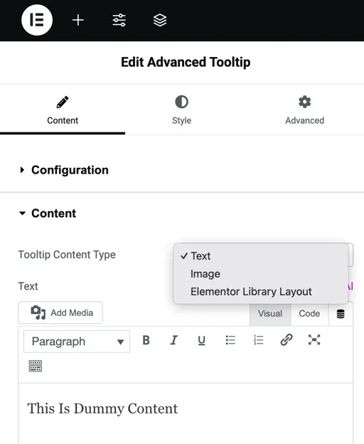
Content
- Tooltip Content Type – Select the type of content to display in the tooltip. Options include Text, Image, and Elementor Library Layout.
- Text – If Text is selected, enter the content to be shown inside the tooltip.
- Image – If Image is selected, upload or choose the image to be displayed in the tooltip.
- Elementor Library Layout – If Elementor Library Layout is selected, choose the layout from the Elementor library to display in the tooltip.
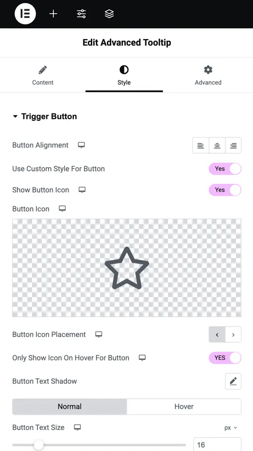
Trigger button
Button Alignment – Set the alignment of the trigger button within the widget.
Use Custom Style for Button – Enable this option to apply custom styling to the button.
Show Button Icon – Toggle this option to display an icon on the button.
Button Icon – Choose the icon to be displayed on the button.
Button Icon Placement – Select the position of the icon relative to the button text.
Only Show Icon on Hover for Button – Enable this to display the icon only when hovering over the button.
Button Text Shadow – Add and customize the shadow effect for the button text.
Button Text Size – Set the size of the text on the button.
Style options
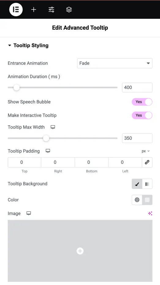
Tooltip styling
- Entrance Animation – Select the animation style that plays when the tooltip appears.
- Animation Duration – Set the time it takes for the entrance animation to complete.
- Show Speech Bubble – Enable this option to display a small pointer (speech bubble) on the tooltip.
- Make Interactive Tooltip – Toggle this to allow users to interact with the content inside the tooltip.
- Tooltip Max Width – Define the maximum width of the tooltip for better layout control.
- Tooltip Padding – Adjust the inner spacing between the tooltip content and its edges.
- Tooltip Background – Choose a background color for the tooltip.
- Color – Set the text color inside the tooltip.
- Image – Add an image as part of the tooltip content or background.
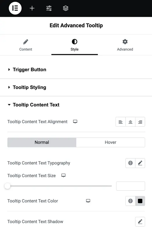
Tooltip content text
- Text Alignment – Set the alignment of the tooltip content text (left, center, or right).
- Tooltip Content Text Typography – Customize the font family, weight, and style for the tooltip text.
- Tooltip Content Text Size – Adjust the font size of the tooltip text.
- Text Color – Select the color for the tooltip text.
- Text Shadow – Apply a shadow effect to the tooltip text for added emphasis or style.