Are you editing your checkout page? The checkout page of your WooCommerce store should be well-optimized to ensure customer satisfaction and maintain good conversion rates. When you customize the checkout page with a checkout field editor plugin or any other way, there are possibilities of some common mistakes. These mistakes can hamper the customer experience and can cause potential buyers to bounce from your e-commerce store.
In this post, we will discuss some common mistakes while editing a WooCommerce checkout page with a plugin. We have also covered some essential tips that can help you in providing a seamless and efficient checkout experience to customers.
Let’s explore them.
1. Ignoring Mobile Optimization
A major portion of online shopping is done by customers through their mobile phones. Ignoring it while editing the WooCommerce checkout page can turn out to be a big mistake. All mobile users expect a smooth shopping experience during checkout and any hiccups can frustrate them leading to cart abandonment. Let’s discuss them in more detail.
Common Issues
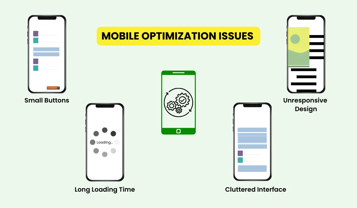
Small Buttons: When users find it difficult to tap small buttons they get frustrated.
Unresponsive Design: A WooCommerce checkout page that does not adapt to different screen sizes can result in a poor experience.
Long Loading Time: Mobile users specifically experience this issue, that’s why page loading speed is crucial.
Cluttered Interface: Mobile users may find the checkout procedure difficult if there are too numerous fields and information to handle.
Tips for Mobile Optimization On WooCommerce Checkout Page
- Reduce user frustration by providing large and decent-sized clickable buttons on the WooCommerce checkout page.
- Use an adaptive design for different screen sizes to facilitate users using multiple kinds of devices.
- Compress images, use browser caching, and limit the code to improve page loading time.
- Simplify the forms by reducing the number of fields. Instead, you can use drop-down fields, and auto-fill options to make the checkout process more smooth.
2. Overcomplicating the Checkout Process
Customers like a straightforward checkout process and any complications or confusion in it will lead to cart abandonment. Unnecessary steps in the checkout will discourage them from completing a purchase. Let’s talk about them in greater depth.
Common Issues
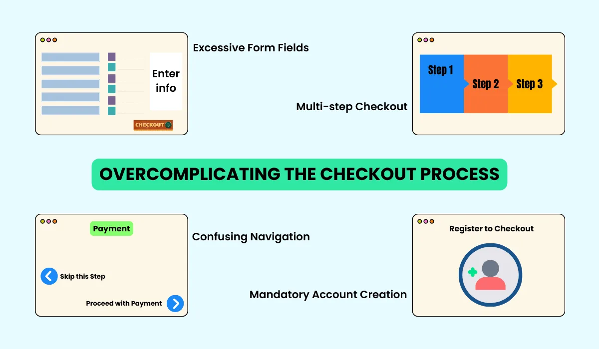
Excessive Form Fields: Don’t ask for too much information that makes customers feel overwhelmed and tired.
Multiple Steps: The checkout process with multiple steps needs extensive user input which can be tiresome for customers.
Confusing Navigation: A checkout process that does not have clear navigation and progress indication will confuse customers leading to cart abandonment.
Mandatory Account Creation: Forcing customers to create an account to continue the checkout and make a purchase will make the new users unhappy. New users find it tedious and time-consuming as it extends the checkout procedure.
Tips for Simplifying the WooCommerce Checkout Process
- Make the customers feel relaxed by asking a limited and essential information. Use auto-fill and default options to minimize user input.
- Introduce a single-page checkout process by reducing the number of steps which appears pleasant for users.
- Use clear progress indicators to notify users about the number of steps involved, completed, and remaining in checkout.
- The guest checkout option will keep new users happy, who want to purchase without creating an account.
3. Lack of Consistent Testing
This is one of the most important factors that negatively impact user experience leading to a decline in conversion rates. Regular testing of the checkout process will make you aware of any new issues and help to keep it error-free. Let’s quickly overview them in detail.
Common Issues
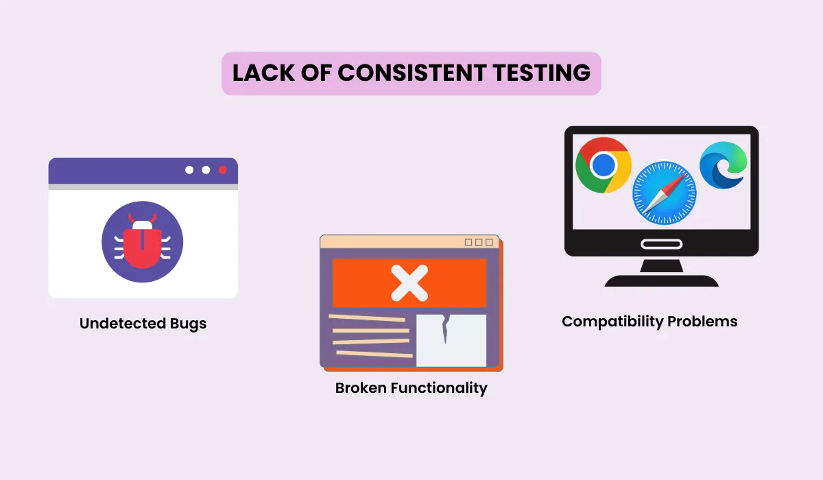
Undetected Bugs: Lack of regular testing you will be unable to notice bugs and glitches which may further cause problems in checkout.
Compatibility Problems: Users access the store on various devices running different operating systems and browsers, which makes errors possible.
Broken Functionality: If you ignore testing, updates to plugins, themes, or the CMS can break the functionality.
Tips for Consistent Testing of WooCommerce Checkout Page
- Manage a regular testing schedule to test the checkout process frequently.
- Test the checkout page on multiple browsers and systems to ensure its smooth functioning.
- Always test the checkout page after updating plugins, themes, or CMS.
4. Neglecting User Experience
Customers expect a seamless and smooth user experience while completing the checkout process. Neglecting it will directly impact the purchases and customers will abandon the carts without completing the checkout. Let’s take a brief, in-depth look at them.
Common Issues
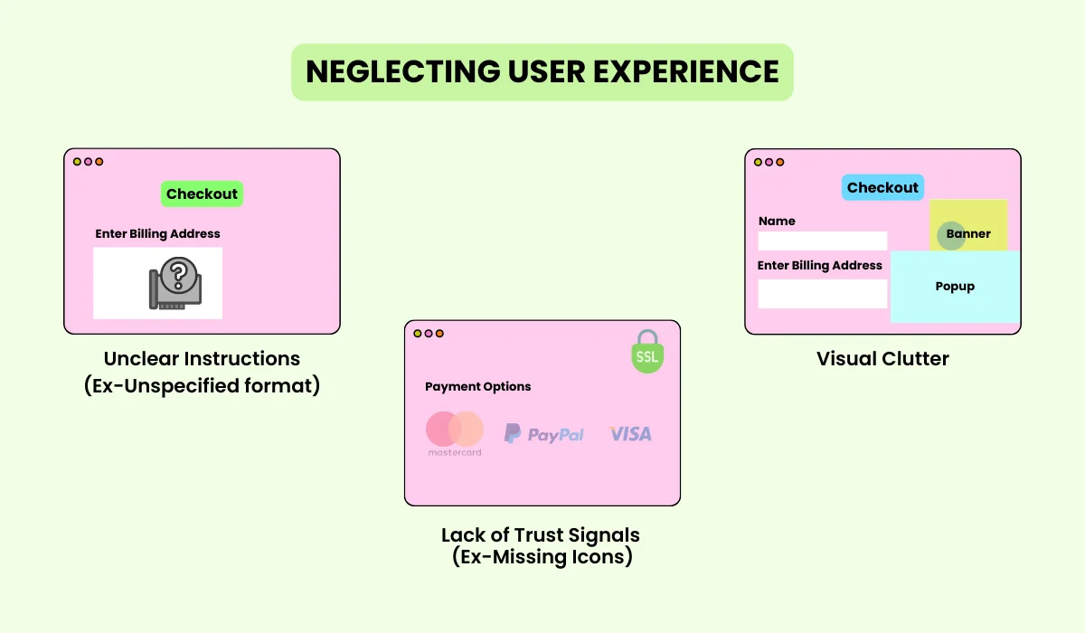
Unclear Instructions: They will be confused if sufficient information is not provided to guide users through the checkout process. If the user is not instructed to use a specified format in the billing address field, he will try the common way and fail to enter it. After attempting and failing too many times he will surely jump from the WooCommerce checkout page.
Visual Clutter: Involving many elements in the checkout will lead to visual cluttering and will disturb the customer’s focus from completing a purchase.
Lack of Trust Signals: If trust signals do not appear they create a trust issue and users will hesitate to enter their payment information. The absence of a payment network and SSL-secured payment Icons will make him feel insecure about providing his payment information on the checkout page.
Tips for Improving User Experience of WooCommerce Checkout
- For every field, include clear instructions and labeling. To assist users in understanding what information is required, include samples and tooltips.
- Create an easy-to-understand checkout process flow. For actions like “Continue” and “Submit,” use clear buttons, and make sure that users can quickly navigate between steps.
- Include trust signals like SSL certificates, client reviews, security badges, and clear return guidelines. This will assure customers about the security of their payment information.
5. Failing to Communicate Clearly
A clear communication strategy is important for encouraging customers to complete the checkout process and make a purchase. Unclear information can lead to confusion, frustration, and cart abandonment. Keep everything simple and easy to understand on the checkout page to boost the conversion on your WooCommerce store.
Common Issues
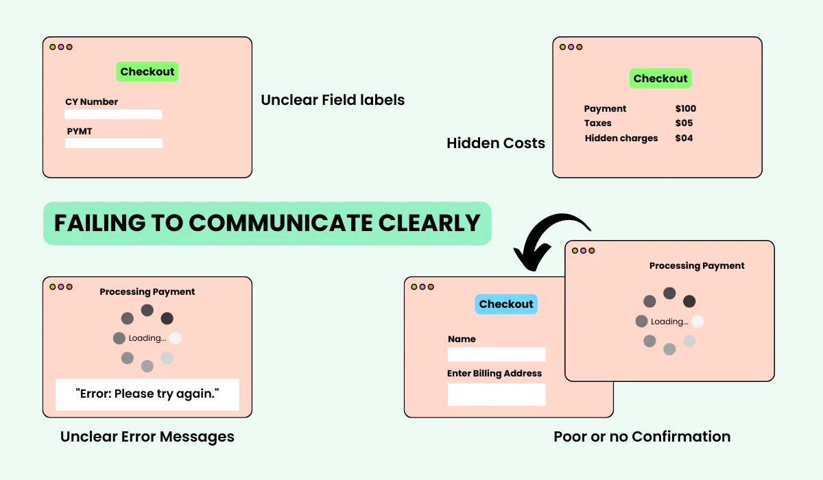
Unclear Field labels: Technical and ambiguous fields will confuse customers about what they need to enter.
Hidden Costs: Additional costs that appear during the checkout can surprise customers and stop customers from making a purchase.
Unclear Error Messages: Sudden error messages that don’t even notify what went wrong can frustrate users leading to cart abandonment. For example – A consumer tries to enter their payment details during the checkout process, but they get an ambiguous error message that says, “Error: Please try again.” The customer is not clarified with the notification whether there is a problem with the billing address, credit card number, expiration date, or CVV code.
Poor Confirmation and Feedback: If you don’t provide clear confirmation for customer actions throughout the checkout process, it will make them uncertain, leading to cart abandonment.
Tips for Improving User Experience of WooCommerce Checkout
- Use clear descriptive labels that are easy to understand for customers. For example, use “Enter your First Name” in place of “First Name”.
- Display all the costs including shipping, taxes, and any additional fees transparently on the checkout page earlier. This avoids unpleasant surprises for customers and keeps them inspired to make a purchase.
- Show clear messages to explain the issues. For example, use “Invalid email format. Please enter a valid email address.”
- Display success and confirmation messages after the completion of each successful step during the checkout.
You can also use WPMozo Checkout Manager to implement these tips and make the entire checkout field editing task a piece of cake. Also try to learn the entire process of editing WooCommerce Checkout page from scratch in detail.
Final Takeaway
If you keep all these common issues in mind while designing and maintaining your checkout page and implement these tips, it will increase conversions and reduce cart abandonment. You can also streamline the checkout process by avoiding common mistakes such as unclear navigation, lack of proper instructions, visual clutter, lack of trust signals, ambiguous field labels, vague error messages, and poor confirmation feedback.

0 Comments