Product Grid for WooCommerce Documentation
Search for answers or browse our knowledge base.
How to use
The WPMozo Product Grid for WooCommerce is a free plugin that allows you to showcase your products within an engaging grid layout.
Add widget on page
To showcase the product grid on your site, go to your WP admin panel >> Page >> create or edit a page.
Now, on the left side, under WPMozo, you’ll find the WPMozo Product Grid widget.
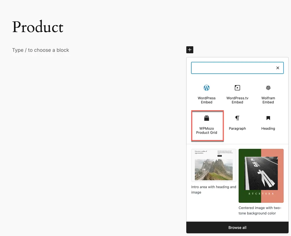
To add the widget simply drag and drop it onto the desired section of the page.
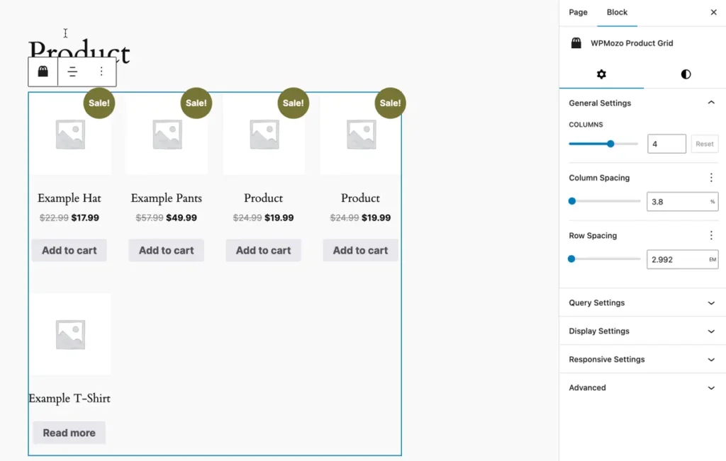
General Setting
The General Settings panel allows you to control the structure and spacing of your product grid layout.
Columns
- Set the number of product columns in the grid.
Column Spacing
- Adjust the horizontal spacing between columns (in %).
Row Spacing
- Adjust the vertical spacing between rows (in EM).
Query Settings
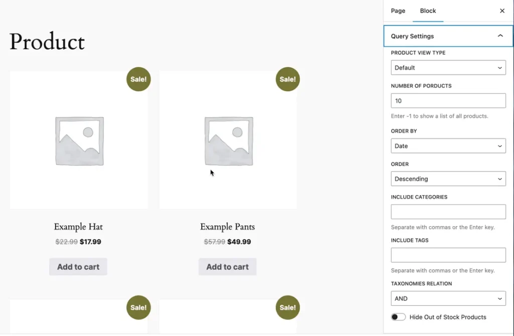
- Product View Type
- Choose the type of products to display: Default, Featured, Sale, Best Selling, or Top Rated.
- Number of Products
- Set the total number of products to display. Use
-1to display all products.
- Set the total number of products to display. Use
- Order By
- Determine the sorting criteria for products: Date, Modified Date, Menu Order, Title, Slug, ID, Random, Stock Status, Price, or None.
- Order
- Choose the sorting order: Descending or Ascending.
- Include Categories
- Specify categories to include in the grid (separate values with commas or Enter key).
- Include Tags
- Specify tags to include in the grid (separate values with commas or Enter key).
- Taxonomies Relation
- Set the relation for taxonomies:
AND(all conditions must match) orOR(any condition can match).
- Set the relation for taxonomies:
- Hide Out of Stock Products
- Option to hide products that are out of stock from the grid.
Display Options
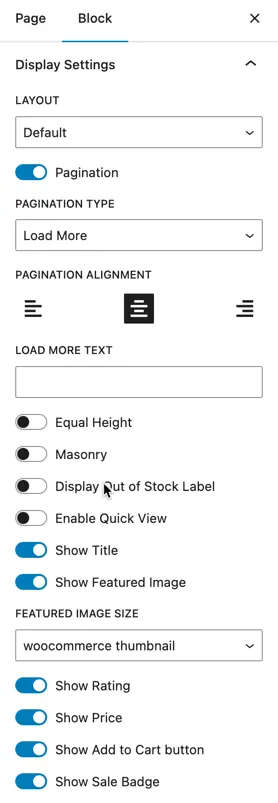
- Layout
- Choose a layout style: Default, Layout 1, or Layout 2.
- Pagination Type
- Select the pagination method: Pagination or Load More.
- Pagination Alignment
- Align pagination: Left, Center, or Right.
- Pagination Previous/Next Text
- Customize the text for previous and next buttons using the
|separator.
- Customize the text for previous and next buttons using the
- Ajax Pagination
- Enable or disable Ajax-based pagination.
- Equal Height
- Toggle to ensure equal height for all product cards.
- Masonry
- Toggle to enable a masonry-style layout.
- Display Out of Stock Label
- Toggle to show a label for out-of-stock products.
- Enable Quick View
- Toggle to allow users to view product details quickly.
- Show Title
- Toggle to display the product title.
- Show Featured Image
- Toggle to display the product’s featured image.
- Featured Image Size
- Choose the size for the featured image (e.g., WooCommerce Thumbnail).
- Show Rating
- Toggle to display product ratings.
- Show Price
- Toggle to display product prices.
- Show Add to Cart Button
- Toggle to display the “Add to Cart” button.
- Show Sale Badge
- Toggle to display a sale badge on discounted products.
- Sale Badge Type
- Choose the style of the sale badge: Sale Label or Sale Percentage.
Responsive Feature
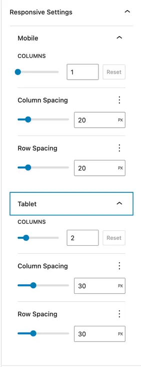
Mobile Settings
- Columns
- Set the number of product columns displayed on mobile devices (default: 1).
- Column Spacing
- Adjust the horizontal spacing between columns (in PX) for mobile (default: 20px).
- Row Spacing
- Adjust the vertical spacing between rows (in PX) for mobile (default: 20px).
Tablet Settings
- Columns
- Set the number of product columns displayed on tablets (default: 2).
- Column Spacing
- Adjust the horizontal spacing between columns (in PX) for tablets (default: 30px).
- Row Spacing
- Adjust the vertical spacing between rows (in PX) for tablets (default: 30px).
Customization Options
Products Style
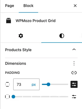
Padding
- Horizontal: Adjust the left and right padding for product cards.
- Vertical: Adjust the top and bottom padding for product cards.
Pagination Style
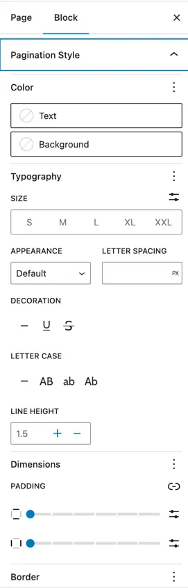
Color Settings
- Text
- Set the color of the pagination text.
- Background
- Set the background color of the pagination buttons.
Typography Settings
- Size
- Choose the size of pagination text (e.g., S, M, L, XL, XXL).
- Appearance
- Set the font weight and style for pagination text.
- Letter Spacing
- Adjust the spacing between letters (in PX).
- Decoration
- Choose text decoration (e.g. Underline).
- Letter Case
- Select text capitalization: All Caps (AB), Lowercase (ab), or Title Case (Ab).
- Line Height
- Adjust the spacing between lines in pagination text.
Dimensions
- Padding
- Horizontal: Adjust left and right padding of pagination buttons.
- Vertical: Adjust top and bottom padding of pagination buttons.
Border Settings
- Color
- Set the border color of pagination buttons.
- Radius
- Adjust the border radius to round the corners of the buttons.
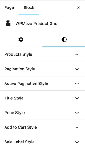
Active Pagination Style
Customize the active page indicator with options for color and typography to ensure it stands out and matches your site’s design.
Title Style
Adjust the color and typography of titles to match your branding, creating a consistent and visually appealing look.
Price Style
Control the color and typography of prices to enhance visibility and complement your website’s style.
Add to Cart Style
Style the Add to Cart button by adjusting its color, typography, and dimensions to fit your design and improve user interaction.
Sale Label Style
Customize the color and typography of sale labels to make discounted products more noticeable and attractive.